
In the vast landscape of web development, finding the right tools to kickstart your projects can be a tedious task, especially for beginners. Learn Bootstrap – a powerful and popular front-end framework that has revolutionized the way websites and applications are built. Whether you’re a novice coder or an experienced developer looking to streamline your workflow, Bootstrap offers a comprehensive set of tools and resources to help you create stunning, responsive web designs with ease. In this beginner’s guide, we’ll take you through the fundamentals of Bootstrap, from understanding its key features to implementing it in your projects. Let’s embark on this journey together and unlock the potential of Bootstrap for your web development endeavors.
Bootstrap, a boon for beginners in web development, streamlines the process with simplicity and ready-made components. Its mantra, ‘Streamline, design, prosper,’ captures its essence, fostering a supportive learning environment and efficient development for newcomers.
What is Bootstrap?
Bootstrap is a free and open-source front-end framework for web development, designed to streamline the process of building responsive and visually appealing websites. It was initially created by Twitter developers Mark Otto and Jacob Thornton, and it was first released in 2011 as Twitter Bootstrap. Later, it became simply Bootstrap and evolved into one of the most popular frameworks in the web development community.
Purpose:
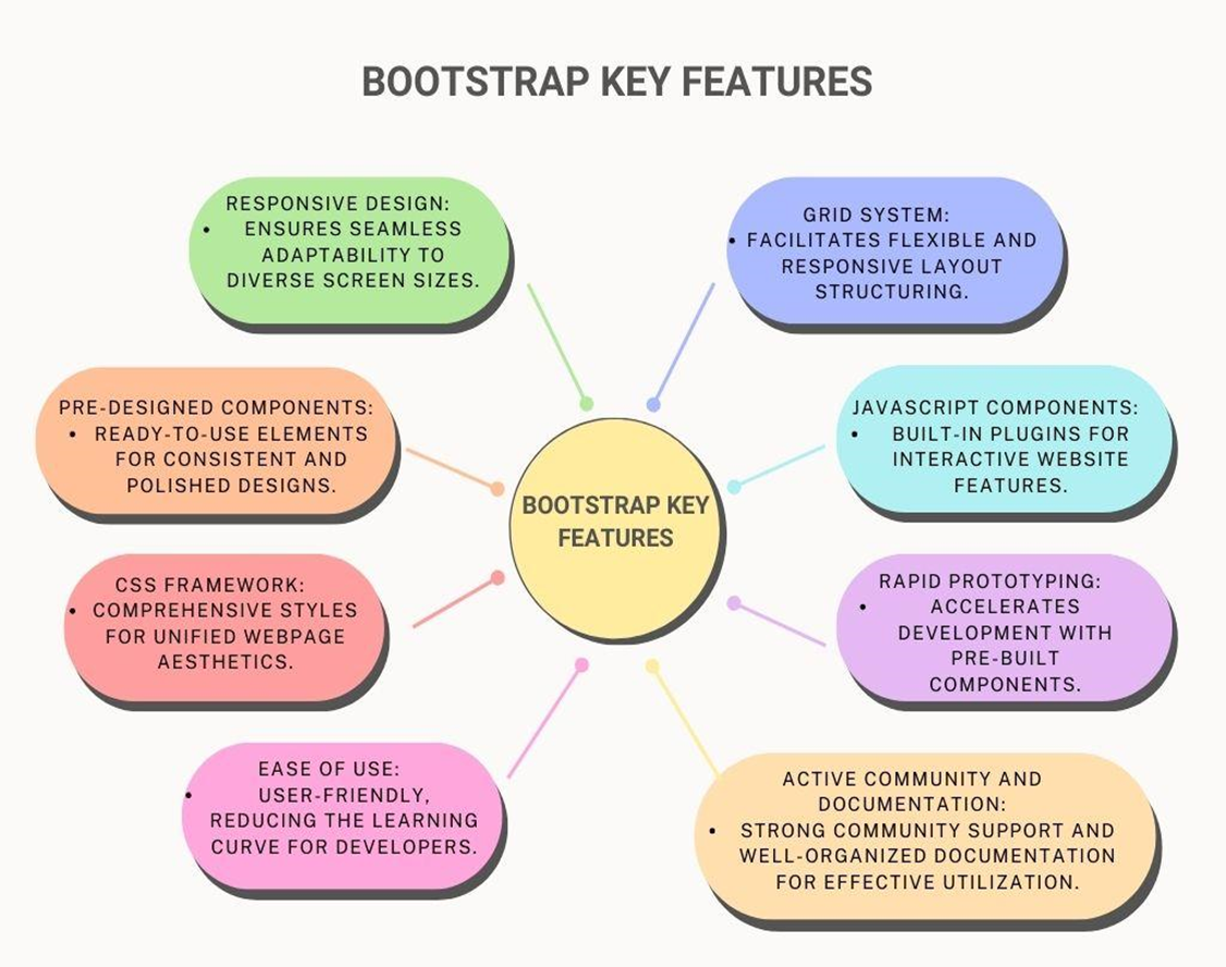
- Responsive Design: Bootstrap employs a responsive grid system, ensuring websites adapt seamlessly to various devices and screen sizes, maintaining a consistent user experience.
- Consistent Styling: With pre-designed components like buttons and forms, Bootstrap facilitates uniform styling throughout the site, reducing the need for extensive custom design.
Features:
- CSS Framework: Bootstrap provides an extensive set of CSS styles, simplifying the application of consistent styles across different web page elements.
- JavaScript Components: The framework includes JavaScript plugins enhancing webpage functionality, such as modal dialogs and carousels.
Usage:
- Ease of Use: Bootstrap’s simplicity and ready-to-use components make it user-friendly, reducing manual coding for common design elements.
- Rapid Prototyping: Widely employed for rapid prototyping, Bootstrap accelerates development with its pre-built components and responsive grid system.
Community and Documentation:
- Active Community: Bootstrap boasts a large, active developer community, fostering ongoing development, providing support, and sharing resources.
- Documentation: Its well-organized documentation caters to developers of all skill levels.
Customization:
- Themeable: Bootstrap allows high customization, enabling developers to create themes aligned with specific project or brand aesthetics.
- Sass Integration: Bootstrap 4 introduced integration with Sass, adding flexibility and enhancing customization options.
- Bootstrap is extensively used in web development due to its ability to simplify the creation of responsive and visually appealing websites. Stemming from Twitter’s roots, it has evolved into a versatile framework that caters to both novices and experts, striking a balance between user-friendliness and flexibility.
Origin of Bootstrap
- Bootstrap originated as an internal tool at Twitter in 2010.
- Developed by Twitter engineers Mark Otto and Jacob Thornton.
- Released to the public as Twitter Bootstrap in August 2011.
- Created to standardize UI development and address responsive design challenges.
- Rapidly gained popularity for its simplicity and responsive features.
- Evolved into a widely adopted open-source framework.
- Known for user-friendly design and active community involvement.
Top 10 Reasons to Choose Bootstrap
| 1. Speedy Development | Using Bootstrap, you can create stylish and quick web pages in minutes. |
| 2. Effortless Responsive Design | The intuitive grid system ensures responsive designs for various screen sizes. |
| 3. Consistent Styling Brilliance | Uniform styling across elements simplifies the creation of sleek and consistent designs. |
| 4. Robust Documentation Support | Comprehensive and well-organized documentation serves as a reliable guide. |
| 5. Thriving Community Backing | Joining the Bootstrap community provides access to a vast knowledge base. |
| 6. Adaptability for Every Skill Level | Caters to beginners and advanced developers, making it accessible and powerful. |
| 7. Incorporated JavaScript Elegance | Built-in JavaScript components, such as modals, add interactivity without complexity. |
| 8. Themeable and Adaptable | Allows easy customization for personalized websites with different colors and fonts. |
| 9. Time and Effort Savings | Pre-built components reduce redundant code, saving time and effort. |
| 10. Industry Relevance | Widely used in the industry, enhancing your employability as a web developer. |
Click here to know more
Essential features of Bootstrap
Installing Bootstrap
Bootstrap Installation in Easy Steps
Step 1: Create a New HTML File
Begin by creating a new HTML file using your preferred text editor.
Step 2: Obtain Bootstrap Files
Choose one of the following options to get Bootstrap files:
- Download from the official Bootstrap website.
- Use a Content Delivery Network (CDN) by adding links directly to your HTML file.
Step 3: Link Bootstrap Files in HTML
Link the Bootstrap files in your HTML. If you downloaded them, place the CSS link in the head section and the JavaScript links before the closing body tag. If using CDN, include the links directly in your HTML file.
Step 4: Verify Installation
Confirm the installation by adding a simple Bootstrap component (e.g., a button) to your HTML file. Save and open the HTML file in a web browser. If the button appears styled as a Bootstrap button, the installation is successful!
References: Bootstrap Official Website: https://getbootstrap.com/
Bootstrap Basic Structure
The basic structure of a Bootstrap project
It involves organizing content within containers, rows, and columns to achieve a responsive and visually consistent layout.
Container:
- This wrapper ensures a consistent fixed-width layout for content.
Rows:
- Content is arranged horizontally within a container using rows, which help with proper alignment and spacing.
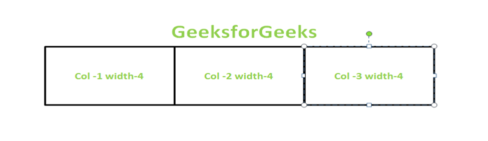
Columns:
- Columns, positioned within rows, define the structure of content. Bootstrap’s grid system, based on 12 columns, allows for flexible and responsive layouts.
This structural foundation enables developers to create web designs that seamlessly adapt to different screen sizes and devices.
Become a Certified Bootstrap Professional by vskills
The use of the container, rows, and columns in Bootstrap
Efficient Tool:
- The Bootstrap grid, powered by flexbox, simplifies website development.
- It ensures complete responsiveness by dynamically adjusting layouts based on device width.
Optimal User Experience:
- Adapts layouts to different device widths, ensuring an optimal user experience.
Container Structure:
- Utilizes a container element wrapping all webpage items.
- The widely used .container class not only facilitates grid functionality but also offers features like center alignment and horizontal padding.
Column Flexibility:
- Features 12 columns, providing flexibility in creating layouts.
- The sum of column widths should not exceed 12, allowing customization within this framework.
Merging Columns:
- Columns can be merged to create wider layouts as needed.
Manipulation Classes:
- Utilizes the classes .row and .col for manipulating rows and columns, respectively.
The Bootstrap grid system categorizes classes based on device or browser width
For small devices:
- col: Browser width less than 576px.
- col-sm: Browser width equal to or greater than 576px.
For medium devices:
- col-md: Browser width equal to or greater than 768px.
For large and extra-large devices:
- col-lg: Screen width equal to or greater than 992px.
- col-xl: Screen width equal to or greater than 1200px.
In this context, the designations “sm,” “md,” “lg,” and “xl” correspond to the device sizes, signifying small, medium, large, and extra-large, respectively.
Basic Structure
| <div class=”container”> <div class=”row”> <div class=”col-lg”> column-1 </div> <div class=”col-lg”> Column-2 </div> </div> </div> |
This will create 2 center-aligned columns of equal widths. The class container wraps all the rows, columns, and content of the grid. The class row is used to create a row and the class col-lg denotes the device width is large.
BootstrapTypography and Icons
Bootstrap provides a robust system for handling typography, ensuring consistent and visually appealing text across web projects. Here’s a detailed explanation of how Bootstrap manages typography.
Heading Styles:
Bootstrap defines heading styles from h1 to h6 with predefined classes, such as .display-1 to .display-6. These classes ensure consistent sizing and styling for headings.
| <h1 class=”display-1″>Display 1 Heading</h1> |
Lead Paragraphs:
The .lead class is available to emphasize and style lead paragraphs, providing a distinct appearance.
| <p class=”lead”>This is a lead paragraph.</p> |
Text Alignment:
Bootstrap includes classes for easy text alignment, such as .text-left, .text-center, .text-right, and .text-justify.
| <p class=”text-center”>Center-aligned text.</p> |
Font Weight and Style:
Classes like .font-weight-bold and .font-italic allow you to quickly adjust the weight and style of text.
| <p class=”font-weight-bold”>Bold text.</p> |
Text Transformation:
Bootstrap provides classes for transforming text, including .text-uppercase, .text-lowercase, and .text-capitalize.
| <p class=”text-uppercase”>uppercase text</p> |
Text Colors:
Easily change text colors using contextual classes like .text-primary, .text-success, and others.
| <p class=”text-danger”>This text is red.</p> |
Responsive Font Sizes:
Bootstrap includes responsive font-sizing classes like .fs-1 to .fs-6 for adjusting text size based on viewport size.
| <p class=”fs-2″>Larger text on larger screens.</p>arger text on larger screens.</p> |
These Bootstrap typography classes offer a consistent and flexible approach to text styling, making it simpler for developers to create visually harmonious designs across various elements of their web projects.
CSS Components in Bootstrap
Buttons in CSS provide interactive elements for users to trigger actions or navigate within a webpage. They can be styled in various ways, and Bootstrap simplifies this process by offering predefined button styles.
Example
Implementation of a primary button with Bootstrap styling
| <button class=”btn btn-primary”>Click Me</button>Click Me</button> |
Forms
Forms are crucial for user interaction, allowing them to input data or make selections. Bootstrap styles form elements, making them visually appealing and responsive.
Example:
Implementation of a simple Bootstrap-styled form:
| <form> <div class=”mb-3″> <label for=”exampleInput” class=”form-label”>Name:</label> <input type=”text” class=”form-control” id=”exampleInput” placeholder=”John Doe”> </div> <button type=”submit” class=”btn btn-success”>Submit</button> </form>ubmit</button> </form> |
Navigation Bars
Navigation bars provide a user-friendly way to navigate through different sections of a website. Bootstrap simplifies the creation of responsive and styled navigation bars.
Example:
Implementation of a basic Bootstrap navigation bar:
| <nav class=”navbar navbar-expand-lg navbar-light bg-light”> <div class=”container-fluid”> <a class=”navbar-brand” href=”#”>Logo</a> <button class=”navbar-toggler” type=”button” data-bs-toggle=”collapse” data-bs-target=”#navbarNav” aria-controls=”navbarNav” aria-expanded=”false” aria-label=”Toggle navigation”> <span class=”navbar-toggler-icon”></span> </button> <div class=”collapse navbar-collapse” id=”navbarNav”> <ul class=”navbar-nav”> <li class=”nav-item”> <a class=”nav-link” href=”#”>Home</a> </li> <li class=”nav-item”> <a class=”nav-link” href=”#”>About</a> </li> <li class=”nav-item”> <a class=”nav-link” href=”#”>Contact</a> </li> </ul> </div> </div> </nav>ntact</a> </li> </ul> </div> </div> </nav> |
These examples showcase the simplicity and effectiveness of Bootstrap in creating consistent and visually appealing CSS components. For more detailed information and customization options, refer to the official Bootstrap documentation.
JavaScript Components in Bootstrap
Let’s delve into interactive JavaScript components in Bootstrap, including modal windows, carousels, and tooltips with practical examples and customization options for each:
Modal Windows
Modal windows are interactive pop-up dialogs that overlay the current webpage. They are commonly used for displaying additional content, forms, or messages.
Example:
| <button type=”button” class=”btn btn-primary” data-bs-toggle=”modal” data-bs-target=”#exampleModal”> Open Modal </button> <div class=”modal fade” id=”exampleModal” tabindex=”-1″ aria-labelledby=”exampleModalLabel” aria-hidden=”true”> <div class=”modal-dialog”> <div class=”modal-content”> <!– Modal content goes here –> </div> </div> </div><!– Modal content goes here –> </div> </div> </div> > <!– Modal content goes here –> </div> </div> </div> |
Customization Options
- You can customize the modal title, content, and appearance.
- Add buttons and define actions using JavaScript.
- Adjust animation and transition effects.
Carousels
Carousels, or sliders, are interactive elements that cycle through a set of images or content items.
Example:
| <div id=”carouselExample” class=”carousel slide” data-bs-ride=”carousel”> <div class=”carousel-inner”> <!– Carousel items go here –> </div> <button class=”carousel-control-prev” type=”button” data-bs-target=”#carouselExample” data-bs-slide=”prev”> <!– Previous button content –> </button> <button class=”carousel-control-next” type=”button” data-bs-target=”#carouselExample” data-bs-slide=”next”> <!– Next button content –> </button> </div> |
Customization Options
- Add more items to the carousel.
- Customize navigation controls, indicators, and captions.
- Implement automatic sliding and adjust transition duration.
Tooltips
Tooltips provide additional information when users hover over an element.
Example:
| <button type=”button” class=”btn btn-secondary” data-bs-toggle=”tooltip” data-bs-placement=”top” title=”Tooltip text”> Hover for Tooltip </button>er for Tooltip </button> |
Customization Options
- Adjust the tooltip’s position using data-bs-placement.
- Customize tooltip content and appearance.
- Enable or disable tooltips programmatically.
These interactive elements enhance user experience and engagement on your website. Bootstrap provides flexibility and customization options to align these components with your design preferences.
Customization: Tailoring Bootstrap for Your Project
How to customize Bootstrap to suit individual project needs with the the use of themes and custom styles
Customizing Bootstrap to meet the unique requirements of your project involves adjusting themes and applying custom styles. Here’s a step-by-step guide on how to achieve this:
1. Customizing Themes
A. Utilizing Bootstrap Themes:
Bootstrap themes, readily available online, provide pre-designed styles that seamlessly integrate into your project.
Download a Bootstrap Theme:
- Choose a theme from a reputable source and download the theme files.
Incorporate Theme Stylesheet:
- Link the theme’s CSS file in your HTML document, placing it after the default Bootstrap CSS link.
Adjust Theme Settings (Optional):
- Some themes may offer configurable options. Consult the theme’s documentation to customize settings if required.
B. Customizing Bootstrap Sass:
For a more detailed approach, customize Bootstrap using Sass to modify variables and influence various framework aspects.
Install Sass:
- If not already installed, use npm to install the official Bootstrap Sass package.
Create a Custom Sass File:
- Develop a custom Sass file (e.g., custom.scss) and import Bootstrap at the beginning.
Override Bootstrap Variables:
- Customize Bootstrap variables before the import statement to override default values.
Compile Sass:
- Compile the Sass file to generate a custom CSS file.
2. Applying Custom Styles:
A. Incorporate Custom CSS:
- If you prefer a non-Sass approach, create a separate CSS file and include it after the Bootstrap CSS.
B. Customizing Components:
- To tailor specific Bootstrap components, override their styles in your custom CSS file. Refer to the Bootstrap documentation for detailed insights into customizing individual components.
C. JavaScript Customization:
- For JavaScript components, Bootstrap offers data attributes and JavaScript options for customization. Consult the official documentation for comprehensive details.
Following these customization methods empowers you to adapt Bootstrap to align with the visual identity and functional requirements of your projects. Striking a balance between customization and Bootstrap’s core principles ensures optimal results.
Resources and Documentation
| Resource Type | Resource |
| Official Bootstrap Documentation | Bootstrap Documentation |
| Tutorials | W3Schools Bootstrap Tutorial |
| Bootstrap Tutorial by Tutorialspoint | |
| Online Courses | Coursera – Front-End Web UI Frameworks and Tools: Bootstrap 4 |
| Udemy – Bootstrap 4 From Scratch With 5 Projects | |
| YouTube Channels | Academind |
| Traversy Media | |
| Community and Forums | Bootstrap GitHub Repository |
| Stack Overflow – Bootstrap | |
| Bootstrap Forum |
Best Practices for using Bootstrap effectively
| No. | Best Practice |
| 1 | Implement Responsive Design Excellence |
| 2 | Optimize Asset Loading |
| 3 | Focus on Accessibility |
| 4 | Maintain Consistency in Styling |
| 5 | Regularly Update Bootstrap and Dependencies |
| 6 | Use Sass for Extensive Customization |
| 7 | Embrace Mobile-First Development |
Common mistakes to avoid
| No. | Common Pitfall |
| 1 | Aggressive Overriding of Styles |
| 2 | Neglecting Browser Compatibility |
| 3 | Unnecessary Component Loading |
| 4 | Documentation Oversight |
| 5 | Ignoring Responsive Utilities |
| 6 | Disregarding Accessibility |
Case Studies to know real experiences
- Check the official Bootstrap Showcase: Bootstrap Showcase.
- Explore GitHub repositories using Bootstrap: GitHub Bootstrap Repositories.
- Visit developer forums like Stack Overflow and Reddit.
- Read tech blogs and articles on Medium.
- Follow Bootstrap developers and organizations on LinkedIn and Twitter.
- Case Studies: Successful Bootstrap Stories to Inspire Your Startup Journey
- Successful bootstrapping in SAAS
Conclusion: Benefits of using Bootstrap
In summary, Bootstrap emerges as a robust front-end framework, equipped with a plethora of features that streamline the web development journey.
Key Highlights:
- Responsive Design: Bootstrap’s adaptive grid system ensures a smooth transition across various devices, maintaining a uniform user experience.
- Consistent Styling: By incorporating pre-designed components and styles, Bootstrap fosters a cohesive appearance throughout your website, minimizing the necessity for extensive custom design.
- Extensive Documentation: Bootstrap provides well-organized and comprehensive documentation, catering to developers of all skill levels.
- Active Community: Tap into a vibrant and engaged developer community, fostering continuous development, offering support, and sharing valuable resources.
- Ease of Use: Bootstrap’s simplicity and pre-built components enhance user-friendliness, reducing the need for manual coding in common design elements.
- Rapid Prototyping: Widely embraced for rapid prototyping, Bootstrap accelerates development through its ready-to-use components and responsive grid system.
Embarking on your web development journey with exploration and practice in Bootstrap is pivotal. Hands-on experience deepens your grasp of the framework, enabling you to unleash its full potential.
Whether you’re a novice or a seasoned developer, Bootstrap’s versatility and user-friendliness make it an invaluable tool for crafting visually appealing and responsive websites. Capitalize on the extensive documentation, engage with the community, and immerse yourself in practical projects to truly master the art of Bootstrap.
Empower your web development endeavors with Bootstrap – a framework that harmoniously blends simplicity and flexibility, making the process both enjoyable and efficient.
