Analyze Phase
This phase is the starting of the statistical analysis of the problem. This phase statistically reviews the families of variation to determine which significant contributors to the output are. The statistical analysis is done with the development of a theory, null hypothesis. The analysis will “fail to reject” or “reject” the theory. The families of variation and their contributions are quantified and relationships between variables are shown graphically and numerically to provide the team direction for improvements. The main objectives of this phase are
- Reduce the number of inputs (X’s) to a manageable number
- Determine the presence of noise variables through Multi-Vari Studies
- Plan first improvement activities
Exploratory data analysis or EDA, is the important first step in analyzing the data from an experiment as it is used for
- Detection of mistakes
- Checking of assumptions
- Preliminary selection of appropriate models
- Determining relationships among the explanatory variables, and
- Assessing the direction and rough size of relationships between explanatory and outcome variables.
EDA does not include any formal statistical modeling and inference. The four types of EDA are univariate non-graphical, multivariate non-graphical, univariate graphical, and multivariate graphical.
Multi-vari studies
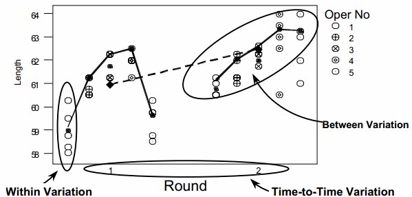
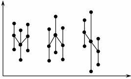
Usually the variation is within piece and the source of this variation is different from piece-to-piece and time-to-time variation. The multi-vari chart is a very useful tool for analyzing all three types of variation. Multi-vari charts are used to investigate the stability or consistency of a process. The chart consists of a series of vertical lines, or other appropriate schematics, along a time scale. The length of each line or schematic shape represents the range of values found in each sample set. The multi-vari chart presents an analysis of the variation in a process, hereby differentiating between three main sources
- Intra-piece, the variation within a piece, batch, lot, etc
- Inter-piece, the additional variation between pieces.
- Temporal variation, variation which is related to time.
Data can be grouped in terms of sources of variation to help define the way measurements are partitioned. These sources describe characteristics of populations, and the few common types are classifications (by category), geography (of a distribution center or a plant), geometry (chapters of a book or locations within buildings), people (tenure, job function or education) and time (deadlines, cycle time or delivery time).
We can stratify the data to help us understand the way our processes work by categorizing the individual measurements. This helps us understand the variation of the components as it relates to the whole process. For example, errors are being tracked in a process. The variation could be within a subgroup (within a certain batch), between subgroups (from one batch to another batch) or over time (time of day, day of week, shift or even season of the year). Interpretation of the chart is apparent once the values are plotted. The advantages of multi-vari charts are
- It can dramatize the variation within the piece (positional).
- It can dramatize the variation from piece to piece (cyclical).
- It helps to track any time related changes (temporal).
- It helps minimize variation by identifying areas to look for excessive variation. It also identifies areas not to look for excessive variation.
Sources of variation in multi-vari analysis can be
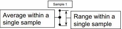
- Within Individual Sample – Variation is present upon repeat measurements within same sample.
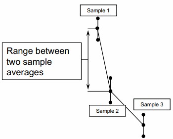
- Piece to Piece – Variation is present upon measurements of different samples collected within a short time frame.
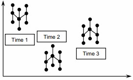
- Time to Time – Variation is present upon measurements collected with a significant amount of time between samples.
Multi-vari analysis is applicable to either product or service as it can control variation for both as
- Within Individual Sample variations like Measurement Accuracy, Out of Round, Irregularities in Part, Measurement Accuracy and Line Item Complexity
- Piece to Piece variations like Machine fixturing, Mold cavity differences, Customer Differences, Order Editor, Sales Office and Sales Rep
- Time to Time variations like Material Changes, Setup Differences, Tool Wear, Calibration Drift, Operator Influence, Seasonal Variation, Management Changes, Economic Shifts and Interest Rate
Steps to develop multi-vari chart
- Plot the first sample range with a point for the maximum reading obtained, and a point for the minimum reading. Connect the points and plot a third point at the average of the within sample readings
- Plot the sample ranges for the remaining “piece to piece” data. Connect the averages of the within sample readings.
- Plot the “time to time” groups similarly.
Interpreting the multi-vari chart
- Within Piece – It is characterized by large variation in readings taken of the same single sample, often from different positions within the sample, as shown below
- Piece to Piece – It is characterized by large variation in readings taken between samples taken within a short time frame, as shown below
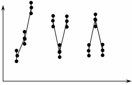
- Time to Time – It is characterized by large variation in readings taken between samples taken in groups with a significant amount of time elapsed between groups, as shown below
Simple linear correlation and regression
Correlation
Correlation is tool that is with a continuous x and a continuous y. Correlation begins with investigating the relationship between x factors, inputs, and critical variable y outputs of the process. It involves addressing the following questions like Does a relationship exist? or How strong is that relationship? or Which of those x inputs have the biggest impact or relationship to your y factors? What’s the hierarchy of importance that you’re going to need to pursue later in the improvement process?
Correlation doesn’t specifically look for causes and effects. It focuses only on whether there is a correlation between the x factors, y factors, and how strong that relationship is to the y variable output in your business process. The correlation between two variables does not imply that one is as a result of the other. The correlation value ranges from -1 to 1. The closer to value 1 signify positive relationship with x and y going in same direction similarly if nearing -1, both are in opposite direction and zero value means no relationship between the x and y.
Correlation analysis starts with relating the x inputs to the continuous y variable outputs. You do this over a range of observations, in which the x values and inputs can change over time. By doing this, you’re able to identify and begin to understand the key x inputs to the processes and the relationship between different x outputs.
Often the interaction of these different x factors can be a real challenge to understand in Six Sigma projects. A specific methodology called design of experiments defines a rigorous set of steps for identifying the various x factors, the variable y output factors, setting up and staging series of experiments to compare multiple x factors to one another, and their impact on the y, based on their interactions. So there are some powerful tools that enable you to go beyond just basic once-off x-factor analysis.
In product companies, for example, in circuit board assembly operations, you may be interested in knowing the number of hours of experience of the workers and comparing and correlating that to the percentage of incorrectly installed circuit modules. You might want to do visual acuity tests and determine if the visual acuity of your workers correlates to incorrectly installed modules on the circuit boards.
In service companies, for example, you may want to know about the correlation of blood pressure to the relative age of patients. When considering sales, you might want to know if you can correlate sales volume achieved to level of education and number of years of experience in the industry that you’re selling in. You may not get a causation but you could show a strong correlation that would lead you to further discoveries.
Measure of correlation
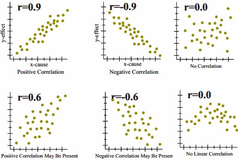
The correlation coefficient is a measure that determines the degree to which two variables’ movements are associated. The range of values for the correlation coefficient is -1.0 to 1.0. If a calculated correlation is greater than 1.0 or less than -1.0, a mistake has been made. A correlation of -1.0 indicates a perfect negative correlation, while a correlation of 1.0 indicates a perfect positive correlation.
While the correlation coefficient measures a degree to which two variables are related, it only measures the linear relationship between the variables. Nonlinear relationships between two variables cannot be captured or expressed by the correlation coefficient. There are many measures of correlation. The Pearson correlation coefficient is just one of them.
To gain an understanding of correlation coefficients, consider how the scatter diagrams would differ for different coefficient values:
- with a correlation coefficient value of 1, plotted data points would form a straight line that rises from left to right
- with a correlation coefficient value of 0.82, the plotted data would maintain a similar line, but the data points would be more loosely scattered on either side of it
- with a correlation coefficient value of 0, data points would be scattered widely and there would be no line of best fit
- with a correlation coefficient value of -0.67, the data points would be scattered to either side of a best-fit line that would slope downward from left to right
- with a correlation coefficient value of -1, the data points would form a straight line that would slope down from left to right
Confidence in a relationship is computed both by the correlation coefficient and by the number of pairs in data. If there are very few pairs then the coefficient needs to be very close to 1 or –1 for it to be deemed ‘statistically significant’, but if there are many pairs then a coefficient closer to 0 can still be considered ‘highly significant’. The standard method used to measure the ‘significance’ of analysis is the p-value. It is computed as
For example to know the relationship between height and intelligence of people is significant, it starts with the ‘null hypothesis’ which is a statement ‘height and intelligence of people are unrelated’. The p-value is a number between 0 and 1 representing the probability that this data would have arisen if the null hypothesis were true. In medical trials the null hypothesis is typically of the form that the use of drug X to treat disease Y is no better than not using any drug. The p-value is the probability of obtaining a test statistic result at least as extreme as the one that was actually observed, assuming that the null hypothesis is true. Project team usually “reject the null hypothesis” when the p-value turns out to be less than a certain significance level, often 0.05. The formula to calculate the p value for Pearson’s correlation coefficient (r) is p=r/Sqrt(r^2)/(N—2).
The Pearson coefficient is an expression of the linear relationship in data. It gives you a correlation expressed as a simple numerical value between -1 and 1. The Pearson coefficient can help you understand weaknesses. Weaknesses occur where you can’t distinguish between dependent and the independent variables, and there’s no information about the slope of the line. However, this coefficient may not tell you everything you want to know. For example, say you’re trying to find the correlation between a high-calorie diet, which is the dependent variable or cause, and diabetes, which is the independent variable or effect. You might find a high correlation between these two variables. However, the result would be exactly the same if you switch the variables around, which could lead you to conclude that diabetes causes a high-calorie diet. Therefore, as a researcher, you have to be aware of the context of the data that you’re plugging into your model.
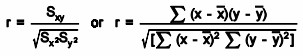
The Pearson coefficient is the co-variance of the two variables divided by the product of their standard deviations. Calculation requires
- the individual values of the first variable, represented by xi
- the individual values of the second variable, represented by yi
- the number of pairs of data in the dataset, represented by n
Causation
Causation is different from correlation as the correlation is the mutual relation that exists between two or more things while causation is the fact that something causes an effect. Correlation does not equal causation. To understand causation, the values of the x and y factors, and how they relate. Important aspects of causation, are
- causation is asymmetrical – This means correlation is symmetrical but does not imply causation. The x correlated with the y is the same as the y correlated with the x. Correlation is symmetrical; causation is asymmetrical or directional.
- causation is not reversible – X causes y. It flows in one direction. For example, a hurricane causes the phone lines to go down, but you can’t reverse it and say that y causes x. The phone lines going down doesn’t cause a hurricane.
- causation can be difficult to determine – Causation is often difficult to determine in a case where there’s a third unknown variable. Situations and variable relationships are often complex and require more analysis.
- correlation can help point to causation – In the finding of a strong correlation between variables, you’ll also rule out data that’s unrelated and help focus on the relationship that may lead to determining causation.
When considering the significance of correlation, you need to determine whether you’re focusing on the right variables, understand and determine which of your correlation coefficients are subject to chance and determine the significance of the correlations. The significance of correlation helps tell you whether correlation is by chance, and what likelihood there is of finding a correlation value other than the one you estimated in your example.
The p-value allows you to determine and measure the significance, but not necessarily the importance, of two different relationships. The p-value provides statistical evidence of the relationship.
You typically look for a p-value of less than 0.05. This is true when your alpha factor or constant factor equals 0.05. The significance of this is that you’re aiming for a 95% confidence interval that what you’re finding is actually true.
Linear Regression
When the input and output variables are both continuous and to see a relationship between the two variables, regression and correlation are used. Determining how the predicted or dependent variable (the response variable, the variable to be estimated) reacts to the variations of the predicator or independent variable (the variable that explains the change) involves first to determine any relationship between them and it’s importance. Regression analysis builds a mathematical model that helps making predictions about the impact of variable variations.
Usually, there is more than one independent variable causing variations of a dependent variable like changes in the volume of cars sold depends on the price of the cars, the gas mileage, the warranty, etc. But the importance of all these factors in the variation of the dependent variable (the number of cars sold) is disproportional. Hence, project team should concentrate on one important factor instead of analyzing all the competing factors.
In simple linear regression, prediction of scores on one variable is done from the scores on a second variable. The variable to predict is called the criterion variable and is referred to as Y. The variable to base predictions on is called the predictor variable and is referred to as X. When there is only one predictor variable, the prediction method is called simple regression. In simple linear regression, the predictions of Y when plotted as a function of X form a straight line.
As an example, data for X and Y are listed below and having a positive relationship between X and Y. For predicting Y from X, the higher the value of X, the higher prediction of Y.
| X | Y |
| 1.00 | 1.00 |
| 2.00 | 2.00 |
| 3.00 | 1.30 |
| 4.00 | 3.75 |
| 5.00 | 2.25 |
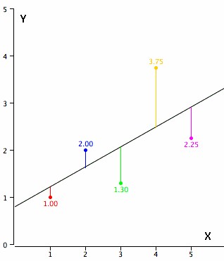
Linear regression consists of finding the best-fitting straight line through the points. The best-fitting line is called a regression line. The diagonal line in the figure is the regression line and consists of the predicted score on Y for each possible value of X. The vertical lines from the points to the regression line represent the errors of prediction. As the line from 1.00 is very near the regression line; its error of prediction is small and similarly for the line from 1.75 is much higher than the regression line and therefore its error of prediction is large.
The error of prediction for a point is the value of the point minus the predicted value (the value on the line). The below table shows the predicted values (Y’) and the errors of prediction (Y-Y’) like, for the first point has a Y of 1.00 and a predicted Y (called Y’) of 1.21 hence, its error of prediction is -0.21.
| X | Y | Y’ | Y-Y’ | (Y-Y’)2 |
| 1.00 | 1.00 | 1.210 | -0.210 | 0.044 |
| 2.00 | 2.00 | 1.635 | 0.365 | 0.133 |
| 3.00 | 1.30 | 2.060 | -0.760 | 0.578 |
| 4.00 | 3.75 | 2.485 | 1.265 | 1.600 |
| 5.00 | 2.25 | 2.910 | -0.660 | 0.436 |
The most commonly-used criterion for the best-fitting line is the line that minimizes the sum of the squared errors of prediction. That is the criterion that was used to find the line in the figure. The last column in the above table shows the squared errors of prediction. The sum of the squared errors of prediction shown in the above table is lower than it would be for any other regression line.
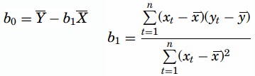
The regression equation is calculated with the mathematical equation for a straight line as y = b0+ b1 X where, b0 is the y intercept when X= 0 and b1 is the slope of the line with the assumption that for any given value of X, the observed value of Y varies in a random manner and possesses a normal probability distribution. For calculations are based on the statistics, assuming MX is the mean of X, MY is the mean of Y, sX is the standard deviation of X, sY is the standard deviation of Y, and r is the correlation between X and Y, a sample data is as
| MX | MY | sX | sY | r |
| 3 | 2.06 | 1.581 | 1.072 | 0.627 |
The slope (b) can be calculated as b = r sY/sX and the intercept (A) as A = MY – bMX. For the above data, b = (0.627)(1.072)/1.581 = 0.425 and A = 2.06 – (0.425)(3) = 0.785. The calculations have all been shown in terms of sample statistics rather than population parameters. The formulas are the same but need the usage of the parameter values for means, standard deviations, and the correlation.
Least Squares Method- In this method, for computing the values of b1 and b0, the vertical distance between each point and the line called the error of prediction is used. The line that generates the smallest error of predictions will be the least squares regression line. The values of b1 and b0 are computed as
The P-value is determined by referring to a t-distribution with n-2 degrees of freedom.
Simple Linear Regression Hypothesis Testing
Hypothesis tests can be applied to determine whether the independent variable (x) is useful as a predictor for the dependent variable (y). The following are the steps using the cost per transaction example for hypothesis testing in simple regression
- Determine if the conditions for the application of the test are met. There is a population regression equation Y = β0+ β1 so that for a given value of x, the prediction equation is

Given a particular value for x, the distribution of y-values is normal. The distributions of y-values have equal standard deviations. The y-values are independent.
- Establish hypotheses.
Ho:b1= 0 (the equation is not useful as a predictor of y – cost per transaction)
Ha:b1≠ 0 (the equation is useful as a predictor of y – cost per transaction)
- Decide on a value of alpha.
- Find the critical t values. Use the t–table and find the critical values with +/- tα/2 with n – 2 df.
- Calculate the value of the test statistic t. The confidence interval formula is used to determine the test statistic
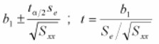
Interpret the results. If the test statistic is beyond one of the critical values greater than tα/2 OR less than -tα/2 reject the null hypothesis; otherwise, do not reject.
Multiple Linear Regression
Multiple linear regression expands on the simple linear regression model to allow for more than one independent or predictor variable. The general form for the equation is y = b0+ b1x + … bn+ e where, (b0,b1,b2…) are the coefficients and are referred to as partial regression coefficients. The equation may be interpreted as the amount of change in y for each unit increase in x (variable) when all other xs are held constant. The hypotheses for multiple regression are Ho:b1=b2= … =bn Ha:b1≠ 0 for at least one i.
In the case of a multiple lineal regression, multiple y’s can come into play. For example, if you’re only comparing height and weight, that would be a simple linear regression. However, if you compare height, age, and gender and then plot that against weight, you would actually have three different factors. You’d be analyzing three different multiple lineal regressions.
It is an extension of linear regression to more than one independent variable so a higher proportion of the variation in Y may be explained as first-order linear model

And second-order linear model

R2 the multiple coefficient of determination has values in the interval 0<=R2<=1
| Source | DF | SS | MS |
| Regression | k | SSR | MSR=SSR/k |
| Error | n-(k+1) | SSE | MSE=SSE[n-(k+1)] |
| Total | n-1 | Total SS |
Where k is the number of predictor variables.
Coefficient of Determination
Coefficients are estimated by minimizing the sum of squares (SS) residuals. The coefficients follow a t-distribution, which allows us to use t-tests to assess their significance. The coefficient of determination, R2, or multiple regression coefficients, is the proportion of variation in Y that can be explained by the regression model and is the square of r. In multiple regression, R2adj (adjusted value) represents the percent of explained variation when the model is adjusted for the number of terms in it. Ideally, R2 should be equal to 1, indicating that all of the variation is explained by the regression model. 0 ≤ R2≤ 1 Related to the coefficient of determination is the correlation coefficient, which ranges from -1 ≤ r ≤ 1 and determines whether there is a positive or negative correlation in the regression analysis, where r is the coefficient of correlation determined by sample data and an estimate of ρ(rho), the population parameter.
Coefficient of Determination Equation
R2 Equation
R2= SSregression / SStotal = (SStotal – SSerror) / SStotal = 1- [SSerror/ SStotal]
Where SS = the sum of squares R2 adj Equation
R2adj= 1- [SSerror/ (n – p)] / [SS total / (n -1)]
Where
- n = number of data points
- p = number of terms in the model including the constant
Unlike R2, R2 adj can become smaller when added terms provide little new information and as the number of model terms gets closer to the total sample size. Ideally, R2 adj should be maximized and as close to R2 as possible
