Drawing statistical conclusions involves usage of enumerative and analytical studies, which are
Enumerative or descriptive studies
It describes data using math and graphs and focus on the current situation like a tailor taking a measurement of length, is obtaining quantifiable information which is an enumerative approach. Enumerative data is data that can be counted. These studies are used to explain data, usually sample data in central tendency (median, mean and mode), variation (range and variance) and graphs of data (histograms, box plots and dot plots). Measures calculate from a sample, called statistics with which these measures describe a population, called as parameters.
A statistic is a quantity derived from a sample of data for forming an opinion of a specified parameter about the target population. A sample is used as data on every member of population is impossible or too costly. A population is an entire group of objects that contains characteristic of interest. A population parameter is a constant or coefficient that describes some characteristic of a target population like mean or variance.
Analytical (Inferential) Studies
The objective of statistical inference is to draw conclusions about population characteristics based on the information contained in a sample. It uses sample data to predict or estimate what a population will do in the future like a doctor taking a measurement like blood pressure or heart beat to obtain a causal explanation for some observed phenomenon which is an analytic approach.
It entails define the problem objective precisely, deciding if it will be evaluated by a one or two tail test, formulating a null and an alternate hypothesis, selecting a test distribution and critical value of the test statistic reflecting the degree of uncertainty that can be tolerated (the alpha, beta, risk), calculating a test statistic value from the sample and comparing the calculated value to the critical value and determine if the null hypothesis is to be accepted or rejected. If the null is rejected, the alternate must be accepted. Thus, it involves testing hypotheses to determine the differences in population means, medians or variances between two or more groups of data and a standard and calculating confidence intervals or prediction intervals.
Population and sample data
A population is essentially a collection of units that you’re going to study. This can be people, places, objects, time periods, pharmaceuticals, procedures, and all kinds of different things. Much of statistics is really concerned with understanding the numerical properties or parameters of an entire population, often using a random sampling from that population. Defining a population means you’re going to have a well-defined collection of objects or individuals that have similar characteristics. All those individuals or objects in that population usually have a common or binding characteristic or trait that you’re interested in. The samples are a collection of units from within the population and sampling is very often a process of taking a subset of those subjects that are represented over the entire population. It needs to be of sufficient size so you can actually warrant a statistical analysis.
Population parameters
When dealing with population parameters it’s important to understand several key data elements – mean, standard deviation, and variance – as well as the sample statistics for each of these. For example, the mean is represented as the Mu symbol with Xbar as the sample statistic, or a symbol that would represent that. Standard deviation to the left or to the right of the central mode is represented by the sigma symbol, and the sample statistic for that is the lowercase s symbol. Variance is sigma squared or the standard deviation squared, and the sample statistic is a lowercase s squared.
It’s important to understand that the relation of sampling to statistics in a population parameter is that they are somewhat similar. The statistic describes what percentage of the population fits in the category and the parameter describes the entire population.
Statistical Basic Terms
Various statistics terminologies which are used extensively are
- Data – facts, observations, and information that come from investigations.
- Measurement data sometimes called quantitative data — the result of using some instrument to measure something (e.g., test score, weight). Quantitative data typically gets classified in different fashions, but the key ones are called nominal, ordinal, interval, and ratio scale.
- Categorical data also referred to as frequency or qualitative data. Things are grouped according to some common property(ies) and the number of members of the group are recorded (e.g., males/females, vehicle type). It focuses on observations, interviews, capturing opinions about things, in-depth descriptions – verbal and written, and capturing personal perspectives and opinions.
- Variable – property of an object or event that can take on different values. For example, college major is a variable that takes on values like mathematics, computer science, etc.
- Discrete Variable – a variable with a limited number of values (e.g., gender (male/female).
- Continuous Variable – It is a variable that can take on many different values, in theory, any value between the lowest and highest points on the measurement scale.
- Independent Variable – a variable that is manipulated, measured, or selected by the user as an antecedent condition to an observed behavior. In a hypothesized cause-and-effect relationship, the independent variable is the cause and the dependent variable is the effect.
- Dependent Variable – a variable that is not under the user’s control. It is the variable that is observed and measured in response to the independent variable.
- Outlier – An outlier is an observation point that’s distant from the other observations in your dataset. This may be due to variability in the measurement or it may indicate some kind of experimental error, which you may want to throw out of your dataset. Outliers can occur by chance at any distribution and often indicate a measurement error or that the population has a heavily tailed distribution. The frequent cause of outliers is a mixture of two distributions, which may be two distinct subpopulations, or it may indicate a correct trial issue versus a measurement error. This is often modeled by using a mixture model.
Descriptive Statistics
Central Tendencies
Central tendency is a measure that characterizes the central value of a collection of data that tends to cluster somewhere between the high and low values in the data. It refers to measurements like mean, median and mode. It is also called measures of center. It involves plotting data in a frequency distribution which shows the general shape of the distribution and gives a general sense of how the numbers are grouped. Several statistics can be used to represent the “center” of the distribution.
Remember that the central tendency is a distribution of data typically contrasted with this dispersion or variability, so it’s the width of the bell curve that gives you an idea of the amount of dispersion you’re seeing in your data. Then you can use that to judge whether the data has a strong or weak central tendency, based on its dispersion and the general shape of your curve.
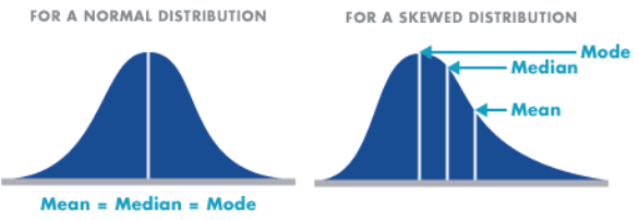
Normal and skewed distribution can be demonstrated through four bell curve examples. The first bell curve graph has the calculated mean or average value in the middle of the curve and has a wide range. The second bell curve has the mean or average value in the middle of the curve and has a narrow range. If you compare the two curves, you can conclude that they both act normally and they have a strong central tendency, but the second curve has a much narrower range of dispersion across the arc than the first one does. They could have exactly the same mean value but a big difference in the range.
- Mean – The mean is the most common measure of central tendency. It is the ratio of the sum of the scores to the number of the scores. For ungrouped data which has not been grouped in intervals, the arithmetic mean is the sum of all the values in that population divided by the number of values in the population as

where, µ is the arithmetic mean of the population, Xi is the ith value observed, N is the number of items in the observed population and ∑ is the sum of the values. For example, the production of an item for 5 days is 500, 750, 600, 450 and 775 then the arithmetic mean is µ = 500 + 750 + 600 + 450 + 775/ 5 = 615. It gives the distribution’s arithmetic average and provides a reference point for relating all other data points. For grouped data, an approximation is done using the midpoints of the intervals and the frequency of the distribution as

- Median – It divides the distribution into halves; half are above it and half are below it when the data are arranged in numerical order. It is also called as the score at the 50th percentile in the distribution. The median location of N numbers can be found by the formula (N + 1) / 2. When N is an odd number, the formula yields an integer that represents the value in a numerically ordered distribution corresponding to the median location. (For example, in the distribution of numbers (3 1 5 4 9 9 8) the median location is (7 + 1) / 2 = 4. When applied to the ordered distribution (1 3 4 5 8 9 9), the value 5 is the median. If there were only 6 values (1 3 4 5 8 9), the median location is (6 + 1) / 2 = 3.5 hence, median is half-way between the 3rd and 4th scores (4 and 5) or 4.5. It is the distribution’s center point or middle value with an equal number of data points occur on either side of the median but useful when the data set has extreme high or low values and used with non-normal data
- Mode – It is the most frequent or common score in the distribution or the point or value of X that corresponds to the highest point on the distribution. If the highest frequency is shared by more than one value, the distribution is said to be multimodal and with two, it is bimodal or peaks in scoring at two different points in the distribution. For example in the measurements 75, 60, 65, 75, 80, 90, 75, 80, 67, the value 75 appears most frequently, thus it is the mode. The mode allows you to get a good handle on what the most commonly occurring value across that entire population is. You need to remember that it’s not necessarily at the center of the dataset. You must also remember that if no value appears more than any other, there really is no mode. You could also find that you can have different conditions around the mode. It could be bimodal, with two modes; trimodal, with three modes; or multimodal. The usefulness of the mode for nominal data is that it can often be seen as the only center value by some experts for analysis purposes. It’s the most frequently found choice. For example, if you’re a retailer, it could be very useful to find out which particular product people buy the most out of a family of products that you’re offering to the market.
Measures of Dispersion
It is important in the practice of statistics, Six Sigma projects, and analysis of data. First understand the central tendency of your data as does the data tend to be a symmetrical bell curve shape once you put it into the form of a histogram? or Is it severely skewed left or right?
From there, you want to understand the dispersion.
- How far does the data stray from the central point that you’re looking for?
- How far out to the left or right?
- You also need to know, within one standard deviation, how much dispersion is in there that would take in 66 to 67% of the entire data population for your project.
You can see some characteristics of dispersion when you compare two example histograms. The histograms display the different call handle times for a technical support center. They have approximately the same mean value but the second histogram has a greater range than the first one. You could have essentially the same number of observations and maybe even the same mean value at the center, but you could have a big difference in the dispersion between them.
There are three important measures of dispersion:
- standard deviation, which measures the amount of dispersion from the average, left or right, from the center value in your data
- range, which is essentially the spread of the data, or how far to the left and to the right of your central measurement it goes
- variance, which is the square of the standard deviation and characterizes the difference between the individual measurements in the entire study
Measures of Spread
Although the average value in a distribution is informative about how scores are centered in the distribution, the mean, median, and mode lack context for interpreting those statistics. Measures of variability provide information about the degree to which individual scores are clustered about or deviate from the average value in a distribution.
- Range – The simplest measure of variability to compute and understand is the range. The range is the difference between the highest and lowest score in a distribution. Although it is easy to compute, it is not often used as the sole measure of variability due to its instability. Because it is based solely on the most extreme scores in the distribution and does not fully reflect the pattern of variation within a distribution, the range is a very limited measure of variability. The whole thing is really based on just two numbers, that highest and lowest value, and this really only gives you a very limited inference that you can make about the data. It is very sensitive to outliers – data points you captured that are well outside the range.
- Inter-quartile Range (IQR) – Provides a measure of the spread of the middle 50% of the scores. The IQR is defined as the 75th percentile – the 25th percentile. The interquartile range plays an important role in the graphical method known as the boxplot. The advantage of using the IQR is that it is easy to compute and extreme scores in the distribution have much less impact but its strength is also a weakness in that it suffers as a measure of variability because it discards too much data. Researchers want to study variability while eliminating scores that are likely to be accidents. The boxplot allows for this for this distinction and is an important tool for exploring data.
Variance (σ2)
The variance is a measure based on the deviations of individual scores from the mean. As, simply summing the deviations will result in a value of 0 hence, the variance is based on squared deviations of scores about the mean. When the deviations are squared, the rank order and relative distance of scores in the distribution is preserved while negative values are eliminated. Then to control for the number of subjects in the distribution, the sum of the squared deviations, is divided by N (population) or by N – 1 (sample). The result is the average of the sum of the squared deviations and it is called the variance. The variance is not only a high number but it is also difficult to interpret because it is the square of a value.
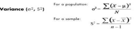
It is not expressed in units of data; it’s a measure of the actual variation. For example, if your curve has lots of dispersion and getting to that middle value is important to you, what you’d like to do is make your curve much tighter. The desirable outcome is to come up with a lower level dispersion across the variation of your data. Standard deviation is a measure of dispersion from the mean. Variance is an expression of how much that value is different from the mean, how that’s expressed, and how many sigma values it might stray from that mean over time. There are two types of variance – explained variance measures the proportion of your model and what part of that can be accounted for in the dispersion of the data from a given dataset and unexplained variance breaks that down into two major parts – random variance, which tends to wash out with the aggregation of data, and unidentified or systemic variance, which can definitely introduce bias into your conclusions.
- Standard deviation (σ) – The standard deviation is defined as the positive square root of the variance and is a measure of variability expressed in the same units as the data. The standard deviation is very much like a mean or an “average” of these deviations. In a normal (symmetric and mound-shaped) distribution, about two-thirds of the scores fall between +1 and -1 standard deviations from the mean and the standard deviation is approximately 1/4 of the range in small samples (N < 30) and 1/5 to 1/6 of the range in large samples (N > 100).
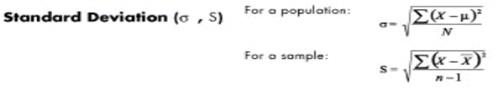
In Six Sigma, the empirical rule for standard deviation, is the 68-95-99.7% rule. The empirical rule says that if a population of statistical data has a normal distribution with a population mean and a sensible standard deviation, 68% of the data you’re going to find is going to fall within about one standard deviation from your mean about and 95% of your data is going to be found within two standard deviations from your mean and at about three standard deviations, you’re going to find 99.74% of your data; all the data is going to fall between about three sigmas from a nominal value.
Standard deviation is used only to measure dispersion around the mean and it will always be expressed as a positive value. The reason for that is that it’s a measure of variation. So you express it as a positive value even though on a normal distribution graph you could have -1 sigma or -2 sigma to help show the dispersion around the mean value. Standard deviation is also highly sensitive to outliers. If you have significant outliers way out to the left or way out to the right of three standard deviations, that can give you some real headaches in understanding the data. Having a greater data spread also means that you’ll have a higher standard deviation value.
- Coefficient of variation (cv) – Measures of variability can not be compared like the standard deviation of the production of bolts to the availability of parts. If the standard deviation for bolt production is 5 and for availability of parts is 7 for a given time frame, it cannot be concluded that the standard deviation of the availability of parts is greater than that of the production of bolts thus, variability is greater with the parts. Hence, a relative measure called the coefficient of variation is used. The coefficient of variation is the ratio of the standard deviation to the mean. It is cv = σ / µ for a population and cv = s/ for a sample.
Measures of Shape
For distributions summarizing data from continuous measurement scales, statistics can be used to describe how the distribution rises and drops.
- Symmetric – Distributions that have the same shape on both sides of the center are called symmetric and those with only one peak are referred to as a normal distribution.
- Skewness – It refers to the degree of asymmetry in a distribution. Asymmetry often reflects extreme scores in a distribution. Positively skewed is when it has a tail extending out to the right (larger numbers) so, the mean is greater than the median and the mean is sensitive to each score in the distribution and is subject to large shifts when the sample is small and contains extreme scores. Negatively skewed has an extended tail pointing to the left (smaller numbers) and reflects bunching of numbers in the upper part of the distribution with fewer scores at the lower end of the measurement scale.
Measures of Association
It provides information about the relatedness between variables so as to help estimate the existence of a relationship between variables and it’s strength. They are
- Covariance – It shows how the variable y reacts to a variation of the variable x. Its formula is for a population cov( X, Y ) = ∑( xi − µx) (yi − µy) / N
- Correlation coefficient (r) – It is a number that ranges between −1 and +1. The sign of r will be the same as the sign of the covariance. When r equals−1, then it is a perfect negative relationship between the variations of the x and y thus, increase in x will lead to a proportional decrease in y. Similarly when r equals +1, then it is a positive relationship or the changes in x and the changes in y are in the same direction and in the same proportion. If r is zero, there is no relation between the variations of both. Any other value of r determines the relationship as per how r is close to −1, 0, or +1. The formula for the correlation coefficient for population is ρ = Cov( X, Y ) /σx σy
- Coefficient of determination (r2) – It measures the proportion of changes of the dependent variable y as explained by the independent variable x. It is the square of the correlation coefficient r thus, is always positive with values between zero and one. If it is zero, the variations of y are not explained by the variations of x but if it one, the changes in y are explained fully by the changes in x but other values of r are explained according to closeness to zero or one.
Frequency Distributions
A distribution is the amount of potential variation in the outputs of a process, usually expressed by its shape, mean or variance. A frequency distribution graphically summarizes and displays the distribution of a process data set. The shape is visualized against how closely it resembles the bell curve shape or if it is flatter or skewed to the right or left. The frequency distribution’s centrality shows the degree to which the data center on a specific value and the amount of variation in range or variance from the center.
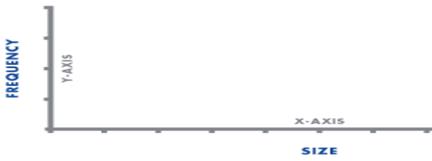
A frequency distribution groups data into certain categories, each category representing a subset of the total range of the data population or sample. Frequency distributions are usually displayed in a histogram. Size is shown on the horizontal axis (x-axis) and the frequency of each size is shown on the vertical axis (y-axis) as a bar graph. The length of the bars is proportional to the relative frequencies of the data falling into each category, and the width is the range of the category. It is used to ascertain information about data like distribution type of the data.
It is developed by segmenting the range of the data into equal sized bars or segments groups then computing and labeling the frequency vertical axis with the number of counts for each bar and labeling the horizontal axis with the range of the response variable. Finally, determining the number of data points that reside within each bar and construct the histogram.
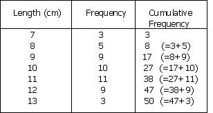
Cumulative Frequency Distribution
It is created from a frequency distribution by adding an additional column to the table called cumulative frequency thus, for each value, the cumulative frequency for that value is the frequency up to and including the frequency for that value. It shows the number of data at or below a particular variable
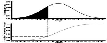
The cumulative distribution function, F(x), denotes the area beneath the probability density function to the left of x.
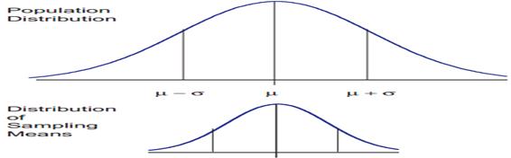
Central limit theorem and sampling distribution of the mean
The central limit theorem is the basis of many statistical procedures. The theorem states that for sufficiently large sample sizes ( n ≥ 30), regardless of the shape of the population distribution, if samples of size n are randomly drawn from a population that has a mean µ and a standard deviation σ , the samples’ means X are approximately normally distributed. If the populations are normally distributed, the sample’s means are normally distributed regardless of the sample sizes. Hence, for sufficiently large populations, the normal distribution can be used to analyze samples drawn from populations that are not normally distributed, or whose distribution characteristics are unknown. The theorem states that this distribution of sample means will have the same mean as the original distribution, the variability will be smaller than the original distribution, and it will tend to be normally distributed.
The basic tenants of the central limit theorem revolve around the sampling of distribution and the mean approaches of a normal distribution, as the sample size number increases over time. Now consider the effect of increasing the sample size and what that does to the shape of the data.
An example shows that you have 100 samples and if you take that and you do the calculations, it gives you a curve. If you increase you sample size to 500, the arc of the curve becomes higher and steeper. When you increase the sample size to 1000, you see this theory of large numbers or the central limit theorem coming into play and the arc of the curve becomes even higher and steeper. This gives you what you expected as the sample size gets larger.
When means are used as estimators to make inferences about a population’s parameters and n ≥ 30, the estimator will be approximately normally distributed in repeated sampling. The mean and standard deviation of that sampling distribution are given as µx = µ and σx = σ/√n. The theorem is applicable for controlled or predictable processes. Most points on the chart tend to be near the average with the curve’s shape is like bell-shaped and the sides tend to be symmetrical. Using ± 3 sigma control limits, the central limit theorem is the basis of the prediction as, if the process has not changed, a sample mean falls outside the control limits an average of only 0.27% of the time. The theorem enables the use of smaller sample averages to evaluate any process because distributions of sample means tend to form a normal distribution.
Confidence Interval
You use confidence intervals to determine, at different levels of confidence, what that given interval estimate is for the population. It’s a test of whether a parameter is true, calculated from the observations. What you want to do is understand what’s going on.
For example, in a symmetrical bell curve, the measurement is expected to fall between the range of 9.1 and 9.3. So what you want to know is how reliably can you expect the value to fall within the range at 95% confidence factor? To test that, you would want to be able to look at the confidence interval and know, working off the mean, what you are getting with this particular process.
Statistical and hypothesis testing
Statistical and hypothesis testing is an assumption about the population parameter. This assumption may or may not be true. Hypothesis testing refers to the formal procedures that you use to accept or reject statistical hypotheses. The best way to determine whether the statistical hypothesis is true would be to examine the entire population, but that’s usually impractical. So typically you’re going to examine a random sample from the population and find out if that data is consistent with your statistical hypothesis. If it’s not, you can reject it.
There are two types of hypothesis that you can draw – a null hypothesis or an alternative hypothesis:
- a null hypothesis is denoted by the capital letter H with the subscript zero, and usually indicates that the sample observations resulted as expected purely by chance
- an alternative hypothesis is denoted by the capital letter H with the subscript a, and indicates that the samples are influenced by some other random cause
For example, suppose you wanted to determine whether a coin flip was fair and perfectly balanced. A null hypothesis might be that half of the flips would result in heads and half of the flips in tails. Then suppose you actually flip the coin 50 times with a result of 40 heads and just 10 tails. Given this result, you’d be inclined to reject the null hypothesis. You’d conclude, based on the evidence, that the coin flip is probably not fair and evenly balanced.
Control charts
Control charts are one of the more important tools that you use in measuring and providing feedback to organizations and are loaded with lots of great information that you can leverage. Just like a run chart, you’re looking for trends in the data, such as average trending upward, trending downwards, or signals of big problems with your process.
For example, the y-axis on a graph shows values that range from 1 to 12, and on the x-axis, the values range from 0 to 20, typically showing time in days, weeks, or seconds, depending on the process. You have an upper control limit (UCL) and a lower control limit (LCL). These are the levels at which you will be exceeding the design parameters you’re looking for. In this example, the UCL is set at the value 9 on the y-axis and runs parallel to the x-axis. The LCL is set at the value 3 on the y-axis and runs parallel to the x-axis.
A control chart can show the value of a measured variable over time. It’s important that you watch the chart to ensure the plotted values don’t move above the UCL or below the LCL. This would trigger actions to re-measure or re-evaluate your process and trigger root cause analysis.
At a level above the UCL, you’d reject or scrap the part and at a level below the LCL, you would rework, fix, or scrap the part. You want to see that you stay between these two limits. There is also a target, or center line, which is set at the value 6 on the y-axis in this example and runs parallel to the x-axis. In this example, 20 points are plotted, two are above the UCL and two are below the LCL.
Basic Probability
Basic probability concepts and terminology is discussed below
- Probability – It is the chance that something will occur. It is expressed as a decimal fraction or a percentage. It is the ratio of the chances favoring an event to the total number of chances for and against the event. The probability of getting 4 with a rolling of dice, is 1 (count of 4 in a dice) / 6 = .01667. Probability then can be the number of successes divided by the total number of possible occurrences. Pr(A) is the probability of event A. The probability of any event (E) varies between 0 (no probability) and 1 (perfect probability).
- Sample Space – It is the set of possible outcomes of an experiment or the set of conditions. The sample space is often denoted by the capital letter S. Sample space outcomes are denoted using lower-case letters (a, b, c . . .) or the actual values like for a dice, S={1,2,3,4,5,6}
- Event – An event is a subset of a sample space. It is denoted by a capital letter such as A, B, C, etc. Events have outcomes, which are denoted by lower-case letters (a, b, c . . .) or the actual values if given like in rolling of dice, S={1,2,3,4,5,6}, then for event A if rolled dice shows 5 so, A ={5}. The sum of the probabilities of all possible events (multiple E’s) in total sample space (S) is equal to 1.
- Independent Events – Each event is not affected by any other events for example tossing a coin three times and it comes up “Heads” each time, the chance that the next toss will also be a “Head” is still 1/2 as every toss is independent of earlier one.
- Dependent Events – They are the events which are affected by previous events like drawing 2 Cards from a deck will reduce the population for second card and hence, it’s probability as after taking one card from the deck there are less cards available as the probability of getting a King, for the 1st time is 4 out of 52 but for the 2nd time is 3 out of 51.
- Simple Events – An event that cannot be decomposed is a simple event (E). The set of all sample points for an experiment is called the sample space (S).
- Compound Events – Compound events are formed by a composition of two or more events. The two most important probability theorems are the additive and multiplicative laws.
- Union of events – The union of two events is that event consisting of all outcomes contained in either of the two events. The union is denoted by the symbol U placed between the letters indicating the two events like for event A={1,2} and event B={2,3} i.e. outcome of event A can be either 1 or 2 and of event B is 2 or 3 then, AUB = {1,2}
- Intersection of events – The intersection of two events is that event consisting of all outcomes that the two events have in common. The intersection of two events can also be referred to as the joint occurrence of events. The intersection is denoted by the symbol ∩ placed between the letters indicating the two events like for event A={1,2} and event B={2,3} then, A∩B = {2}
- Complement – The complement of an event is the set of outcomes in the sample space that are not in the event itself. The complement is shown by the symbol ` placed after the letter indicating the event like for event A={1,2} and Sample space S={1,2,3,4,5,6} then A`={3,4,5,6}
- Mutually Exclusive – Mutually exclusive events have no outcomes in common like the intersection of an event and its complement contains no outcomes or it is an empty set, Ø for example if A={1,2} and B={3,4} and A ∩ B= Ø.
- Equally Likely Outcomes – When a sample space consists of N possible outcomes, all equally likely to occur, then the probability of each outcome is 1/N like the sample space of all the possible outcomes in rolling a die is S = {1, 2, 3, 4, 5, 6}, all equally likely, each outcome has a probability of 1/6 of occurring but, the probability of getting a 3, 4, or 6 is 3/6 = 0.5.
- Probabilities for Independent Events or multiplication rule – Independent events occurrence does not depend on other events of sample space then the probability of two events A and B occurring both is P(A ∩ B) = P(A) x P(B) and similarly for many events the independence rule is extended as P(A∩B∩C∩. . .) = P(A) x P(B) x P(C) . . . This rule is also called as the multiplication rule. For example the probability of getting three times 6 in rolling a dice is 1/6 x 1/6 x 1/6 = 0.00463
- Probabilities for Mutually Exclusive Events or Addition Rule – Mutually exclusive events do not occur at the same time or in the same sample space and do not have any outcomes in common. Thus, for two mutually exclusive events, A and B, the event A∩B = Ø, and the probability of events A and B occurring is zero, as P(A∩B) = 0, for events A and B, the probabilities of either or both of the events occurring is P(AUB) = P(A) + P(B) – P(A∩B) also called as addition rule.For example let P(A) = 0.2, P(B) = 0.4, and P(A∩B) = 0.5, then P(AUB) = P(A) + P(B) – P(A∩B) = 0.2 + 0.4 – 0.5 = 0.1
Conditional probability – It is the result of an event depending on the sample space or another event. The conditional probability of an event (the probability of event A occurring given that event B has already occurred) can be found as
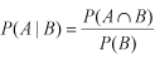
For example in sample set of 100 items received from supplier1 (total supplied= 60 items and reject items = 4) and supplier 2(40 items), event A is the rejected item and B be the event if item from supplier1. Then, probability of reject item from supplier1 is – P(A|B) = P(A∩B)/ P(B), P(A∩B) = 4/100 and P(B) = 60/100 = 1/15.
