Various tools and techniques
Let’s discuss the various tools and techniques.
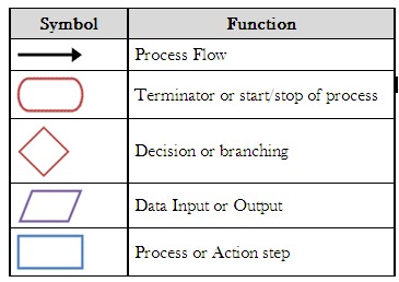
Flowchart
- Flowcharting can be a helpful tool for outlining the steps. Moreover, after finishing it, be sure to obtain consensus from the group. Above all, use of Flowchart is for developing process maps.
- Moreover, a process map is a graphical representation of a process that displays the sequence of tasks using flowcharting symbols.
- And, flowchart includes symbols that ANSI provides. The common symbols are,
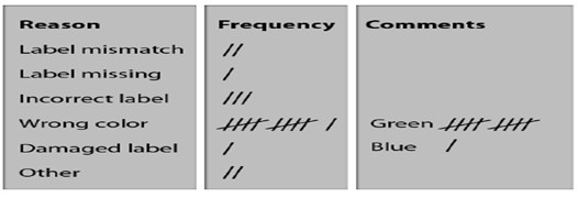
Check Sheets
- They consist of lists of items and are an indicator of how often each item on the list occurs. It is also known as confirmation check sheets.
- Moreover, it is a simple tool for process improvement and problem-solving that can also highlight items during data collection.
- Check Sheets is of two types,
1.Location or concentration diagram
- In it the marking is done on a diagram like before submitting car to a service center, a car diagram is used to list defects at present by marking and writing on the diagram.
2.Graphical or Distribution check sheet –
- It is for collecting frequency by marking to visualize the distribution of the data as shown in the diagram below,
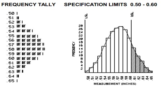
Histograms
- The histogram shows frequencies in data as adjacent rectangles, erected over intervals with an area proportional to the frequency of the observations in the interval.
- Above all, its identification is by the number of data points that fall within a given bar or interval or frequency. And, enables the user to visualize how the data points spread, skew and detect the presence of outliers.
- The construction of a histogram starts with the division of a frequency distribution into equal classes, and then each class is represented by a vertical bar. Below you can see the diagram,
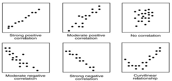
Scatter diagrams
- Scatter diagram displays multiple XY coordinate data points representing the relationship between two different variables on the X and Y-axis. It is also known as a correlation chart.
- Moreover, it depicts the relationship strength between an independent variable on the vertical axis and a dependent variable on the horizontal axis.
- And, the relationship may show a correlation between the two variables. However, correlation does not always refer to a cause and effect relationship.
- Moreover, the correlation may be positive if both variables are moving in the same direction. But, for negative correlation both, move in opposite directions.
Developing a Scatter Diagram
- Firstly, collecting data for both variables.
- Then, drawing a graph with the independent variable on the horizontal axis (x) and the dependent variable on the vertical axis (y).
- Lastly, for each pair of data, plot a dot (or symbol) where the x-axis value intersects the y-axis value.
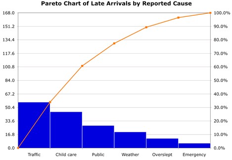
Pareto analysis
- This is a type of bar chart in which the horizontal axis represents categories which are usually defects or errors. And, the height of the bars can represent a count or percent of errors/defects.
- Moreover, by arranging the bars from largest to smallest, a Pareto chart determines focusing on which categories will yield the biggest gains and which are only minor contributors to the problem.
- In other words, it is the process of ranking opportunities to determine which of many potential opportunities should be taken first.
Pareto Chart Development
It involves the following steps,
- Firstly, collecting data on different types of problems.
- Tabulating the scores.
- Then, determining the counts or impact for each category.
- For small or infrequent problems, add them together into an “other” category
- After that, draw a vertical axis and divide it into increments equal to the total number.
- Then, draw the bars for each category, starting with the largest and working down.
- The “other” category always goes last even if it is not the shortest bar.
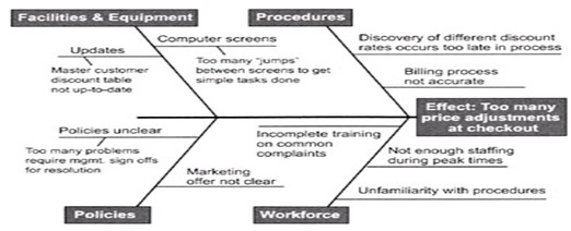
Cause and Effect Diagram
- This helps teams uncover potential root causes by providing structure to cause identification effort. And, it is also known as the Ishikawa diagram.
- Moreover, it helps in ensuring new ideas during brainstorming by not overlooking any major possible cause.
Developing Cause and Effect Diagram
It involves the following steps
- Name the problem or effect of interest. Be as specific as possible.
- Write the problem at the head of a fishbone “skeleton”
- Decide the major categories for causes and create the basic diagram on a flip chart or whiteboard.
- Typical categories include the manpower, machines, materials, methods, measurements and environment
- Brainstorm for more detailed causes and create the diagram either by working through each category or open brainstorming for any new input.
- Write suggestions onto self-stick notes and arrange in the fishbone format, placing each idea under the appropriate categories.
- Review the diagram for completeness.
- Eliminate causes that do not apply
- Brainstorm for more ideas in categories that contain fewer items
- Discuss the final diagram. Identify causes that are most critical for follow-up investigation.
CEDAC
- A variation on the cause and effect approach that many major corporations use across the world, is the cause and effect diagram with the addition of cards (CEDAC).
- Moreover, the effect side of a CEDAC chart quantifies a description of the problem, with a visual target and updates of the progress. And, the cause side of the CEDAC chart uses two different cards for writing facts and ideas. The basic diagram for CEDAC has a classic fishbone appearance.
Nominal Group Technique (NGT)
- The nominal group technique is a kind of brainstorming that encourages every participant to express his/her views. Moreover, this technique is for creating a rank list of ideas. And, it helps in decision-making and organizational planning where creative solutions are sought.
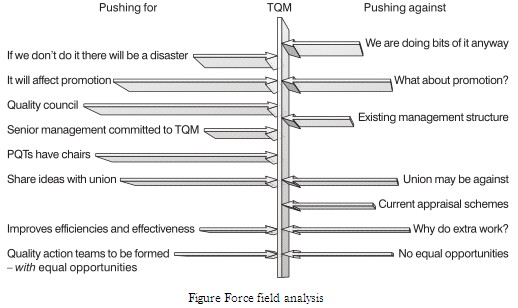
Force Field Analysis
- Force field analysis is a technique for identifying the forces that either obstruct or help a change that needs to be made.
- Moreover, it is similar to negative brainstorming and cause/effect analysis and helps to plan how to overcome the barriers to change or improvement.
- And, it may also provide a measure of the difficulty in achieving the change.
- The below figure shows a force field analysis by a senior management team considering the implementation of TQM in its organization.
Control charts
- These are the most powerful tools to analyze variation in most processes, either manufacturing or administrative.
- Moreover, these charts using variables data are line graphs that display a dynamic picture of process behavior.
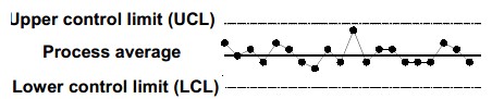
Control Charts various benefits
- Firstly, the addition of control limits facilitates the ability to detect special or assignable causes of variation.
- Displaying and comparing the current process to improve the process by identifying shifts in either average or variation and
- Moreover, every process varies within predictable limits, identifying assignable causes and addressing them will save money.
Types of control charts
Variable charts
- It came from variable data. And, Variable data contains more information than data that simply qualifies or counts something.
- Most importantly, variable charts are some of the most powerful tools in quality improvement. Various types of variable charts are,
- R Charts
- Run Charts
- M- MR Charts
- X – MR Charts.etc.
Attribute charts
- It uses attribute data. And, control charts on the basis of attribute data are generally less powerful and sometimes more difficult to interpret than variable charts.
- Moreover, samples are taken from lots of material where there is the counting of a number of defective units in the sample. Various types of attribute charts are,
- p Charts
- np Charts
- c Charts
- u Charts
Learn and improve your Tools and Techniques skills. Become a Certified TQM Professional Now!
