
Management and Planning Tools- We shall here discuss the various management and planning tools used are –
Flowchart
It is used to develop a process map. A process map is a graphical representation of a process which displays the sequence of tasks using flowcharting symbols.
The two most common types of boxes in a flowchart are,
- a processing step, usually called activity, and denoted as a rectangular box
- a decision, usually denoted as a diamond.
Management and Planning- A flowchart is described as “cross-functional” when the page is divided into different swimlanes describing the control of different organizational units. A symbol appearing in a particular “lane” is within the control of that organizational unit. This technique allows the author to locate the responsibility for performing an action or making a decision correctly, showing the responsibility of each organizational unit for different parts of a single process.
Various flowcharting symbols are as:
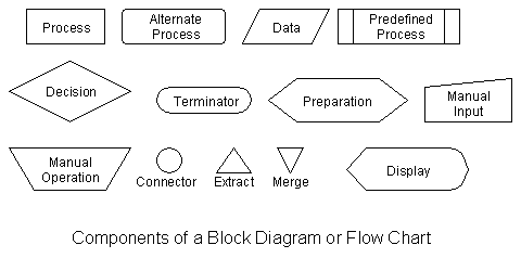
Start and end symbols
Represented as circles, ovals or rounded (fillet) rectangles, usually containing the word “Start” or “End”, or another phrase signaling the start or end of a process, such as “submit inquiry” or “receive product”.
Arrows
Showing “flow of control”. An arrow coming from one symbol and ending at another symbol represents that control passes to the symbol the arrow points to. The line for the arrow can be solid or dashed. The meaning of the arrow with dashed line may differ from one flowchart to another and can be defined in the legend.
Generic processing steps
Represented as rectangles. Examples: “Add 1 to X”; “replace identified part”; “save changes” or similar.
Subroutines
Represented as rectangles with double-struck vertical edges; these are used to show complex processing steps which may be detailed in a separate flowchart. Example: PROCESS-FILES. One subroutine may have multiple distinct entry points or exit flows (see coroutine); if so, these are shown as labeled ‘wells’ in the rectangle, and control arrows connect to these ‘wells’.
Input/Output
Represented as a parallelogram. Examples: Get X from the user; display X.
Prepare conditional
Represented as a hexagon. Shows operations which have no effect other than preparing a value for a subsequent conditional or decision step (see below).
Conditional or decision
Represented as a diamond (rhombus) showing where a decision is necessary, commonly a Yes/No question or True/False test. The conditional symbol is peculiar in that it has two arrows coming out of it, usually from the bottom point and right point, one corresponding to Yes or True, and one corresponding to No or False. (The arrows should always be labeled.) More than two arrows can be used, but this is normally a clear indicator that a complex decision is being taken, in which case it may need to be broken-down further or replaced with the “pre-defined process” symbol.
Junction symbol
Generally represented with a black blob, showing where multiple control flows converge in a single exit flow. A junction symbol will have more than one arrow coming into it, but only one going out.
In simple cases, one may simply have an arrow point to another arrow instead. These are useful to represent an iterative process (what in Computer Science is called a loop). A loop may, for example, consist of a connector where control first enters, processing steps, a conditional with one arrow exiting the loop, and one going back to the connector.
For additional clarity, wherever two lines accidentally cross in the drawing, one of them may be drawn with a small semicircle over the other, showing that no junction is intended.
Labeled connectors
Represented by an identifying label inside a circle. Labeled connectors are used in complex or multi-sheet diagrams to substitute for arrows. For each label, the “outflow” connector must always be unique, but there may be any number of “inflow” connectors. In this case, a junction in control flow is implied.
Concurrency symbol
Management and Planning- Represented by a double transverse line with any number of entry and exit arrows. These symbols are used whenever two or more control flows must operate simultaneously. The exit flows are activated concurrently when all of the entry flows have reached the concurrency symbol. A concurrency symbol with a single entry flow is a fork; one with a single exit flow is a join.
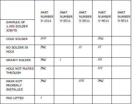
Check Sheets
They consist of lists of items and are indicator of how often each item on the list occurs. It is also called as confirmation check sheets.
Check sheets typically employ a heading that answers the Five Ws:
- Who filled out the check sheet
- What was collected (what each check represents, an identifying batch or lot number)
- Where the collection took place (facility, room, apparatus)
- When the collection took place (hour, shift, day of the week)
- Why the data were collected
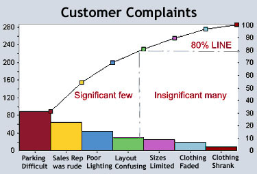
Pareto charts
It is a type of bar chart in which the horizontal axis represents categories which are usually defects, errors or sources (causes) of defects/errors.
The purpose of the Pareto chart is to highlight the most important among a (typically large) set of factors. In quality control, it often represents the most common sources of defects, the highest occurring type of defect, or the most frequent reasons for customer complaints, and so on. Wilkinson (2006) devised an algorithm for producing statistically based acceptance limits (similar to confidence intervals) for each bar in the Pareto chart.
These charts can be generated by simple spreadsheet programs, such as OpenOffice.org Calc and Microsoft Excel and specialized statistical software tools as well as online quality charts generators.
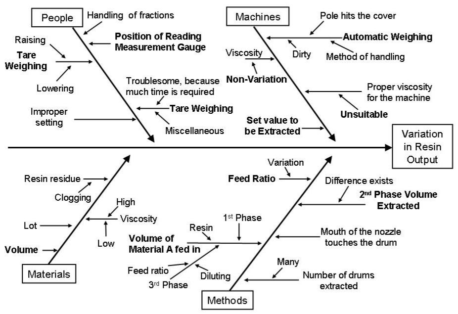
Cause and Effect Diagram
Management and Planning- It helps teams uncover potential root causes by providing structure to cause identification effort. It is also called as fishbone or Ishikawa diagram.
Common uses of the Ishikawa diagram are product design and quality defect prevention, to identify potential factors causing an overall effect. Each cause or reason for imperfection is a source of variation. Causes are usually grouped into major categories to identify these sources of variation.
Causes in the diagram are often categorized, such as to the 6 M’s, described below. Cause-and-effect diagrams can reveal key relationships among various variables, and the possible causes provide additional insight into process behavior.
Causes can be derived from brainstorming sessions. These groups can then be labeled as categories of the fishbone. They will typically be one of the traditional categories mentioned above but may be something unique to the application in a specific case. Causes can be traced back to root causes with the 5 Whys technique.
Typical categories are:
The 6 Ms (used in manufacturing industry)
- Machine (technology)
- Method (process)
- Material (Includes Raw Material, Consumables and Information.)
- Man Power (physical work)/Mind Power (brain work): Kaizens, Suggestions
- Measurement (Inspection)
- Milieu/Mother Nature (Environment)
Tree Diagram
They are also similar to cause and effect diagram but tree diagram break down problem progressively in detail by partitioning bigger problem into smaller ones.
The tree diagram is a tool used to analyze and visualize the structure of a problem, very similar to the cause and effect diagram. Each branch of the tree is supported by limbs, which explode and explain the branch in greater detail.
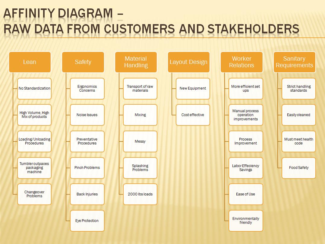
Affinity Diagram
Management and Planning- The word affinity means a ‘‘natural attraction’’ or kinship. The affinity diagram organizes ideas into meaningful categories by recognizing their underlying similarity.
The tool is commonly used within project management and allows large numbers of ideas stemming from brainstorming to be sorted into groups, based on their natural relationships, for review and analysis.
The affinity diagram organizes ideas with following steps:
- Record each idea on cards or notes.
- Look for ideas that seem to be related.
- Sort cards into groups until all cards have been used.
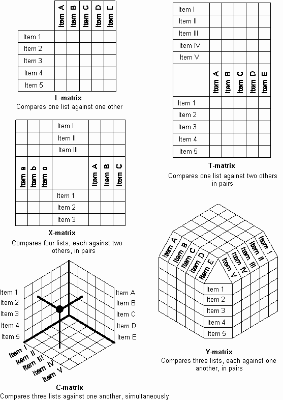
Matrix Diagram
It is also known as matrix or matrix chart as it uses a matrix to display information.
It shows the relationship between two, three or four groups of information. It also can give information about the relationship, such as its strength, the roles played by various individuals or measurements.
Six differently shaped matrices are possible: L, T, Y, X, C and roof–shaped, depending on how many groups must be compared.
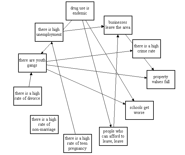
Interrelationship Digraph
Interrelationship digraphs helps in organizing disparate information, usually ideas generated during brainstorming sessions.
They show all the different relationships between factors, areas, or processes. They make it easy to pick out the factors in a situation which are the ones which are driving many of the other symptoms or factors.
Benchmarking
Benchmarks are measures (of quality, time, or cost) that have already been achieved by others.
Prioritization Matrix
It is used to prioritize is to arrange or deal with in order of importance. A prioritization matrix is a combination of a tree diagram and a matrix chart and used to help decision makers determine the order of importance of the activities.
It helps you in narrowing down the activities or projects by identifying a beneficial order of getting the most important things done first. It works on assignments and projects whose relative importance is not yet known. It is used in situations where you have access to limited resources like money, time, and people (employees).
Focus Group
They are facilitated discussion sessions of customers that help an organization understand the Voice of the Customer (VOC). Usually they are of 1-3 hour sessions with maximum 20 customers.
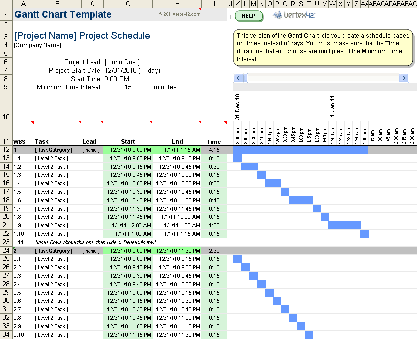
Gantt Chart
It is a graphical chart, showing the relationships amongst the project tasks, along with time constraints.
Gantt charts illustrate the start and finish dates of the terminal elements and summary elements of a project. Terminal elements and summary elements comprise the work breakdown structure of the project. Gantt charts also show the dependency (i.e. precedence network) relationships between activities.
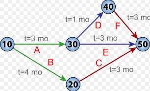
CPM/PERT Chart
CPM or “Critical Path Method” – It is a tool to analyze project and determine duration, based on identification of “critical path” through an activity network.
The program (or project) evaluation and review technique, commonly abbreviated PERT, is a statistical tool, used in project management, which was designed to analyze and represent the tasks involved in completing a given project.
The first step to scheduling the project is to determine the tasks that the project requires and the order in which they must be completed. The order may be easy to record for some tasks (e.g. When building a house, the land must be graded before the foundation can be laid) while difficult for others (There are two areas that need to be graded, but there are only enough bulldozers to do one). Additionally, the time estimates usually reflect the normal, non-rushed time. Many times, the time required to execute the task can be reduced for an additional cost or a reduction in the quality.
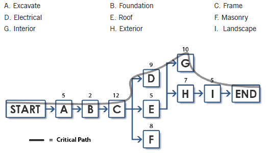
Activity Network Diagram
It charts the flow of activity between separate tasks and graphically displays interdependent relationships between groups, steps, and tasks as they all impact a project.
It is a diagram of project activities that shows the sequential relationships of activities using arrows and nodes.
Take Free Mock Test on Six Sigma Green Belt
Apply for Certification Exam !!
Certified Six Sigma Green Belt Professional
Become Vskills Certified Six Green Belts Professional. Gain knowledge on the module “Management and Planning”. Try the free practice test!