Flowchart
It is used to develop a process map. A process map is a graphical representation of a process which displays the sequence of tasks using flowcharting symbols.
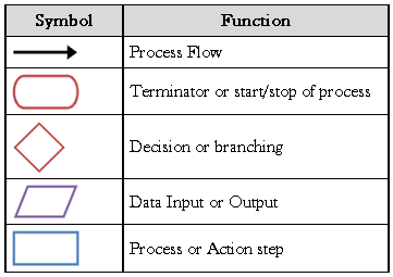
It shows the inputs, actions and outputs of a given system. Inputs are the factors of production like land, materials, labor, equipment, and management. Actions are the way in which the inputs are processed and value is added to the product like procedures, handling, storage, transportation, and processing. Outputs are the finished good or delivered service given to the customer but, output also includes un-planned and undesirable entities like scrap, rework, pollution, etc. Flowchart symbols are standardized by ANSI and common symbols used are
The flowchart shows a high-level view of a process view and it’s capability analysis. The flow chart can be made either more complex or less complex.
In the practice of DMAIC – Define, Measure, Analyze, Improve, and Control – you will often find that a flowchart is helpful in the Define, Measure, and the Analyze steps in the process. Flowcharts and process mapping are used to depict the flow of activity in a process.
Process maps and flowcharts are often used interchangeably, although they are not exactly the same thing. A flowchart is the diagram itself, while process mapping involves the flowchart being used to map a process in order to identify the waste, and the non-value-added activities in a process.
Check Sheets
They consist of lists of items and are indicator of how often each item on the list occurs. It is also called as confirmation check sheets. They are used for data collection process easier by pre-written descriptions of events likely to occur like ‘‘Have all inspections been performed?’’ ‘‘How often does a particular problem occur?’’ ‘‘Are problems more common with part X than with part Y?’’
It is a simple tool for process improvement and problem solving. It can also highlight items of importance during data collection. They are an effective tool for quality improvement when used with histograms and Pareto analysis. It is not a check list which is used to ensure that all important steps or actions have been taken but check sheet is a tally sheet to collect data on frequency of occurrence of defects or errors.
A check sheet is also knows as a tally sheet. It’s a data collection form that is set up to allow subject matter experts to assist in capturing data about processes. Check sheets are used to capture data quickly and easily with everybody’s help in the process. These charts are typically used to look for things like defects found in a manufacturing organization or the frequency of a particular problem that occurs in a process. There is no experience, and very little training needed for the involved parties to be able to use a check sheet in order to gather the data. It is an effective technique for getting a simple analysis quickly about faults in processes and assisting in gather the data needed for creating a Pareto chart.
It is of two types
- Location or concentration diagram – In it the marking is done on a diagram like before submitting car to service center, a car diagram is used to list defects at present by marking and writing on the diagram. Online application forms highlight errors before submission by highlighting the error section, is also an example of this type.
- Basic check sheet – Lists the different defects and the number of times each instance occurs. For example, these can be given to employees on the floor when a manufacturing operation is taking place. An operator can record each time there is a problem by ticking off the relevant check box. Using this method would allow the quality control team to recognize how often each fault occurs, and address the contributing factors.
- Traveler check sheets – These are a powerful method when attached to a particular order or going through the system step in the process to capture how many defects are found.
- Location check sheet – An image is drawn up of the whole process and then used to identify the problems in the process. This is also called a measles chart because the operators make small red marks on this chart where they find problems. During the time period that data is being captured, they will have an instantaneous view of where are the problems are. This very powerful and visual tool that allows a team to zero in on where efforts need to be focused first.
- Confirmation check sheet – This is a real simple method to understand what the steps are that should be done properly in the sequence. This ensures the process is executed accurately the first time. This could also be used for things like gathering issues that customers have on an inbound call, or maybe filling out an order in an order entry function to ensure that everything is right and all the accurate questions have been asked for the entire process.
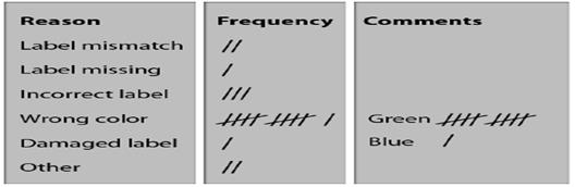
- Graphical or Distribution check sheet – It is commonly used for collecting frequency by marking to visualize the distribution of the data as shown in diagram below
Pareto charts
A Pareto chart is a bar chart that has its basis in the Vilfredo Pareto principle. This was built around the idea that only a finite number of the world’s population controls the wealth. The principle has been expanded upon over time to form a true reflection of the “vital few.” The Pareto principle, or the 80/20 principle, argues that on average 20% of the defect causes are actually 80% of the opportunity in any process improvement effort.
It is a type of bar chart in which the horizontal axis represents categories which are usually defects, errors or sources (causes) of defects/errors. The height of the bars can represent a count or percent of errors/defects or their impact in terms of delays, rework, cost, etc.
By arranging the bars from largest to smallest, a Pareto chart determines focusing on which categories will yield the biggest gains if addressed, and which are only minor contributors to the problem. It is the process of ranking opportunities to determine which of many potential opportunities should be pursued first. It is used at various stages in a quality improvement program to determine which step to take next.
The Pareto chart helps to identify the vital few sources of defects, and the mistakes that need to be addressed. The chart is also very useful in analyzing non-numerical data as it allows you to isolate those critical few where you can get the biggest bang for your buck in improvement efforts. When defining project scope, it’s very important that we zero in on the vital few as there is often little time and money to make changes. You use a Pareto chart when variables can be categorized, allowing you to put them into groupings like the sources of defects, or mistakes made by people in a process.
The purpose of the chart is to prioritize problems, assess system changes, and it is a reference of how the current process is performing. Looking at how a process is performing is a very important aspect of Pareto charts. It allows you to take a current state snapshot of how the process is performing and make improvements, then later go back and check the data, re-examine the Pareto chart, and see what changed. This way, you can ensure things got better and that you are doing the right things. Pareto charts are used for assessing the frequency of problems and examining particular items within a broad analysis.
Part of identifying the causes and frequencies of defects involves listing the causes of defects in descending order and then recording the number of defects in order to find the total. To list those causes of defects in descending order, you would categorize the problems and count the frequency of defects in each category. The category with the most defects would be listed as number one, and so on. Once all the categories are listed, the total number of defects can be added. From there, you can find the sum of the defects by dividing the number of defect for each cause by the total.
Pareto Chart Development
It involves the following steps
- Collect data on different types or categories of problems.
- Tabulate the scores.
- Determine the total number of problems observed and/or the total impact. Also determine the counts or impact for each category.
- For small or infrequent problems, add them together into an “other” category
- Sort the problems by frequency or by level of impact.
- Draw a vertical axis and divide into increments equal to the total number observed. Do not make the vertical axis as tall as the tallest bar, which can overemphasize the importance of the tall bars and lead to false conclusions
- Draw bars for each category, starting with the largest and working down.
- The “other” category always goes last even if it is not the shortest bar
Example
In an example of how to calculate the percentage of defects, cause 1 has 50 defects and is divided into the total sum of defects, which is 90. This equals 0.56 or 56%. Cause 2 has 30 defects, which when divided by the total of 90, gives you 0.33 or 33%. Cause 3 has 10 defects, and when you divide that by 90, you get .11 or 11%. You know you did it right when the percentages add up to 100%.
You can then use this information in a Pareto chart. The axes and numeric score are created first. On the left hand side, the number of quantities is listed in numeric order. On the x-axis is the list of defect categories. Next, the bars are be added to the relevant categories to demonstrate the number of defects visually. Another y-axis is added on the right of the x-axis to represent the percentage. Then data points are added to the chart, according to cumulative percentages. To complete the chart, a cumulative percentage must be added and follow along the data points. The chart represents the data in a visual form, as it is being developed.
Pareto principle
The fixed-percent method refers to using the Pareto principle for finding the vital few. The principle, also called the 80/20 principle, states that 20% of the causes combined are likely 80% of the challenge that one needs to address and focus on for continuous improvement. This technique is the most accurate if you have valid data.
Cumulative frequency
The change-in-slope method uses a bar chart with a cumulative frequency line, and generally all causes to the left of the line break are the vital few. You have all the causes organized to the left side of the chart with the plotted values in your trend line where you are coming up with that accumulated to the 100%. Then you look at where that slope breaks. In other words, the slope is very steep, it’s going up very, very quickly and then it breaks and starts to flatten out. This is a very visual technique and it allows you to see where you need to be spending your time and money on improvement projects to attack the root causes.
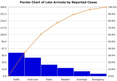
In an example chart representing damage errors, there are the numbers 0-40 on the y-axis and a list of defects on the x-axis. The percentage that each defect contributes is represented by descending bars. The highest contributing factor of defects is due to damage during shipping, and second to that is a result of to damage during packing. Together these factors make up just short of 80% of the causes of defects, which means that they are the vital few. It is represented by the cumulative line that follows the data points.
Cause and Effect Diagram
Cause and effect, or fishbone, diagrams were developed by Kaoru Ishikawa when he was working in the shipyards in Japan before and during World War II. Later Dr. D. Edwards Deming was an associate of Mr. Ishikawa and actually taught this as part of the widespread practice of quality in Japan after World War II. So the cause and effect diagram, or Ishikawa diagram, is very helpful to you in the DMAIC problem-solving cycle by helping you with defining, and understanding what the measure is and then later with analysis of what you were running up against in a project or process.
It helps teams uncover potential root causes by providing structure to cause identification effort. It is also called as fishbone or Ishikawa diagram. It helps in ensuring new ideas being generated during brainstorming by not overlooking any major possible cause. It should be used for cause identification after clearly defining the problem. It is also useful as a cause—prevention tool by brainstorming ways to maintain or prevent future problems.
Developing Cause and Effect Diagram
It involves the following steps
- Name the problem or effect of interest. Be as specific as possible.
- Write the problem at the head of a fishbone “skeleton”
- Decide the major categories for causes and create the basic diagram on a flip chart or whiteboard.
- Typical categories include the manpower, machines, materials, methods, measurements and environment
- Brainstorm for more detailed causes and create the diagram either by working through each category or open brainstorming for any new input.
- Write suggestions onto self-stick notes and arrange in the fishbone format, placing each idea under the appropriate categories.
- Review the diagram for completeness.
- Eliminate causes that do not apply
- Brainstorm for more ideas in categories that contain fewer items
- Discuss the final diagram. Identify causes which are most critical for follow-up investigation.
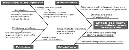
For example, say you are doing a technical support call and you are doing password resets, then you may want to create categories. Maybe you would have a cause and effect diagram depicted – why you failed to do a password reset correctly. Perhaps it has something to do with the knowledge base. Maybe it’s the information the customer is giving you on the call, maybe it’s your technician taking the call, or maybe it’s the software version you are dealing with. The major causes that you are dealing with that can create headaches for you later in the process. The remaining steps are fairly straightforward.
What you need to do is get at, and really understand, what the key factors that come into play are. So under each of these major cause buckets, which might line up with man, method, material, mother nature, the measurement, and certainly the materials that you are using as inputs to the processes – in the case of manufacturing – and really get at and understand these key factors. These key factors could involve a lot of additional work. In other words, you would now want to brainstorm down and write down what are the major factors for each of these causes.
Key Factors
Identify and understand the key factors of each causal link. Under each of these major cause buckets, the key factors will help to formulate and visualize a solution to one or more causes. These key factors could involve a lot of additional work, and could include brainstorming and writing down many major factors for each of these causes. At this point you may need to analyze further into the causes, and take a causal factor analysis of the main elements. Examine each aspect of the diagram, and ensure everything is being properly captured. In some situations, it may be appropriate to have one or more sub-factors underneath major factors. Once all the information is gathered and represented, a team can efficiently analyze the diagram.
Effective cause and effect diagrams assist in reaching an agreement about problem statement. Disagreement may indicate that the problem is more complex, and that each cause should be fully explored and broken down to find the root.
Control Impact Matrix
This is a prioritization tool that is used in conjunction with the Cause and Effect (C&E) tool typically after the causes have been captured using C&E. Prioritization is done based on factors (causes) that are in your control and the impact (extent) of the factor on the problem or the effect.
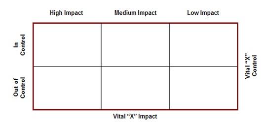
We generate the factors/causes using the C&E (Cause and Effect) matrix. Followed by verification of this qualitative assessment of the factors/causes by seeking data, which can then be prioritized using the control impact matrix or Pareto analysis. But are these the root causes? Or do we need to drill down further?
Tree Diagram
They are also similar to cause and effect diagram but tree diagram break down problem progressively in detail by partitioning bigger problem into smaller ones. This partitioning brings a level when the problem seems easy to solve. It is made by starting from right and going towards the left. It is used by quality improvement programs. Sometimes goals are placed on left and resources on right and then both are linked to for achievement of goal.
It starts with single entity which branches into two or more, each of which branch into two or more, and so on. It looks like a tree, with trunk and multiple branches. It is used for known issues whose specific details are to be addressed for achieving an objective. It also assists in listing other solution, detailing processes and probing the root cause of a problem. It is also known as systematic diagram or tree analysis or analytical tree or hierarchy diagram.
There are various types of tree structures. An example is the convergent chain or convergent structure. In this arrangement, the chart appears the other way around. Instead of starting with a large task and breaking it down into smaller pieces, the smaller pieces all build together until one major task is created. This could also look much like a bill of materials.
To create a tree diagram, you begin by defining the process and breaking down the details. Then you continue by defining the criteria for determining when the lowest item has actually been reached or the lowest level in this process has been reached.
Affinity Diagram
The word affinity means a ‘‘natural attraction’’ or kinship. The affinity diagram organizes ideas into meaningful categories by recognizing their underlying similarity. It reduces data by organizing large inputs into a smaller number of major dimensions, constructs or categories. It organizes facts, opinions and issues into natural groups to help diagnose a complex situation or find themes.
It helps to organize a lot of ideas and identify central themes in them. It is useful when information about a problem is not well organized and solution beyond traditional thinking is needed. It organizes ideas from a brainstorming session in any phase of DMAIC and can find themes and messages in customer statements gleaned from interviews, surveys, or focus groups.
The activity of creating an affinity diagram typically takes place at the end of any idea generation exercise, for example a brainstorming session or a focus group. Perhaps you have suggestions from people that you want to organize logically. The basic structure of the affinity diagram is to put forth the problem statement. Then you create column headers for any logical groupings of ideas that you can find. Finally, you list each idea in its appropriate column.
Affinity diagrams can be used throughout the entire DMAIC process. During a complex Lean Six Sigma project, you could be generating waves of brainstorming many times. This means that affinity diagramming will be used very often.
Developing Affinity Diagram
- Gather inputs from brainstorming session or customer feedbacks.
- Write each input on cards and place them randomly.
- Allow people to silently start grouping the cards.
- When the clustering is done, create a “header” label (on a note or card) for each group.
- Write the theme on a larger self-stick note or card (the “Header”) and place it at top of cluster.
- Continue until all clusters are labeled
- Complete the diagram and discuss the results.
Matrix Diagram
It is also known as matrix or matrix chart as it uses a matrix to display information. The matrix diagram displays relationship amongst two, three or four groups of information like the strength of relationship amongst the group, the roles played by various groups, etc. It helps in analyzing the correlations between groups of information. It enables systematic analysis of correlations. Six different matrix shaped diagram are possible: L, T, Y, X, C and roof–shaped, depending on how many groups must be compared.
Relationship amongst two groups of entities is done by an L–shaped matrix or roof shaped matrix. T–shaped, Y–shaped or C–shaped matrix are used to show relationship amongst three groups and four groups, X–shaped matrix is used. Various matrix types showing relationship is listed below
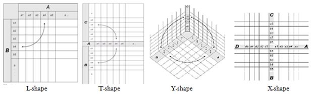
A T-shape matrix has the shape of a “T” that is laid on its side and is used to compare two groups of items to a third group of items. The Y-shape matrix has a “Y” shape and is used to get an idea of what’s going on with the customer requirements versus your internal matrix and departments. The C-shape matrix has a three dimensional shape and is used to compare three groups simultaneously.
Consider a simple matrix diagram that examines some issues with a transport company. You begin by making a list of all the actual problems, which are used as the rows in the matrix diagram. Then, you track affected orders by using the order numbers as the column headers. Wherever an issue affects a specific order, you make a checkmark in the intersecting cell. So at a glance you can begin to understand which factors have the biggest issue or impact on the stated problem. Then, if enough data has been generated, you can do a Pareto analysis to gain further insights.
There are various kinds of symbols that you can use in a matrix diagram. There are relationship, roles or responsibility, and rating scale symbols. The relationship symbols are a circle with a hole in the center to depict strong, a shaded circle to depict medium, a shaded triangle to depict weak, a plus sign for positive, a zero for neutral, and a minus sign for negative. The roles or responsibility symbols are an S for supplier, a C for customer, a D for doer, and an O for owner. The rating scale has the options least important, somewhat important, neutral, quite important, and most important. These options are numbered from 1 to 5, respectively.
Interrelationship Digraph
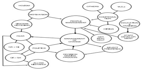
Interrelationship digraphs helps in organizing disparate information, usually ideas generated during brainstorming sessions. It defines the ways in which ideas influence one another instead of arranging ideas into groups as done by affinity diagrams.
Similar to affinity diagram, interrelationship digraphs are developed by writing down the ideas or information on paper like Post-it notes which are then placed on a large sheet of paper and arrows are drawn between related ideas. An idea that has arrows leaving it but none entering is a root idea. By evaluating the relationships between ideas the functioning is made clear and usually the root idea is the key to improving the system.
Benchmarking
Benchmarks are measures (of quality, time, or cost) that have already been achieved by others. It indicates about the level of possible goal so as to set goals for own operations. It is helpful for listing new ideas into the process though borrowed from others.
Usually the benchmarking data is sourced from surveys or interviews with industry experts, trade or professional organizations, published articles, company tours, prior experience of current staff or conversations.
Types of Benchmarks
- Internal/Company – It establishes a baseline for external benchmarking Identifies differences within the company and provides rapid and easy-to-adapt improvements though opportunities for improvement are limited to the company’s practices.
- Direct Competition – It prioritizes areas of improvement according to competition and is of interest to most companies but often involves a limited pool of participants thus, opportunities for improvement are limited to “known” competitive practices and may lead to potential antitrust issues.
- Industry – It provides industry trend information and is a conventional basis for quantitative and process-based comparison though opportunities for improvement may be limited by industry paradigms
- Best-in-Class – It examines multiple industries to provide the best opportunity for identifying radically innovative practices and processes by building a brand new perspective but, usually difficult to identify best-in-class companies and get them to participate.
Prioritization Matrix
It is used to prioritize is to arrange or deal with in order of importance. A prioritization matrix is a combination of a tree diagram and a matrix chart and used to help decision makers determine the order of importance of the activities. It narrows down options by systematically comparing choices through the selection, weighing, and application of criteria.
It quickly surfaces basic disagreements, forces the team to narrow down all solutions from all solutions to the best solutions, limits “hidden agendas” by bringing decision criteria to the forefront of a choice and increases follow-through by asking for consensus after each step of the process.
Developing a prioritization matrix – It involves five simple steps, as
- Determine criteria and rating scale – Determine the factors to assess the importance of each entity. Choose factors that will clearly differentiate important from unimportant which are the criteria like the value it brings to the customer, etc. Then, for each criteria, establish a rating scale to use in assessing how well a particular entity satisfies that criteria.
- Establish criteria weight – Place criteria in descending order of importance and assign a weight.
- Create the matrix – List criteria down the left column and the weight and names of potential entities across the top in an L-shaped matrix to judge the relative importance of each criterion.
- Work in teams to score entities – Review each entity and rate the entity on each of the criteria. Next, multiply the rating for each criterion by its weight and record the weighted value. After evaluating the entity against all of the criteria, add up the weighted values to determine the entity’s total score.
- Discuss results and prioritize list – After entities have been scored, undertake a discussion to compare notes on results and develop a master list of prioritized entities that everyone agrees upon.
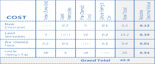
- An example of prioritization matrix where, 10 is much less expensive, 5 is less expensive, 1 is same cost, 0.2 is more expensive and 0.1 is much more expensive
Focus Group
They are facilitated discussion sessions of customers that help an organization understand the Voice of the Customer (VOC). Usually they are of 1-3 hour sessions with maximum 20 customers. It facilitates better understanding of the voice of customer and organizes the gathered data. It also enables evaluation of the feedbacks and channelizes them for further action..
Usually two types of focused groups are applied, first being the explorative focus group which explores the collective needs of customers, develop and evaluate concepts for new product development as sensed or demanded by the voice of the customer. The next, experiential focus group observes the usage of products in the market and study what the customers feel and experience about the products, learning their reasons and motivations to use the product.
Online focus groups have gained importance in recent times due to access to internet but, the discussion takes place on the internet instead of a interview site. Online focus groups are more suited for younger age groups.
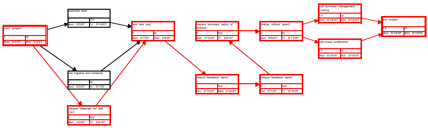
Gantt Chart
It is a graphical chart, showing the relationships amongst the project tasks, along with time constraints. The horizontal axis of a Gantt chart shows the units of time (days, weeks, months, etc.). The vertical axis shows the activities to be completed. Bars show the estimated start time and duration of the various activities. A Gantt chart shows what has to be done (the activities) and when (the schedule) as shown in the figure below
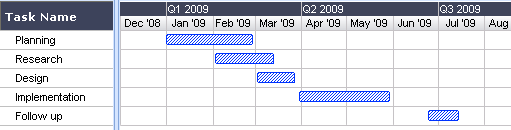
A Gantt chart consists of multiple rows and columns. Typically it includes columns for task ID number, task name, duration, and date. The rows list major tasks and sub-tasks, each of which is assigned its own ID number. Next, each task has a duration specified – which is how long the task should take to complete. In the date column, the start and end dates of the task are indicated. These are equivalent to the duration specified in the duration column for the task.
The Gantt chart is a very common tool used throughout a project for various purposes. It’s used for tracking progress and for controlling performance. The basic layout of a Gantt chart includes numbered rows. Each row is allocated to a major task or a sub task. Each task has a duration that’s specified, for example in hours, days, weeks, or months. The chart also has a date column – so at a specific date, you can check the progress of a task or the project itself.
As an example, a Gantt chart might include four columns – ID, Task name, Duration and Date – and multiple rows, each identifying a particular task. The Duration column specifies the duration of each task in number of days and the Date column contains a block for each task, shaded to show progress in completing the task. For example, a block that’s half-shaded indicates that the corresponding task is 50% completed. Lines link the tasks to show their relationships and dependencies, and a vertical status line is used to indicate the current date. This makes it easy to spot tasks that are behind where they should be.
To interpret a Gantt chart, you need to focus on four critical areas – resources (the actual people performing the tasks in minutes), durations, milestones and slack time. Diamonds usually reflect critical milestones in the project, for example a kickoff or a tollgate review. Squares on the Gantt chart indicate the beginning and end of the critical path and are linked to the milestones. Slack time on the chart is indicated with a horizontal line that extends from the actual end of a task to its allocated end time.
Milestone Charts
Gantt charts are often modified in a variety of ways to provide additional information. One common variation is milestone charts. The milestone symbol represents an event rather than an activity; it does not consume time or resources.
Tollgate Review
A tollgate review is a checkpoint process that determines if the goals and objectives at each stage in the DMAIC project have been met. So for example, before you move into the next phase, you would want to do a tollgate review, and then move into the next phase. This works as a sign-off for the next stage and it can be carried out at each step as you move forward. A tollgate review has four main components – an agenda, a presentation or report, a discussion, and sign-off.
The agenda for a typical tollgate review includes many different components. For example, you need to make it clear which phase the project is in. You also require the facts and the actions that have already been completed, and where you are with your conclusions and recommendations. These are the types of next steps you want the steering committee to approve. Next you will need to present the report, which is usually done by the team members.
Once the report has been presented, the sponsors and Black Belts may begin to ask you questions right then and there with your team. The discussion will be about the issues and whether the scope may need to be adjusted. Their observations about the deliverables will be made and any kind of evaluation they wish to give. The final step is the sign-off. If you get the sign-off it means that the outcome of that particular stage in the DMAIC cycle has been approved.
WBS
A work breakdown structure (WBS) is a tool used to detail how a project is broken down into smaller jobs. Its structure can be likened to that of an inverted tree diagram. The trick is to break the work down into the smallest increments so you can get down to assignable tasks.
The top level of the WBS is the project that you’re chartering. The next level of the structure is the major deliverables that you need to accomplish for a project to be successful. This level may also identify major phases in a project or its external sub-projects.
In turn, each major deliverable has tasks that should be completed to achieve the major deliverable. The tasks can also be further broken down into sub-tasks. Then from each sub-task, you can generate work packages, which are very specific tactical things that need to be done to accomplish the project’s objective. These are at the bottom.
A WBS breaks a project into manageable units which are “bite-size chunks” of work that can readily be delegated and that can be used to define responsibilities, timing, and so on. It also facilitates scheduling by identifying relationships and dependencies between the tasks. Done correctly, we can do backward scheduling, working from a given due date out in the future and backward to when we’d need to start the project. In the case of forward scheduling, if we started today, what’s the soonest we can have this project completed?
Also, it’s often not possible to really get to the true budget for a project until you’ve fully broken down what needs to be done. Using a WBS, you can uncover all of the tasks, dependencies, and specific resources that need to be engaged at the task level, deep down in the project.
A WBS may include columns for recording the name or number of each task and sub-task, a description, the person responsible for the task, the time in hours that the task is expected to take to complete, and the date when the work is due, or the point in the project time line when the specified task needs to be completed.
Major tasks might be identified by number while sub-tasks are identified using letters, for example.
CPM/PERT Chart
A program evaluation review technique (PERT) chart incorporates some important data. For each step in the process, you’re able to create relationships with succeeding steps. They can be start-to-start or finish-to-finish. You can create lags and other kinds of relationships between different activities. You can roll all these out and begin to calculate what’s called three critical paths. This allows you to do additional project risk analysis and understand slack time analysis.
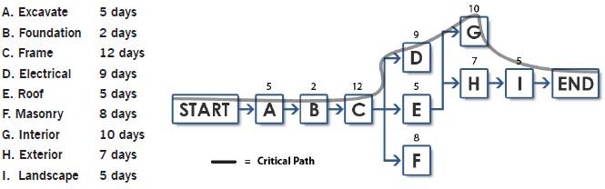
CPM or “Critical Path Method”
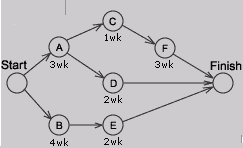
It is a tool to analyze project and determine duration, based on identification of “critical path” through an activity network. The knowledge of the critical path can permit project managers to change duration. It is a project modeling technique developed in 1950s and is used with all forms of projects. It displays activities as nodes or circles with known activity times.
A critical path method (CPM) chart is like a network diagram. Basically, all of the steps in the project are connected. You can go through the connected steps to determine which path dictates the longest amount of time to get through the entire end-to-end process.
CPM is a diagram showing every step of the project, as letters with lines to each letter representing the sequence in which the project steps take place. A list of activities is required to complete the project and the time (duration) that each activity will take to complete, along with the sequence and dependencies between activities. CPM lays out the longest path of planned activities to the end of the project as well as the earliest and latest that each activity can start and finish without delaying other steps in the project. The project manager can then, determine which activities in the project need to be completed before others and how long those activities can take before they delay other parts of the project. They also get to know which set of activities is likely to take the longest, also called as the critical path which is also the shortest possible time period in which the project can be completed.
PERT Chart
A PERT chart (program evaluation review technique) is a form of diagram for CPM that shows activity on an arrow diagram. PERT charts are more simplistic than CPM charts because they simply show the timing of each step of the project and the sequence of the activities. In PERT, estimates are uncertain and ranges of duration and the probability that activity duration will fall into that range is taken whereas CPM is deterministic.
A PERT chart is a graphic representation of a project’s schedule, showing the sequence of tasks, which tasks can be performed simultaneously, and the critical path of tasks that must be completed on time in order for the project to meet its completion deadline. The chart can be constructed with a variety of attributes, such as earliest and latest start dates for each task, earliest and latest finish dates for each task, and slack time between tasks. A PERT chart can document an entire project or a key phase of a project. The chart allows a team to avoid unrealistic timetables and schedule expectations, to help identify and shorten tasks that are bottlenecks, and to focus attention on most critical tasks. It is most useful for planning and tracking entire projects or for scheduling and tracking the implementation phase of a planning or improvement effort.
Developing PERT Chart
- Identify all tasks or project components – Ensure the team has knowledge of the project so that during the brainstorming session all component tasks needed to complete the project are captured. Document the tasks on small note cards.
- Identify the first task that must be completed – Place the appropriate card at the extreme left of the working surface.
- Identify any other tasks that can be started simultaneously with task #1 – Align these tasks either above or below task #1 on the working surface.
- Identify the next task that must be completed – Select a task that must wait to begin until task #1(or a task that starts simultaneously with task #1) is completed. Place the appropriate card to the right of the card showing the preceding task.
- Identify any other tasks that can be started simultaneously with task #2 – Align these tasks either above or below task #2 on the working surface.
- Continue this process until all component tasks are sequenced.
- Identify task durations – Reach a consensus on the most likely amount of time each task will require for completion. Duration time is usually considered to be elapsed time for the task, rather than actual number of hours/days spent doing the work. Document this duration time on the appropriate task cards.
- Construct the PERT chart – Number each task, draw connecting arrows, and add task characteristics such as duration, anticipated start date, and anticipated end date.
- Determine critical path – The project’s critical path includes those tasks that must start or finish on time to avoid delays to the total project. Critical paths are typically displayed in red.
Activity Network Diagram
It charts the flow of activity between separate tasks and graphically displays interdependent relationships between groups, steps, and tasks as they all impact a project. Bubbles, boxes, and arrows are used to depict these activities and the links between them. It shows the sequential relationships of activities using arrows and nodes to identify a project’s critical path. It is similar to the CPM/ PERT and also called as arrow diagram.
In an activity network diagram (AND), you have a starting activity that kicks off two different concurrent processes, with both processes having the same end point. Each process consists of multiple tasks, each having its own duration.
Developing Activity Network Diagram
Development starts with compiling a list of tasks essential for completion of the project. These tasks are then arranged in a chronological order, depending on the project considering inter-task dependency. All tasks are placed in a progressing line with tasks that can be done simultaneously, is placed on parallel paths, whereas jobs that are dependent should be placed in a chronological line. Apply realistic estimate to each task then, enlist the critical path.
You can use the AND in both the Define and the Improve stages. In the Define stage, you want to understand the “as is” state, which shows how the process is currently being performed. In the Improve stage, you can then decide if there is an opportunity to do some re-engineering, or combine some steps, or do some things differently.
When you examine an AND, the series of steps that dictate the longest cycle time for the project are collectively known as the critical path. So if you have a project with two processes and the first process duration is 10 days and the second process duration is 12 days, the second process is the critical chain or critical path.
Root Cause Analysis
During the Improve phase of a Six Sigma project, team members will use a variety of statistical and non-statistical methods to find underlying issues while finding ways to address them. This is a three-step process focusing on fixing the root cause, as opposed to minimizing the effects of the problem. The steps are to list the possible causes, organize and group the possible causes, and prioritize the list of causes.
List possible causes
The process begins with listing the probable causes. This means that data needs to be collected. More time can be spent on gathering the data than anything else in a DMIAC improvement project; this is because a lot of time is spent going out to the workplace, and paying attention to what issues are present. For example, someone may want to establish how frequently a problem occurs, or how long it takes for a problem to resolve.
You might use techniques like tick sheets or tally sheets, where you could design with subject matter experts how to capture easily how often the problem would happen, maybe what the cause of that would be, or how long it takes to get things done. You may use the technique of value stream mapping to collect data and understand what’s going on in the process, where do things tend to break down or where are your bottlenecks.
You can also a time and motion study type technique where you observe what’s going on in the workplace and over time capture the values. What’s important is you get hard data that you can use to build Pareto analysis and use other tools.
Some important tools that come into play at this stage are root cause analysis tools:
- cause and effect diagrams
- relational matrices
- 5 whys analysis
- fault tree analysis
Organize and group possible causes
The next step is to organize and group the possible causes. There are many tools that you can use to do this such as the fishbone diagram and relational matrices. You can also use the “6 Ms” – man, method, machine, measurement, mother-nature, and material. So is it caused by people doing the work? Or is it the method you are using that creates issues? Or is it actually equipment? Is it the way we measure the process that’s causing issues? Is it the environment we are in, mother nature, if you will? Or is it the material or the inputs to the process that we used to create the product or service that we provide? Examine each cause, and find out which group it is most appropriate for.
Prioritize list of causes
After all possible causes are grouped, the causes are prioritized. This means an extensive list is taken, and boiled down to the vital few elements that are important. By narrowing down a particular cause, another layer of Pareto analysis can be done.
