They are effective tools for the visual evaluation of data is a graph showing the relationship between variables. They also provide a visual image of the data thus complementing numerical methods for identifying patterns in the data. They include box plots, stem and leaf plots scatter diagrams, pattern and trend analysis, histograms, normal probability distributions and Weibull distributions.
Box plot
It is also called a box-and-whisker plot or “five number summary”. It has five points of interest, which are the quartiles, the median, and the highest and lowest values and shows how the data are scattered within those ranges. It shows location, spread and shape of the data. It is used for graphically showing the variation between multiple variables and the variations within the ranges. In it, the upper and lower quartiles of the data form the ends of the box, the median forms the centerline of the box which is also dividing the box and the minimum and maximum data points are drawn as end points to lines that extend from the box (the whiskers). Outlier data are represented by asterisks or diamonds outside of the minimum or maximum points. Notches indicate variability of the median, and widths are proportional to the log of the sample size.
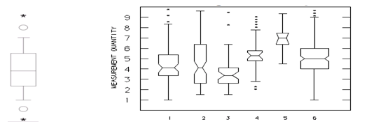
It is used when comparing two or more sets of data or determining significance of an apparent difference. It is useful with a large number of data sets by providing a graphic summary of a data set as it visually shows the center, the spread, the overall range and indicates skewness of the distribution. It is usually used in the early stages of data analysis.
Developing Box plot involves
- Enlisting the data in numerical order and computing the median
- Enlisting the lower and upper quartile and their medians.
- Computing the inter-quartile range and plot the 5-points to a number line (three medians, lowest and highest value).
- Draw a box through the upper and lower quartiles points and a vertical line through the median point.
- Draw the whiskers from each end of the box to the smallest and largest values.
Stem and Leaf Plot
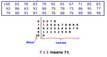
It separates each number into a stem (all numbers but the last digit) and a leaf (the last digit) like, for the numbers 45, and 59, the stems are 4 and 5, while the leaves are 5 and 9. It is easy to make and shows shape and distribution quickly. It is a compact depiction of data showing both variable and categorical data sets. It resembles a histogram and is used to visualize the spread of a distribution and indicate around what values the data are mainly concentrated. It is essentially composed of two parts, the stem on the left side of the graph and the leaf on the right. Data can be read directly from the diagram. It is useful for classifying data and organizing data as it is collected but all numbers should be whole numbers or of same precision. As in the figure, most data is in between 70 to 79.
Developing Stem and Leaf Plot
- Sort the given data in numerical order (ascending).
- Separate the numbers into stems and leaves.
- Group the numbers with the same stems.
Histograms
Histograms are an important graphical tool used with data to provide visualization for the frequency of something that is happening over given time periods. This could perhaps show the variation that you are seeing to a mean or average value that you are targeting in a process.
It shows frequencies in data as adjacent rectangles, erected over intervals with an area proportional to the frequency of the observations in the interval. They are frequency column graphs that display a static picture of process behavior and require a minimum of 50-100 data points. It is characterized by the number of data points that fall within a given bar or interval or frequency. It enables the user to visualize how the data points spread, skew and detect the presence of outliers. A stable process which is predictable, usually shows a histogram with bell-shaped curves which is not shown with unstable process even though shapes like exponential, lognormal, gamma, beta, Poisson, binomial, geometric, etc. are a stable process.
For example, in a customer support contact center you might be tracking the number of calls that are coming in which get dropped on a day-to-day basis. And across the Y-axis would have a 10-day-period, and on the X–axis how many calls got dropped each day.
The construction of a histogram starts with the division of a frequency distribution into equal classes, and then each class is represented by a vertical bar. They are used to plot the density of data especially of continuous data like weight or height.
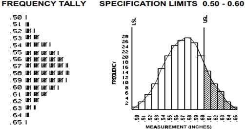
Interpretation of Histograms
Looking at the shape of a histogram provides a sense for whether data is behaving in a normal fashion or in an abnormal fashion. Histograms with central tendency tend to supply a view of the mode and mean of the data. The mode is the most frequently recurring value across the dataset and the mean is the average value found over the time period. Looking at the bottom of the chart helps to understand the range of the data and can supply information on where there are some outliers.
For example, when testing the of intelligence of populations, if the population is uniform, you could expect a lot of people to be in the middle of average intelligence, a smaller number with a lower IQ, and an even smaller number in the genius grade.
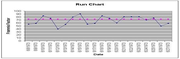
Run Charts
It displays how a process performs over time as data points are plotted in chronological order and connected as a line graph. It is useful in detection of variation or problem trend or pattern as it is evident in run charts when shift occurs that’s why, it is also called as trend charts. It can displays sequential data for spotting patterns and abnormalities. It is used for monitoring and communicating process performance. It is usually used for displaying performance data over time or for showing tabulations.
Even though trends observable on the run chart might not signify deviation as it might be under normal limits but, usually it indicates a trend or shift or a cycle. When a run chart exhibits seven or eight points successively up or down, then a trend is clearly present in the data.
A run chart is a useful technique to track data over time. If you examine a run chart, you can take a look at data points throughout your time frame, and with this data you can identify specific trends and look for shifts. This is a useful way to know whether or not a process is under control or perhaps a warning if a process is drifting with respect to the desired value.
You should examine the relationship between corrective actions and what the lengths are of each process. This is useful way to monitor progress and process performance. In other words, if you want to maintain control while making improvements, this is another way to pay attention to what is going on and make sure that a process does not deteriorate over time.
There are different critical pieces that are used in building a run chart:
- Output – This is an up going scale; it could be percentages, quantities, measured values for a dimension, or the amount of time it takes to handle something, etc. It is a measured output for each time period, or for a particular sample that has been taken.
- Median line – This would be the average of the high and the low values (all of the data that is in the dataset.)
- Time series – This is across the bottom and could be hours, days, weeks, months, and, in certain rare cases, even years of data that is being projected and visualized over time.
- Data points – These are the points for the actual value at these dates that are plugged in with the connecting lines so you can see what’s going on.
Developing Run Chart
- Sequence the input data against time and order the data from lowest to highest.
- Calculate the median and the range.
- Make the Y-axis scale 1.5 to 2 times the range and of X-axis 2 to 3 times against Y-axis.
- Depict the median by a dotted line.
- Plot the points and connect them to form a line graph.
There are a couple of decision rules to consider when working with run charts:
- Shift – When there are seven or more consecutive points above or below the median line, this is called a shift. By examining the median line, and where clusters of data points occur relative to the time frame, you might see a difference above and below the median line. This indicates a clear shift, and a dramatic change to the process.
- Trend – A trend would indicate a steady increase or decrease of data points over a period of time. For example, when there are seven or more consecutive points increasing or decreasing this is called a trend. If you had to draw an arrow or rolling average through a series of data points, you will be able to see a consistent change occurring in the process.
Scatter Diagram
It is displays multiple XY coordinate data points represent the relationship between two different variables on X and Y-axis. It is also called as correlation chart. It depicts the relationship strength between an independent variable on the vertical axis and a dependent variable on the horizontal axis. It enables strategizing on how to control the effect of the relationship on the process. It is also called scatter plots, X-Y graphs or correlation charts.
As you increase the values of x factors in your testing, you measure and plot the changes to the variable y outputs over time. You want to understand the data layout and determine whether it tends to take a direction or form. You also need to know what the strength of the relationship is between the various data points and the line you might draw. For example, a wide range may suggest something about the strength of the relationship, based on the variation of the x inputs to the y outputs.
In a scatter diagram that indicates a positive correlation of x and y variables, the data points fall to either side of a best-fit line that rises steadily from left to right. It’s clear that as you raise the values of x, you also raise the values of the y variable outputs.
In a scatter diagram that indicates a negative correlation, the data points fall to either side of a best-fit line that moves steadily downward from left to right. As you change the x values and you see the y values going in a negative direction, you can draw the conclusion that there continues to be a strong relationship and that it’s linear, but that the nature of this relationship is opposite to the one found in the positive correlation diagram.
A correlation line depicts the relationship between the X and Y axes and it moves upward or downward following the pattern of the dots. You should try to understand the impact of the independent variable – in other words, adjusting the process input on the output variable. Look at the grouping of the dots and consider several things:
- Do they tend to group tightly and do they tend to follow a line on an average calculation basis, and what is the shape of this line?
- Is it nice and straight or is it curved linear?
- Can it change depending on the variation that is made to the process input?
It graph pairs of continuous data, with one variable on each axis, showing what happens to one variable when the other variable changes. If the relationship is understood, then the dependent variable may be controlled. The relationship may show a correlation between the two variables though correlation does not always refer to a cause and effect relationship. The correlation may be positive due to one variable moving in one direction and the second variable in the same direction but, for negative correlation both move in opposite directions. Presence of correlation is due to a cause-effect relationship, a relationship between one cause and another cause or due to a relationship between one cause and two or more other causes.
There are several common types of correlations:
- High positive – These have closely grouped data points that ascend from left to right. There is also a strong relationship between the X value and the Y value, and if you increase the process value, the output value increases.
- High negative – These have closely grouped points that descend from left to right. There is also a strong relationship between the X value and the Y value, and if you increase the process value, the output value decreases.
- Low correlation – These have widely scattered points that are slightly ascending or descending. There is a weak relationship between the X value and the Y value, and they cannot predict impact of process on the output.
- No correlation – Here you have uniformly scattered points, no discernible line, no relationship between the X value and the Y value, and no impact of process on output.
- Non-linear – These have closely grouped points that both ascend and descend over time. There is also a strong relationship between the X and the Y value, and they can predict impact at given points in the process.
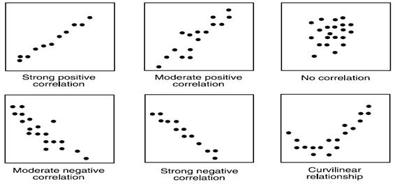
It is used when two variables are related or evaluating paired continuous data. It is also helpful to identify potential root causes of a problem by relating two variables. The tighter the data points along the line, the stronger the relationship amongst them and the direction of the line indicates whether the relationship is positive or negative. The degree of association between the two variables is calculated by the correlation coefficient. If the points show no significant clustering, there is probably no correlation.
Developing Scatter Diagram
- Collect data for both variables.
- Draw a graph with the independent variable on the horizontal axis (x) and the dependent variable on the vertical axis (y).
- For each pair of data, plot a dot (or symbol) where the x-axis value intersects the y-axis value.
Outliers are important to understand. In outlier correlations, data points are far from the cluster. If a graph has a strong correlation with a rogue value, it could either be a chance exception, mistakes in the recorded data, or the measurement tool being used. There could have been human error in the testing or maybe a factor in the environment wasn’t controlled. Outliers should be thrown out or not used later in the process when process parameters are being designed.
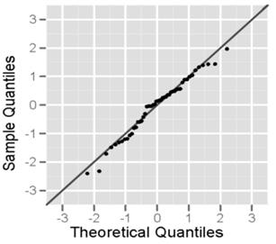
Normal Probability Plots
It is used to detect the presence of normal bell curve or Gaussian distribution in the process data. The plot is defined by mean and variance. For normally distributed data, the mean and median are very close and may be identical. The normal probability plot shows whether or not the data are distributed as a standard normal distribution. Normal distributions will follow a linear pattern. It is also called as normal test plots.
It is used when prediction or taking decisions based on the data distribution and to test the assumption of normality. In it most of the data concentrate around or on the centerline which divides the curve into two equal halves. The data is plotted against a theoretical normal distribution in such a way that the points should form an approximate straight line. Departures from this straight line indicate departures from normality.
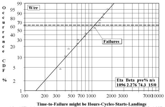
Weibull Plots
It is usually used to estimate the cumulative probability that a given sample will fail under certain conditions. The data can be used to determine a point at which a certain number of samples will fail. Once it is known, this information can help design a process such that no part of the sample approaches the stress limitations. It provides reasonably accurate failure analysis and forecasts with extremely small samples by providing a simple and useful graphical plot of the failure data.
The Weibull plot has special scales designed so that the data points will be almost linear if they follow a Weibull distribution. The Weibull distribution has three parameters but can use only two if the third is assumed
- α is the shape parameter
- θ is the scale parameter
- γ is the location parameter
Weibull plots usually chart data on the probable life of a product or process which is measured in hours, miles, or any other metric that describes the time-to-failure. If complete data is available, the exact time-to-failure is known but for suspended data or right censored, the unit operates successfully for a known period of time and could have continued for an additional period of time that is not known whereas, for interval data or left censored, the time-to failure is known but only within a certain range of time.