A Directive modifies the DOM to change appearance, behavior or layout of DOM elements. Directives are one of the core building blocks Angular 7 uses to build applications. In fact, Angular 7 components are in large part directives with templates. From an Angular 1 perspective, Angular 7 components have assumed a lot of the roles directives used to. The majority of issues that involve templates and dependency injection rules will be done through components, and issues that involve modifying generic behavior is done through directives. There are three main types of directives in Angular 7:
- Component – directive with a template.
- Attribute directives – directives that change the behavior of a component or element but don’t affect the template
- Structural directives – directives that change the behavior of a component or element by affecting how the template is rendered.
Before the Component API shipped in Angular 1.5, directives with templates that were used as elements were defined in a similar way as an attribute directive using the same API, which could lead to messy directive declarations that can be hard to grok. Components use the directive API under the hood, but give us a cleaner interface for defining them by hiding a lot of the defaults that would otherwise be cumbersome.
Components are the most common of the three directives. Structural Directives change the structure of the view. Two examples are NgFor and NgIf. Attribute directives are used as attributes of elements. The built-in NgStyle directive in the Template Syntax guide, for example, can change several element styles at the same time.
Directive classes, like component classes, can implement life-cycle hooks to influence their configuration and behavior.
| Option | Description |
| selector | The CSS selector that identifies this directive in a template and triggers instantiation of the directive. |
| inputs | Enumerates the set of data-bound input properties for a directive |
| outputs | The set of event-bound output properties. When an output property emits an event, an event handler attached to that event in the template is invoked. |
| providers | Configures the injector of this directive or component with a token that maps to a provider of a dependency. |
| exportAs | The name or names that can be used in the template to assign this directive to a variable. For multiple names, use a comma-separated string. |
| queries | Configures the queries that will be injected into the directive. |
| jit | If true, this directive/component will be skipped by the AOT compiler and so will always be compiled using JIT. |
| host | Maps class properties to host element bindings for properties, attributes, and events, using a set of key-value pairs. |
Component or Directives
Since as per the above list, component itself act as direcitves. So as a programmer, it is very common to assume that component and direcitves are the same. But actually it is not true. Below the comparison of the Directives and component.
| Component | Directives |
| A component is register with the @Component Decorator | A Directives is register with the @Directives Decorator |
| Component is a directive which uses shadow DOM to create encapsulated visual behavior called components. Components are typically used to create UI widgets | Directive is used to add behavior to an existing DOM element |
| Component is used to break up the application into smaller components. | Directive is use to design re-usable components. |
| Only one component can be present per DOM element. | Many directives can be used per DOM element. |
| @View decorator or templateurl template are mandatory in the component. | Directive doesn’t use View. |
Attribute Directives
Attribute directives are a way of changing the appearance or behavior of a component or a native DOM element. Ideally, a directive should work in a way that is component agnostic and not bound to implementation details. Attribute directives actually modifies the appearance or behavior of an element. The attribute directive changes the appearance or behavior of a DOM element. These directives look like regular HTML attributes in templates. The ngModel directive which is used for two-way binding is an perfect example of an attribute directive. For create attribute directives, we always need to use or inject the below objects in our custom attribute directive component class.
Build a simple attribute directive – An attribute directive minimally requires building a controller class annotated with @Directive, which specifies the selector that identifies the attribute. The controller class implements the desired directive behavior.
This page demonstrates building a simple appHighlight attribute directive to set an element’s background color when the user hovers over that element. You can apply it like this:
src/app/app.component.html (applied)
<p appHighlight>Highlight me!</p>
Write the directive code – Create the directive class file in a terminal window with this CLI command.
ng generate directive highlight
The CLI creates src/app/highlight.directive.ts, a corresponding test file (…/spec.ts, and declares the directive class in the root AppModule.
Directives must be declared in Angular Modules in the same manner as components. The generated src/app/highlight.directive.ts is as follows:
src/app/highlight.directive.ts
import { Directive } from ‘@angular/core’;
@Directive({
selector: ‘[appHighlight]’
})
export class HighlightDirective {
constructor() { }
}
The imported Directive symbol provides the Angular the @Directive decorator. The @Directive decorator’s lone configuration property specifies the directive’s CSS attribute selector, [appHighlight].
It’s the brackets ([]) that make it an attribute selector. Angular locates each element in the template that has an attribute named appHighlight and applies the logic of this directive to that element. The attribute selector pattern explains the name of this kind of directive.
Though highlight would be a more concise selector than appHighlight and it would work, the best practice is to prefix selector names to ensure they don’t conflict with standard HTML attributes. This also reduces the risk of colliding with third-party directive names. The CLI added the app prefix for you.
Make sure you do not prefix the highlight directive name with ng because that prefix is reserved for Angular and using it could cause bugs that are difficult to diagnose.
After the @Directive metadata comes the directive’s controller class, called HighlightDirective, which contains the (currently empty) logic for the directive. Exporting HighlightDirective makes the directive accessible. Now edit the generated src/app/highlight.directive.ts to look as follows:
src/app/highlight.directive.ts
import { Directive, ElementRef } from ‘@angular/core’;
@Directive({
selector: ‘[appHighlight]’
})
export class HighlightDirective {
constructor(el: ElementRef) {
el.nativeElement.style.backgroundColor = ‘yellow’;
}
}
The import statement specifies an additional ElementRef symbol from the Angular core library:
You use the ElementRef in the directive’s constructor to inject a reference to the host DOM element, the element to which you applied appHighlight.
ElementRef grants direct access to the host DOM element through its nativeElement property.
Built-in Attribute Directives
Attribute directives listen to and modify the behavior of other HTML elements, attributes, properties, and components. They are usually applied to elements as if they were HTML attributes, hence the name.
Many details are covered in the Attribute Directives guide. Many NgModules such as the RouterModule and the FormsModule define their own attribute directives. This section is an introduction to the most commonly used attribute directives:
- NgClass – add and remove a set of CSS classes
- NgStyle – add and remove a set of HTML styles
- NgModel – two-way data binding to an HTML form element
NgClass – You typically control how elements appear by adding and removing CSS classes dynamically. You can bind to the ngClass to add or remove several classes simultaneously.
A class binding is a good way to add or remove a single class.
src/app/app.component.html
<!– toggle the “special” class on/off with a property –>
<div [class.special]=”isSpecial”>The class binding is special</div>
To add or remove many CSS classes at the same time, the NgClass directive may be the better choice.
Try binding ngClass to a key:value control object. Each key of the object is a CSS class name; its value is true if the class should be added, false if it should be removed.
Consider a setCurrentClasses component method that sets a component property, currentClasses with an object that adds or removes three classes based on the true/false state of three other component properties:
src/app/app.component.ts
currentClasses: {};
setCurrentClasses() {
// CSS classes: added/removed per current state of component properties
this.currentClasses = {
‘saveable’: this.canSave,
‘modified’: !this.isUnchanged,
‘special’: this.isSpecial
};
}
Adding an ngClass property binding to currentClasses sets the element’s classes accordingly:
src/app/app.component.html
<div [ngClass]=”currentClasses”>This div is initially saveable, unchanged, and special</div>
It’s up to you to call setCurrentClassess(), both initially and when the dependent properties change.
NgStyle – You can set inline styles dynamically, based on the state of the component. With NgStyle you can set many inline styles simultaneously. A style binding is an easy way to set a single style value.
src/app/app.component.html
<div [style.font-size]=”isSpecial ? ‘x-large’ : ‘smaller'” >
This div is x-large or smaller.
</div>
To set many inline styles at the same time, the NgStyle directive may be the better choice. Try binding ngStyle to a key:value control object. Each key of the object is a style name; its value is whatever is appropriate for that style.
Consider a setCurrentStyles component method that sets a component property, currentStyles with an object that defines three styles, based on the state of three other component propertes:
src/app/app.component.ts
currentStyles: {};
setCurrentStyles() {
// CSS styles: set per current state of component properties
this.currentStyles = {
‘font-style’: this.canSave ? ‘italic’ : ‘normal’,
‘font-weight’: !this.isUnchanged ? ‘bold’ : ‘normal’,
‘font-size’: this.isSpecial ? ’24px’ : ’12px’
};
}
Adding an ngStyle property binding to currentStyles sets the element’s styles accordingly:
src/app/app.component.html
<div [ngStyle]=”currentStyles”>
This div is initially italic, normal weight, and extra large (24px).
</div>
It’s up to you to call setCurrentStyles(), both initially and when the dependent properties change.
NgModel – Two-way binding to form elements with [(ngModel)] – When developing data entry forms, you often both display a data property and update that property when the user makes changes.
Two-way data binding with the NgModel directive makes that easy. Here’s an example:
src/app/app.component.html (NgModel-1)
<input [(ngModel)]=”currentHero.name”>
FormsModule is required to use ngModel
Before using the ngModel directive in a two-way data binding, you must import the FormsModule and add it to the NgModule’s imports list. Here’s how to import the FormsModule to make [(ngModel)] available.
src/app/app.module.ts (FormsModule import)
import { NgModule } from ‘@angular/core’;
import { BrowserModule } from ‘@angular/platform-browser’;
import { FormsModule } from ‘@angular/forms’; // <— JavaScript import from Angular
/* Other imports */
@NgModule({
imports: [
BrowserModule,
FormsModule // <— import into the NgModule
],
/* Other module metadata */
})
export class AppModule { }
Built-in Structural Directives
Structural directives are responsible for HTML layout. They shape or reshape the DOM’s structure, typically by adding, removing, and manipulating the host elements to which they are attached.
As with other directives, you apply a structural directive to a host element. The directive then does whatever it’s supposed to do with that host element and its descendants. Structural directives are easy to recognize. An asterisk (*) precedes the directive attribute name as in this example.
src/app/app.component.html (ngif)
<div *ngIf=”hero” class=”name”>{{hero.name}}</div>
No brackets. No parentheses. Just *ngIf set to a string.
You’ll learn in this guide that the asterisk (*) is a convenience notation and the string is a microsyntax rather than the usual template expression. Angular desugars this notation into a marked-up <ng-template> that surrounds the host element and its descendents. Each structural directive does something different with that template.
Three of the common, built-in structural directives—NgIf, NgFor, and NgSwitch…—are described in the Template Syntax guide and seen in samples throughout the Angular documentation. Here’s an example of them in a template:
src/app/app.component.html (built-in)
<div *ngIf=”hero” class=”name”>{{hero.name}}</div>
<ul>
<li *ngFor=”let hero of heroes”>{{hero.name}}</li>
</ul>
<div [ngSwitch]=”hero?.emotion”>
<app-happy-hero *ngSwitchCase=”‘happy'” [hero]=”hero”></app-happy-hero>
<app-sad-hero *ngSwitchCase=”‘sad'” [hero]=”hero”></app-sad-hero>
<app-confused-hero *ngSwitchCase=”‘app-confused'” [hero]=”hero”></app-confused-hero>
<app-unknown-hero *ngSwitchDefault [hero]=”hero”></app-unknown-hero>
</div>
A directive class is spelled in UpperCamelCase (NgIf). A directive’s attribute name is spelled in lowerCamelCase (ngIf). The guide refers to the directive class when talking about its properties and what the directive does. The guide refers to the attribute name when describing how you apply the directive to an element in the HTML template.
NgIf – NgIf is the simplest structural directive and the easiest to understand. It takes a boolean expression and makes an entire chunk of the DOM appear or disappear.
src/app/app.component.html (ngif-true)
<p *ngIf=”true”>
Expression is true and ngIf is true.
This paragraph is in the DOM.
</p>
<p *ngIf=”false”>
Expression is false and ngIf is false.
This paragraph is not in the DOM.
</p>
The ngIf directive doesn’t hide elements with CSS. It adds and removes them physically from the DOM. Confirm that fact using browser developer tools to inspect the DOM.
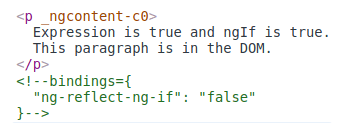
The top paragraph is in the DOM. The bottom, disused paragraph is not; in its place is a comment about “bindings”.
When the condition is false, NgIf removes its host element from the DOM, detaches it from DOM events (the attachments that it made), detaches the component from Angular change detection, and destroys it. The component and DOM nodes can be garbage-collected and free up memory.
The asterisk (*) prefix – Surely you noticed the asterisk (*) prefix to the directive name and wondered why it is necessary and what it does.
Here is *ngIf displaying the hero’s name if hero exists.
src/app/app.component.html (asterisk)
<div *ngIf=”hero” class=”name”>{{hero.name}}</div>
The asterisk is “syntactic sugar” for something a bit more complicated. Internally, Angular translates the *ngIf attribute into a <ng-template> element, wrapped around the host element, like this.
src/app/app.component.html (ngif-template)
<ng-template [ngIf]=”hero”>
<div class=”name”>{{hero.name}}</div>
</ng-template>
- The *ngIf directive moved to the <ng-template> element where it became a property binding,[ngIf].
- The rest of the <div>, including its class attribute, moved inside the <ng-template> element.
The first form is not actually rendered, only the finished product ends up in the DOM.
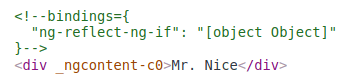
Angular consumed the <ng-template> content during its actual rendering and replaced the <ng-template> with a diagnostic comment.
The NgFor and NgSwitch… directives follow the same pattern.
*ngFor – Angular transforms the *ngFor in similar fashion from asterisk (*) syntax to <ng-template> element. Here’s a full-featured application of NgFor, written both ways:
src/app/app.component.html (inside-ngfor)
<div *ngFor=”let hero of heroes; let i=index; let odd=odd; trackBy: trackById” [class.odd]=”odd”>
({{i}}) {{hero.name}}
</div>
<ng-template ngFor let-hero [ngForOf]=”heroes” let-i=”index” let-odd=”odd” [ngForTrackBy]=”trackById”>
<div [class.odd]=”odd”>({{i}}) {{hero.name}}</div>
</ng-template>
This is manifestly more complicated than ngIf and rightly so. The NgFor directive has more features, both required and optional, than the NgIf shown in this guide. At minimum NgFor needs a looping variable (let hero) and a list (heroes).
You enable these features in the string assigned to ngFor, which you write in Angular’s microsyntax.
Everything outside the ngFor string stays with the host element (the <div>) as it moves inside the <ng-template>. In this example, the [ngClass]=”odd” stays on the <div>.
Microsyntax – The Angular microsyntax lets you configure a directive in a compact, friendly string. The microsyntax parser translates that string into attributes on the <ng-template>:
- The let keyword declares a template input variable that you reference within the template. The input variables in this example are hero, i, and odd. The parser translates let hero, let i, and let odd into variables named, let-hero, let-i, and let-odd.
- The microsyntax parser takes of, and trackBy, title-cases them (of -> Of, trackBy -> TrackBy), and prefixes them with the directive’s attribute name (ngFor), yielding the names ngForOf and ngForTrackBy. Those are the names of two NgFor input properties . That’s how the directive learns that the list is heroes and the track-by function is trackById.
- As the NgFor directive loops through the list, it sets and resets properties of its own context object. These properties include index and odd and a special property named $implicit.
- The let-i and let-odd variables were defined as let i=index and let odd=odd. Angular sets them to the current value of the context’s index and odd properties.
- The context property for let-hero wasn’t specified. Its intended source is implicit. Angular sets let-hero to the value of the context’s $implicit property which NgFor has initialized with the hero for the current iteration.
- The API guide describes additional NgFor directive properties and context properties.
- NgFor is implemented by the NgForOf directive.
These microsyntax mechanisms are available to you when you write your own structural directives. Studying the source code for NgIf and NgForOf is a great way to learn more.
Template input variable – A template input variable is a variable whose value you can reference within a single instance of the template. There are several such variables in this example: hero, i, and odd. All are preceded by the keyword let.
A template input variable is not the same as a template reference variable, neither semantically nor syntactically.
You declare a template input variable using the let keyword (let hero). The variable’s scope is limited to a single instance of the repeated template. You can use the same variable name again in the definition of other structural directives.
You declare a template reference variable by prefixing the variable name with # (#var). A reference variable refers to its attached element, component or directive. It can be accessed anywhere in the entire template. Template input and reference variable names have their own namespaces.
One structural directive per host element – Someday you’ll want to repeat a block of HTML but only when a particular condition is true. You’ll try to put both an *ngFor and an *ngIf on the same host element. Angular won’t let you. You may apply only one structural directive to an element.
The reason is simplicity. Structural directives can do complex things with the host element and its descendents. When two directives lay claim to the same host element, which one takes precedence? Which should go first, the NgIf or the NgFor? Can the NgIf cancel the effect of the NgFor? If so (and it seems like it should be so), how should Angular generalize the ability to cancel for other structural directives?
There are no easy answers to these questions. Prohibiting multiple structural directives makes them moot. There’s an easy solution for this use case: put the *ngIf on a container element that wraps the *ngFor element. One or both elements can be an ng-container so you don’t have to introduce extra levels of HTML.
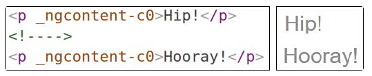
The <ng-template> – The <ng-template> is an Angular element for rendering HTML. It is never displayed directly. In fact, before rendering the view, Angular replaces the <ng-template> and its contents with a comment.
If there is no structural directive and you merely wrap some elements in a <ng-template>, those elements disappear. That’s the fate of the middle “Hip!” in the phrase “Hip! Hip! Hooray!”.
src/app/app.component.html (template-tag)
<p>Hip!</p>
<ng-template>
<p>Hip!</p>
</ng-template>
<p>Hooray!</p>
Angular erases the middle “Hip!”, leaving the cheer a bit less enthusiastic.
A structural directive puts a <ng-template> to work as you’ll see when you write your own structural directive.
Group sibling elements with <ng-container> – There’s often a root element that can and should host the structural directive. The list element (<li>) is a typical host element of an NgFor repeater.
src/app/app.component.html (ngfor-li)
<li *ngFor=”let hero of heroes”>{{hero.name}}</li>
When there isn’t a host element, you can usually wrap the content in a native HTML container element, such as a <div>, and attach the directive to that wrapper.
src/app/app.component.html (ngif)
<div *ngIf=”hero” class=”name”>{{hero.name}}</div>
Introducing another container element—typically a <span> or <div>—to group the elements under a single root is usually harmless. Usually … but not always.
The grouping element may break the template appearance because CSS styles neither expect nor accommodate the new layout. For example, suppose you have the following paragraph layout.
src/app/app.component.html (ngif-span)
<p>
I turned the corner
<span *ngIf=”hero”>
and saw {{hero.name}}. I waved
</span>
and continued on my way.
</p>
You also have a CSS style rule that happens to apply to a <span> within a <p>aragraph.
src/app/app.component.css (p-span)
p span { color: red; font-size: 70%; }
The constructed paragraph renders strangely.
The p span style, intended for use elsewhere, was inadvertently applied here.
Another problem: some HTML elements require all immediate children to be of a specific type. For example, the <select> element requires <option> children. You can’t wrap the options in a conditional <div> or a <span>.
When you try this,
src/app/app.component.html (select-span)
<div>
Pick your favorite hero
(<label><input type=”checkbox” checked (change)=”showSad = !showSad”>show sad</label>)
</div>
<select [(ngModel)]=”hero”>
<span *ngFor=”let h of heroes”>
<span *ngIf=”showSad || h.emotion !== ‘sad'”>
<option [ngValue]=”h”>{{h.name}} ({{h.emotion}})</option>
</span>
</span>
</select>
the drop down is empty.
The browser won’t display an <option> within a <span>.
<ng-container> to the rescue – The Angular <ng-container> is a grouping element that doesn’t interfere with styles or layout because Angular doesn’t put it in the DOM.
Here’s the conditional paragraph again, this time using <ng-container>.
src/app/app.component.html (ngif-ngcontainer)
<p>
I turned the corner
<ng-container *ngIf=”hero”>
and saw {{hero.name}}. I waved
</ng-container>
and continued on my way.
</p>
It renders properly. Now conditionally exclude a select <option> with <ng-container>.
src/app/app.component.html (select-ngcontainer)
<div>
Pick your favorite hero
(<label><input type=”checkbox” checked (change)=”showSad = !showSad”>show sad</label>)
</div>
<select [(ngModel)]=”hero”>
<ng-container *ngFor=”let h of heroes”>
<ng-container *ngIf=”showSad || h.emotion !== ‘sad'”>
<option [ngValue]=”h”>{{h.name}} ({{h.emotion}})</option>
</ng-container>
</ng-container>
</select>
The drop down works properly. The <ng-container> is a syntax element recognized by the Angular parser. It’s not a directive, component, class, or interface. It’s more like the curly braces in a JavaScript if-block:
if (someCondition) {
statement1;
statement2;
statement3;
}
Without those braces, JavaScript would only execute the first statement when you intend to conditionally execute all of them as a single block. The <ng-container> satisfies a similar need in Angular templates.
NgNonBindable – We use ngNonBindable when we want tell Angular not to compile, or bind, a particular section of our page.
The most common example of this is if we wanted to write out some Angular code on the page, for example if we wanted to render out the text {{ name }} on our page, like so:
<div>
To render the name variable we use this syntax <pre>{{ name }}</pre>
</div>
Normally Angular will try to find a variable called name on the component and print out the value of the name variable instead of just printing out {{ name }}. To make angular ignore an element we simply add the ngNonBindable directive to the element, like so:
<div>
To render the name variable we use this syntax <pre ngNonBindable>{{ name }}</pre>
</div>
The NgSwitch directives – NgSwitch is like the JavaScript switch statement. It can display one element from among several possible elements, based on a switch condition. Angular puts only the selected element into the DOM. NgSwitch is actually a set of three, cooperating directives: NgSwitch, NgSwitchCase, and NgSwitchDefault as seen in this example.
src/app/app.component.html
<div [ngSwitch]=”currentHero.emotion”>
<happy-hero *ngSwitchCase=”‘happy'” [hero]=”currentHero”></happy-hero>
<sad-hero *ngSwitchCase=”‘sad'” [hero]=”currentHero”></sad-hero>
<confused-hero *ngSwitchCase=”‘confused'” [hero]=”currentHero”></confused-hero>
<unknown-hero *ngSwitchDefault [hero]=”currentHero”></unknown-hero>
</div>
NgSwitch is the controller directive. Bind it to an expression that returns the switch value. The emotion value in this example is a string, but the switch value can be of any type.
Bind to [ngSwitch]. You’ll get an error if you try to set *ngSwitch because NgSwitch is an attribute directive, not a structural directive. It changes the behavior of its companion directives. It doesn’t touch the DOM directly.
Bind to *ngSwitchCase and *ngSwitchDefault. The NgSwitchCase and NgSwitchDefault directives are structural directives because they add or remove elements from the DOM.
- NgSwitchCase adds its element to the DOM when its bound value equals the switch value.
- NgSwitchDefault adds its element to the DOM when there is no selected NgSwitchCase.
The switch directives are particularly useful for adding and removing component elements. This example switches among four “emotional hero” components defined in the hero-switch.components.ts file. Each component has a hero input property which is bound to the currentHero of the parent component.
Switch directives work as well with native elements and web components too. For example, you could replace the <confused-hero> switch case with the following in src/app/app.component.html
<div *ngSwitchCase=”‘confused'”>Are you as confused as {{currentHero.name}}?</div>
