Various customization options are provided by Angular Material for
- Customizing component styles
- Creating a custom form field control
- Using elevation helper
Customizing Component Styles
There are 3 questions to keep in mind while customizing the styles of Angular Material components:
- Are your styles encapsulated?
- Are your styles more specific than the defaults?
- Is the component a child of your component, or does it exist elsewhere in the DOM?
View encapsulation – By default, Angular component styles are scoped to affect the component’s view. This means that the styles you write will affect all the elements in your component template. They will not affect elements that are children of other components within your template.
Selector specificity – Each CSS declaration has a level of specificity based on the type and number of selectors used. More specific styles will take precedence over less specific styles. Angular Material uses the least specific selectors possible for its components in order to make it easy to override them.
Component location – Some Angular Material components, specifically overlay-based ones like MatDialog, MatSnackbar, etc., do not exist as children of your component. Often they are injected elsewhere in the DOM. This is important to keep in mind, since even using high specificity and shadow-piercing selectors will not target elements that are not direct children of your component. Global styles are recommended for targeting such components.
Styling overlay components – Overlay-based components have a panelClass property (or similar) that can be used to target the overlay pane. For example, to remove the padding from a dialog:
// Add this to your global stylesheet after your theme setup
.myapp-no-padding-dialog .mat-dialog-container {
padding: 0;
}
this.dialog.open(MyDialogComponent, {panelClass: ‘myapp-no-padding-dialog’})
Since you are adding the styles to your global stylesheet, it is good practice to scope them appropriately. Try prefixing your selector with your app name or “custom”. Also note that the mat-dialog-container’s padding is added by default via a selector with specificity of 1. The customizing styles have a specificity of 2, so they will always take precedence.
Styling other components – If your component has view encapsulation turned on (default), your component styles will only affect the top level children in your template. HTML elements belonging to child components cannot be targeted by your component styles unless you do one of the following:
- Add the overriding style to your global stylesheet. Scope the selectors so that it only affects the specific elements you need it to.
- Turn view encapsulation off on your component. If you do this, be sure to scope your styles appropriately, or else you may end up incidentally targeting other components elswhere in your application.
- Use a deprecated shadow-piercing descendant combinator to force styles to apply to all the child elements.
Custom form field control
It is possible to create custom form field controls that can be used inside <mat-form-field>. This can be useful if you need to create a component that shares a lot of common behavior with a form field, but adds some additional logic.
For example in this guide we’ll learn how to create a custom input for inputting US telephone numbers and hook it up to work with <mat-form-field>. Here is what we’ll build by the end of this guide:
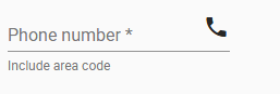
In order to learn how to build custom form field controls, let’s start with a simple input component that we want to work inside the form field. For example, a phone number input that segments the parts of the number into their own inputs. (Note: this is not intended to be a robust component, just a starting point for us to learn.)
class MyTel {
constructor(public area: string, public exchange: string, public subscriber: string) {}
}
@Component({
selector: ‘my-tel-input’,
template: `
<div [formGroup]=”parts”>
<input class=”area” formControlName=”area” size=”3″>
<span>–</span>
<input class=”exchange” formControlName=”exchange” size=”3″>
<span>–</span>
<input class=”subscriber” formControlName=”subscriber” size=”4″>
</div>
`,
styles: [`
div {
display: flex;
}
input {
border: none;
background: none;
padding: 0;
outline: none;
font: inherit;
text-align: center;
}
`],
})
class MyTelInput {
parts: FormGroup;
@Input()
get value(): MyTel | null {
let n = this.parts.value;
if (n.area.length == 3 && n.exchange.length == 3 && n.subscriber.length == 4) {
return new MyTel(n.area, n.exchange, n.subscriber);
}
return null;
}
set value(tel: MyTel | null) {
tel = tel || new MyTel(”, ”, ”);
this.parts.setValue({area: tel.area, exchange: tel.exchange, subscriber: tel.subscriber});
}
constructor(fb: FormBuilder) {
this.parts = fb.group({
‘area’: ”,
‘exchange’: ”,
‘subscriber’: ”,
});
}
}
Providing component as a MatFormFieldControl – The first step is to provide our new component as an implementation of the MatFormFieldControl interface that the <mat-form-field> knows how to work with. To do this, we will have our class implement MatFormFieldControl. Since this is a generic interface, we’ll need to include a type parameter indicating the type of data our control will work with, in this case MyTel. We then add a provider to our component so that the form field will be able to inject it as a MatFormFieldControl.
@Component({
…
providers: [{provide: MatFormFieldControl, useExisting: MyTelInput}],
})
class MyTelInput implements MatFormFieldControl<MyTel> {
…
}
This sets up our component so it can work with <mat-form-field>, but now we need to implement the various methods and properties declared by the interface we just implemented.
Methods and properties of MatFormFieldControl
value – This property allows someone to set or get the value of our control. Its type should be the same type we used for the type parameter when we implemented MatFormFieldControl. Since our component already has a value property, we don’t need to do anything for this one.
stateChanges – Because the <mat-form-field> uses the OnPush change detection strategy, we need to let it know when something happens in the form field control that may require the form field to run change detection. We do this via the stateChanges property. So far the only thing the form field needs to know about is when the value changes. We’ll need to emit on the stateChanges stream when that happens, and as we continue flushing out these properties we’ll likely find more places we need to emit. We should also make sure to complete stateChanges when our component is destroyed.
stateChanges = new Subject<void>();
set value(tel: MyTel | null) {
…
this.stateChanges.next();
}
ngOnDestroy() {
this.stateChanges.complete();
}
id – This property should return the ID of an element in the component’s template that we want the <mat-form-field> to associate all of its labels and hints with. In this case, we’ll use the host element and just generate a unique ID for it.
static nextId = 0;
@HostBinding() id = `my-tel-input-${MyTelInput.nextId++}`;
ngControl – This property allows the form field control to specify the @angular/forms control that is bound to this component. Since we haven’t set up our component to act as a ControlValueAccessor, we’ll just set this to null in our component.
ngControl: NgControl = null;
It is likely you will want to implement ControlValueAccessor so that your component can work with formControl and ngModel. If you do implement ControlValueAccessor you will need to get a reference to the NgControl associated with your control and make it publicly available.
The easy way is to add it as a public property to your constructor and let dependency injection handle it:
constructor(
…,
@Optional() @Self() public ngControl: NgControl,
…,
) { }
Note that if your component implements ControlValueAccessor, it may already be set up to provide NG_VALUE_ACCESSOR (in the providers part of the component’s decorator, or possibly in a module declaration). If so you may get a cannot instantiate cyclic dependency error.
To resolve this, remove the NG_VALUE_ACCESSOR provider and instead set the value accessor directly:
constructor(
…,
@Optional() @Self() public ngControl: NgControl,
…,
) {
// Setting the value accessor directly (instead of using
// the providers) to avoid running into a circular import.
if (this.ngControl != null) { this.ngControl.valueAccessor = this; }
}
focused– This property indicates whether or not the form field control should be considered to be in a focused state. When it is in a focused state, the form field is displayed with a solid color underline. For the purposes of our component, we want to consider it focused if any of the part inputs are focused. We can use the FocusMonitor from @angular/cdk to easily check this. We also need to remember to emit on the stateChanges stream so change detection can happen.
focused = false;
constructor(fb: FormBuilder, private fm: FocusMonitor, private elRef: ElementRef<HTMLElement>) {
…
fm.monitor(elRef.nativeElement, true).subscribe(origin => {
this.focused = !!origin;
this.stateChanges.next();
});
}
ngOnDestroy() {
…
this.fm.stopMonitoring(this.elRef.nativeElement);
}
required – This property is used to indicate whether the input is required. <mat-form-field> uses this information to add a required indicator to the placeholder. Again, we’ll want to make sure we run change detection if the required state changes.
@Input()
get required() {
return this._required;
}
set required(req) {
this._required = coerceBooleanProperty(req);
this.stateChanges.next();
}
private _required = false;
disabled – This property tells the form field when it should be in the disabled state. In addition to reporting the right state to the form field, we need to set the disabled state on the individual inputs that make up our component.
@Input()
get disabled() {
return this._disabled;
}
set disabled(dis) {
this._disabled = coerceBooleanProperty(dis);
this.stateChanges.next();
}
private _disabled = false;
<input class=”area” formControlName=”area” size=”3″ [disabled]=”disabled”>
<span>–</span>
<input class=”exchange” formControlName=”exchange” size=”3″ [disabled]=”disabled”>
<span>–</span>
<input class=”subscriber” formControlName=”subscriber” size=”4″ [disabled]=”disabled”>
Elevation Helpers
Angular Material’s elevation classes and mixins allow you to add separation between elements along the z-axis. All material design elements have resting elevations. In addition, some elements may change their elevation in response to user interaction.
Angular Material provides two ways to control the elevation of elements: predefined CSS classes and mixins.
Predefined CSS classes – The easiest way to add elevation to an element is to simply add one of the predefined CSS classes mat-elevation-z# where # is the elevation number you want, 0-24. Dynamic elevation can be achieved by switching elevation classes:
<div [class.mat-elevation-z2]=”!isActive” [class.mat-elevation-z8]=”isActive”></div>
Mixins – Elevations can also be added in CSS via the mat-elevation mixin, which takes a number 0-24 indicating the elevation of the element as well as optional arguments for the elevation shadow’s color tone and opacity.
Since an elevation shadow consists of multiple shadow components of varying opacities, the $opacity argument of the mixin is considered a factor by which to scale these initial values rather than an absolute value.
In order to use the mixin, you must import ~@angular/material/theming:
@import ‘~@angular/material/theming’;
.my-class-with-default-shadow {
// Adds a shadow for elevation level 2 with default color and full opacity:
@include mat-elevation(2);
}
.my-class-with-custom-shadow {
// Adds a shadow for elevation level 2 with color #e91e63 and 80% of the default opacity:
@include mat-elevation(2, #e91e63, 0.8);
}
For convenience, you can use the mat-elevation-transition mixin to add a transition when the elevation changes:
@import ‘~@angular/material/theming’;
.my-class {
@include mat-elevation-transition;
@include mat-elevation(2);
&:active {
@include mat-elevation(8);
}
}
