Tables & Charts
Tables and charts of means and differences can be built. For example, in the Crocodile Restaurant survey it might be required to see how much men and women of different age groups spend in comparison with each other – either comparing men and women of the same age group or comparing all men in the different age groups and separately all women in the different age groups. This is the same table we showed in the example of means and significances but this time rather than seeing if there is a significant difference, we are calculating what the difference in the means is.
-
- Click
 to build a table.
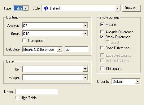
 - Specify the Analysis variable for the table or chart as Q9 (age categories).
- Specify the Break variable for the table or chart as Q10 (gender).
- Select Means & Differences as the Calculate option.
- Specify the Calculate variable as Q5 (amount spent).
- The percentage options on the Analysis Definition dialog box change to difference options.Choose Analysis Difference if you want to see a comparison of the means and difference of men and women of each age group
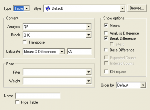
- Choose Break Difference if you want to see a comparison of the means and difference of men in each age category and a separate comparison of the means and difference of women in each of the age groups.Choose Base Difference if you want to see a comparison of the means of each cell with the base mean.
- Click
Apply for DTP Certification Now!!
http://www.vskills.in/certification/Certified-DTP-Operator
