Various diagrams, used are
Pareto charts
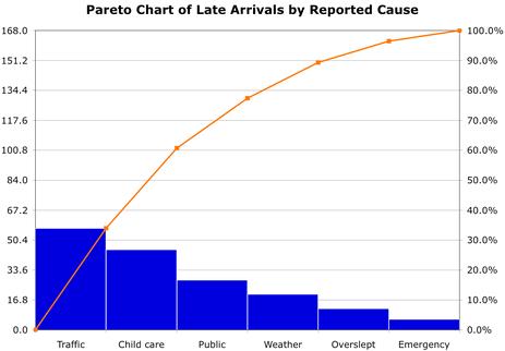
A Pareto chart is a bar chart that has its basis in the Vilfredo Pareto principle. This was built around the idea that only a finite number of the world’s population controls the wealth. The principle has been expanded upon over time to form a true reflection of the “vital few.” The Pareto principle, or the 80/20 principle, argues that on average 20% of the defect causes are actually 80% of the opportunity in any process improvement effort.
It is a type of bar chart in which the horizontal axis represents categories which are usually defects, errors or sources (causes) of defects/errors. The height of the bars can represent a count or percent of errors/defects or their impact in terms of delays, rework, cost, etc.
By arranging the bars from largest to smallest, a Pareto chart determines focusing on which categories will yield the biggest gains if addressed, and which are only minor contributors to the problem. It is the process of ranking opportunities to determine which of many potential opportunities should be pursued first. It is used at various stages in a quality improvement program to determine which step to take next.
The Pareto chart helps to identify the vital few sources of defects, and the mistakes that need to be addressed. The chart is also very useful in analyzing non-numerical data as it allows you to isolate those critical few where you can get the biggest bang for your buck in improvement efforts. When defining project scope, it’s very important that we zero in on the vital few as there is often little time and money to make changes. You use a Pareto chart when variables can be categorized, allowing you to put them into groupings like the sources of defects, or mistakes made by people in a process.
The purpose of the chart is to prioritize problems, assess system changes, and it is a reference of how the current process is performing. Looking at how a process is performing is a very important aspect of Pareto charts. It allows you to take a current state snapshot of how the process is performing and make improvements, then later go back and check the data, re-examine the Pareto chart, and see what changed. This way, you can ensure things got better and that you are doing the right things. Pareto charts are used for assessing the frequency of problems and examining particular items within a broad analysis.
Part of identifying the causes and frequencies of defects involves listing the causes of defects in descending order and then recording the number of defects in order to find the total. To list those causes of defects in descending order, you would categorize the problems and count the frequency of defects in each category. The category with the most defects would be listed as number one, and so on. Once all the categories are listed, the total number of defects can be added. From there, you can find the sum of the defects by dividing the number of defect for each cause by the total.
Pareto Chart Development – It involves the following steps
- Collect data on different types or categories of problems.
- Tabulate the scores.
- Determine the total number of problems observed and/or the total impact. Also determine the counts or impact for each category.
- For small or infrequent problems, add them together into an “other” category
- Sort the problems by frequency or by level of impact.
- Draw a vertical axis and divide into increments equal to the total number observed. Do not make the vertical axis as tall as the tallest bar, which can overemphasize the importance of the tall bars and lead to false conclusions
- Draw bars for each category, starting with the largest and working down.
- The “other” category always goes last even if it is not the shortest bar
Example
In an example of how to calculate the percentage of defects, cause 1 has 50 defects and is divided into the total sum of defects, which is 90. This equals 0.56 or 56%. Cause 2 has 30 defects, which when divided by the total of 90, gives you 0.33 or 33%. Cause 3 has 10 defects, and when you divide that by 90, you get .11 or 11%. You know you did it right when the percentages add up to 100%.
Pareto principle – The fixed-percent method refers to using the Pareto principle for finding the vital few. The principle, also called the 80/20 principle, states that 20% of the causes combined are likely 80% of the challenge that one needs to address and focus on for continuous improvement. This technique is the most accurate if you have valid data.
Cause and Effect Diagram
Cause and effect, or fishbone, diagrams were developed by Kaoru Ishikawa when he was working in the shipyards in Japan before and during World War II. Later Dr. D. Edwards Deming was an associate of Mr. Ishikawa and actually taught this as part of the widespread practice of quality in Japan after World War II. So the cause and effect diagram, or Ishikawa diagram, is very helpful to you in the DMAIC problem-solving cycle by helping you with defining, and understanding what the measure is and then later with analysis of what you were running up against in a project or process.
It helps teams uncover potential root causes by providing structure to cause identification effort. It is also called as fishbone or Ishikawa diagram. It helps in ensuring new ideas being generated during brainstorming by not overlooking any major possible cause. It should be used for cause identification after clearly defining the problem. It is also useful as a cause—prevention tool by brainstorming ways to maintain or prevent future problems.
Developing Cause and Effect Diagram – It involves the following steps
- Name the problem or effect of interest. Be as specific as possible.
- Write the problem at the head of a fishbone “skeleton”
- Decide the major categories for causes and create the basic diagram on a flip chart or whiteboard.
- Typical categories include the manpower, machines, materials, methods, measurements and environment
- Brainstorm for more detailed causes and create the diagram either by working through each category or open brainstorming for any new input.
- Write suggestions onto self-stick notes and arrange in the fishbone format, placing each idea under the appropriate categories.
- Review the diagram for completeness.
- Eliminate causes that do not apply
- Brainstorm for more ideas in categories that contain fewer items
- Discuss the final diagram. Identify causes which are most critical for follow-up investigation.
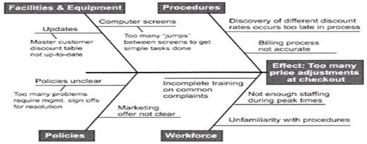
For example, say you are doing a technical support call and you are doing password resets, then you may want to create categories. Maybe you would have a cause and effect diagram depicted – why you failed to do a password reset correctly. Perhaps it has something to do with the knowledge base. Maybe it’s the information the customer is giving you on the call, maybe it’s your technician taking the call, or maybe it’s the software version you are dealing with. The major causes that you are dealing with that can create headaches for you later in the process. The remaining steps are fairly straightforward.
Tree Diagram
They are also similar to cause and effect diagram but tree diagram break down problem progressively in detail by partitioning bigger problem into smaller ones. This partitioning brings a level when the problem seems easy to solve. It is made by starting from right and going towards the left. It is used by quality improvement programs. Sometimes goals are placed on left and resources on right and then both are linked to for achievement of goal.
It starts with single entity which branches into two or more, each of which branch into two or more, and so on. It looks like a tree, with trunk and multiple branches. It is used for known issues whose specific details are to be addressed for achieving an objective. It also assists in listing other solution, detailing processes and probing the root cause of a problem. It is also known as systematic diagram or tree analysis or analytical tree or hierarchy diagram.

There are various types of tree structures. An example is the convergent chain or convergent structure. In this arrangement, the chart appears the other way around. Instead of starting with a large task and breaking it down into smaller pieces, the smaller pieces all build together until one major task is created. This could also look much like a bill of materials.
To create a tree diagram, you begin by defining the process and breaking down the details. Then you continue by defining the criteria for determining when the lowest item has actually been reached or the lowest level in this process has been reached.
Affinity Diagram
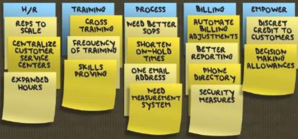
The word affinity means a ‘‘natural attraction’’ or kinship. The affinity diagram organizes ideas into meaningful categories by recognizing their underlying similarity. It reduces data by organizing large inputs into a smaller number of major dimensions, constructs or categories. It organizes facts, opinions and issues into natural groups to help diagnose a complex situation or find themes.
It helps to organize a lot of ideas and identify central themes in them. It is useful when information about a problem is not well organized and solution beyond traditional thinking is needed. It organizes ideas from a brainstorming session in any phase of DMAIC and can find themes and messages in customer statements gleaned from interviews, surveys, or focus groups.
The activity of creating an affinity diagram typically takes place at the end of any idea generation exercise, for example a brainstorming session or a focus group. Perhaps you have suggestions from people that you want to organize logically. The basic structure of the affinity diagram is to put forth the problem statement. Then you create column headers for any logical groupings of ideas that you can find. Finally, you list each idea in its appropriate column.
Affinity diagrams can be used throughout the entire DMAIC process. During a complex Lean Six Sigma project, you could be generating waves of brainstorming many times. This means that affinity diagramming will be used very often.
Developing Affinity Diagram
- Gather inputs from brainstorming session or customer feedbacks.
- Write each input on cards and place them randomly.
- Allow people to silently start grouping the cards.
- When the clustering is done, create a “header” label (on a note or card) for each group.
- Write the theme on a larger self-stick note or card (the “Header”) and place it at top of cluster.
- Continue until all clusters are labeled
- Complete the diagram and discuss the results.
Matrix Diagram
It is also known as matrix or matrix chart as it uses a matrix to display information. The matrix diagram displays relationship amongst two, three or four groups of information like the strength of relationship amongst the group, the roles played by various groups, etc. It helps in analyzing the correlations between groups of information. It enables systematic analysis of correlations. Six different matrix shaped diagram are possible: L, T, Y, X, C and roof–shaped, depending on how many groups must be compared.
Relationship amongst two groups of entities is done by an L–shaped matrix or roof shaped matrix. T–shaped, Y–shaped or C–shaped matrix are used to show relationship amongst three groups and four groups, X–shaped matrix is used. Various matrix types showing relationship is listed below
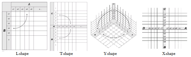
A T-shape matrix has the shape of a “T” that is laid on its side and is used to compare two groups of items to a third group of items. The Y-shape matrix has a “Y” shape and is used to get an idea of what’s going on with the customer requirements versus your internal matrix and departments. The C-shape matrix has a three dimensional shape and is used to compare three groups simultaneously.
Consider a simple matrix diagram that examines some issues with a transport company. You begin by making a list of all the actual problems, which are used as the rows in the matrix diagram. Then, you track affected orders by using the order numbers as the column headers. Wherever an issue affects a specific order, you make a checkmark in the intersecting cell. So at a glance you can begin to understand which factors have the biggest issue or impact on the stated problem. Then, if enough data has been generated, you can do a Pareto analysis to gain further insights.
There are various kinds of symbols that you can use in a matrix diagram. There are relationship, roles or responsibility, and rating scale symbols. The relationship symbols are a circle with a hole in the center to depict strong, a shaded circle to depict medium, a shaded triangle to depict weak, a plus sign for positive, a zero for neutral, and a minus sign for negative. The roles or responsibility symbols are an S for supplier, a C for customer, a D for doer, and an O for owner. The rating scale has the options least important, somewhat important, neutral, quite important, and most important. These options are numbered from 1 to 5, respectively.
