A PivotTable report is an interactive table that you can use to quickly summarize large amounts of data. You can rotate its rows and columns to see different summaries of the source data, filter the data by displaying different pages, or display the details for areas of interest. PivotTable report is an interactive, cross-tabulated Excel report that summarizes and analyzes data, such as database records, from various sources, including ones that are external to Excel.
A user starts with a list in table format, snap the rows and columns into position on a grid, and end up with a sorted, grouped, summarized, totaled, and subtotaled report. PivotTable reports are best for cross-tabulating lists—the more categories, the better. One can reduce a list of thousands of items to a single line, showing totals by category or quarter. Or complex, multilevel groupings can be created that show total sales by employee, grouped by product category and by quarter. The facility to hide or show details are there for each group with a quick double-click. The view or grouping can be changed in seconds, just by dragging items on or off the sheet and moving them between row, column, and page fields.
An individual should start with a list that contains multiple fields, and then use Excel’s PivotTable Wizard to set up a blank PivotTable page with just a few clicks. Instead of sorting the list and entering formulas and functions, drag fields around on the PivotTable page to create a new view of the list—Excel groups the data and adds summary formulas automatically. PivotCharts are the visual equivalent of PivotTables, letting a person create quality charts just as quickly, by dragging fields on a chart layout page.
Unlike subtotals and outlines, which modify the structure of your list to display summaries, PivotTables and PivotCharts create new, independent elements in a workbook. When a person adds or edits data in a list, the changes show up in your PivotTables and PivotCharts as well; because they are separate elements, he/she can easily change the structure of a PivotTable or PivotChart, too, and he/she changes will not interfere with the data in the underlying list. Using interactive Web components, one can also make PivotTables available to other people via a Web browser.
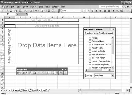
The figure below shows the four main drop zones on a blank PivotTable page. The PivotTable toolbar includes buttons for every field in a list. Use row fields and column fields to define how Excel needs to group the list. Data items define which fields contain the information to summarize. Page fields allow to further refine the view by displaying a separate PivotTable for each item in a group, as though the table were on its own virtual page. The user can use multiple row fields, column fields, or both, and can specify which summary action Excel needs to perform on data items—the sum, average, or count of all related values, for instance.
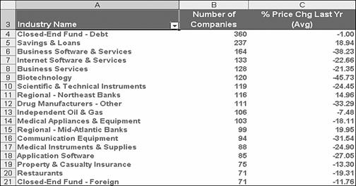
The number of uses is limited only by one’s imagination. Despite their dramatically different structures, for example, each of the following PivotTables started with the same list of information about publicly traded stocks. In its raw form, with its grand total of 106,224 separate data points, the list is a prescription for information overload. Each of the 6,639 rows contains 16 data fields for an individual publicly traded company, including its name, ticker symbol, and industry category, the exchange on which it trades, its high and low stock price for the past year, and financial measurements such as net profit margin and return on equity.
The figure below shows a simple PivotTable to see at a glance how many companies are in each industry category, along with the average increase or decrease in stock price from companies in that category over the past year. This PivotTable consists of a single row field and two data items.
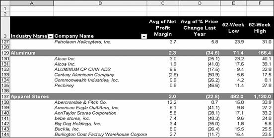
In Figure below, more detail is added, displaying individual statistics for each company, and grouping the detail rows in alphabetical order by industry name. For this PivotTable, the data is arranged in report format, similar to the banded database reports Access and other database management programs produce. Note that this PivotTable includes four data items instead of two, and a slew of Excel formatting options are used to make the report more readable—changing fonts and font sizes, aligning type and adding background shading, and standardizing the number of decimal points in each column.
To hide gridlines and group-related items in bands such as these, choose a report for- mat instead of the default table layout.
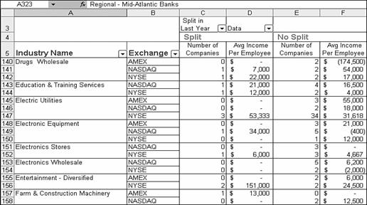
To slice the data even more finely and add an extra analytical dimension, more buttons can be dragged from the PivotTable toolbar to the row and column fields. Each row in the PivotTable is grouped using unique values in two categories, and there are two column headings as well, one for each unique value in the “Split in Last Year” column field. (To make the PivotTable easier to read, the column headings were renamed from Yes and No to Split and No Split.) At the intersection of each row and column in the PivotTable, Excel counts the number of companies and calculates the average income per employee for all rows that match the row and column fields.
The resulting PivotTable, shown in the figure below, is a concise and crystal-clear cross-tabulation, giving a side-by-side analysis of the number of stocks that split in the past year versus those that didn’t, broken down by industry category and exchange.
Add a column field to quickly compare related data points. Notice that the work-sheet pane is frozen to keep headings visible when scrolling, just as with an ordinary worksheet.
There are literally hundreds of options in even a modestly complex PivotTable, but a PivotTable doesn’t have to be large or complex to be effective. The PivotTable in figure below, for example, neatly summarizes more than 100,000 data points in just a few rows and columns.
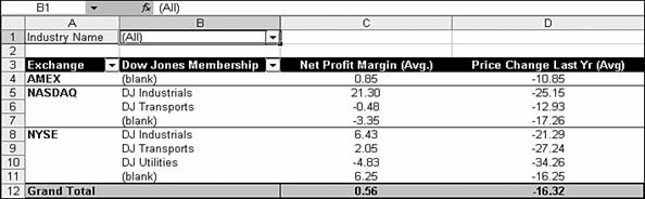
Notice the grand totals under the rows in this PivotTable. Use the page field in the top-left corner to filter the entire list.
To produce this example, two column fields, two row fields, and one page field—a drop-down list were used that lets the user filter the records in the entire table. Choosing (All) from the page field shows a summary of all data in the list; by selecting a different entry from the drop-down list, the same breakdown for each industry name can be shown. Select one category at a time to flip through a series of otherwise identical PivotTables that focus on each category.
The layout Excel produced automatically included totals for each row and column; we kept only the grand total at the bottom of the PivotTable. Other default settings had to be modified as well, including changing the default formula to calculate the average of the data items. To make the headings and totals easier to read, there was some rewording, and then changed fonts and alignment, added shading, and wrapped text.
Creating the pivot table
Use a PivotTable report when you want to compare related totals, especially when you have a long list of figures to summarize and you want to compare several facts about each figure. Use PivotTable reports when you want Microsoft Excel to do the sorting, subtotalling, and totalling for you. In the example above, you can easily see how the third-quarter golf sales in cell F5 stack up against sales for another sport or quarter, or grand total sales. Because a PivotTable report is interactive, you or other users can change the view of the data to see more details or calculate different summaries. Following steps are to be taken for creating a pivot table –
- Open the workbook where you want to create the PivotTable report. If you are basing the report on a Microsoft Excel list or database, click a cell in the list or database.
- On the Data menu, click PivotTable and PivotChart Report.
- In step 1 of the PivotTable and PivotChart Wizard, follow the instructions, and click PivotTable under What kind of report do you want to create?
- Follow the instructions in step 2 of the wizard.
- In step 3 of the wizard, determine whether you need to click Layout.
Do one of the following
- If you clicked Layout in step 3, after you lay out the report in the wizard, click OK in the PivotTable and PivotChart Wizard – Layout dialog box, and then click Finish to create the report.
- If you did not click Layout in step 3, click Finish, and then lay out the report on the worksheet.
- Click inside cell A2 on the spreadsheet
- From Excel’s menu bar, click on Data
- From the menu that drops down, click on PivotTable and PivotChart Report
- The Pivot Table wizard starts up
