HTML5 input validation
HTML5 introduces new attributes for input validation which are safe to use, irrespective of browsers as, the attributes will be safely ignored by any browser if the browser does not understand them. Various attributes are
The placeholder attribute – It provides input controls an easy way to provide descriptive, alternate hint text which is shown only when the user has not yet entered any values. It is provided these days by JavaScript frameworks. It is used by adding it to an input with a text representation. This includes the basic text type, as well as the semantic types such as email, number, url, etc., as
|
HTML code <label>Examiner: <input name=”name” placeholder=”First Name” required></label> |
Browser output
|

In a supporting browser, such as Google Chrome, this causes the field to display a faint version of the placeholder text which will disappear whenever the user or application puts focus into the field, or whenever there is a value present.
The autocomplete attribute – It indicates to the browser to store the value of this input for future or not. It should be used to protect sensitive user data in the browser. It is used as
<input type=”text” name=”creditcard” autocomplete=”off”>
The value on indicates that the field is not secure, and its value can be saved and restored. The value off indicates that the field is secure, and its value should not be saved. If it is not specified then it defaults to “on” value.
The autofocus attribute – It specifies that a given form element should take input focus immediately when the page loads. Only one attribute per page should have it. It’s behavior is undefined if more than one control is set. No value needs to be specified for the true case, as
<input type=”search” name=”criteria” autofocus>
The list attribute and the datalist element – The list attribute and datalist element combine to specify a list of possible values for an input. To use this combination following steps are needed
- Create a datalist element in web page with its id set to a unique value. The datalist can be located anywhere in the document.
- Populate the datalist with as many option elements as needed to represent the full set of suggestions for values of a control like, a datalist representing e-mail contacts should contain all of the contact e-mail addresses as individual option children.
|
HTML code <datalist id=”contactList”> <option value=”x@example.com” label=”Racer X”> <option value=”peter@example.com” label=”Peter”> <option value=”example@codeheaven.org” label=”Asim”> </datalist> |
Browser output
|
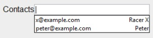
Link the input element to the datalist by setting the list attribute to a value which is the id of the associated datalist.
<input type=”email” id=”contacts” list=”contactList”>
The min and max attributes – They allow a numerical input to be constrained to minimum and maximum values. One, both, or neither of these attributes can be provided as necessary, and the input control should adjust accordingly to increase or decrease the range of acceptable values. For example, to create a range control representing a level of confidence in ability from zero% to 100%, the following code could be used as follows:
|
HTML code <input id=”confidence” name=”level” type=”range” min=”0″ max=”100″ value=”0″> |
Browser output
|
The step attribute – It specifies the granularity of increments or decrements in value as the range is adjusted like confidence level range control can be set up with a step attribute of five as
<input id=”confidence” name=”level” type=”range” min=”0″ max=”100″ step=”5″
value=”0″>
This would limit the acceptable values to increments of five as 0, 5, 10, 15, … 100 either through typed input or through a slider control, depending on the browser representation of the input.
The default step value is one. HTML5 has two functions on the input element that allow the value to be controlled by stepUp and stepDown to increment or decrement the current value by the value of the step.
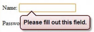
The required attribute – If any input control has the required attribute set, then a value must be set on it before its form can be submitted. If no value is set then the form submission is blocked. It is used by adding to the attribute as
|
HTML code <label for=”name”> Name: <input type=”text” required id=”name” name=”name”/> </label> |
Browser output
|
Apply for HTML5 Certification Now!!
http://www.vskills.in/certification/Certified-HTML5-Developer
