The CONTROL phase is the conclusion of the team’s journey. The GB/BB is responsible for a solid hand-off to the Process Owner to maintain the gains. The primary objective of the DMAIC Control phase is to ensure that the gains obtained during Improve are maintained long after the project has ended. To that end, it is necessary to standardize and document procedures, make sure all employees are trained and communicate the project’s results. In addition, the project team needs to create a plan for ongoing monitoring of the process and for reacting to any problems that arise.
Statistical process control (SPC) is a technique for applying statistical analysis to measure, monitor, and control processes.
Objectives and benefits
The major component of SPC is the use of control charting methods. It had been pioneered by Walter Shewhart in the 1920s and later enhanced by W. Edwards Deming, statistical process control (SPC)is a statistical method for measuring, monitoring, controlling, and improving a process. The basic rule of SPC is to leave the variations from common causes to chance, but to identify and eliminate special causes. Since all processes are subject to variation, SPC relies on the statistical evidence instead of on intuition.
SPC focuses on optimizing continuous improvement by using statistical tools for analyzing data, making inferences about process behavior, and then making appropriate decisions. Variation is defined as “a change in the process data; a characteristic or a function that results from some cause.” Statistical process control begins with the recognition that all processes contain variation. No matter how consistent the production appears to be, measurement of the process data will indicate a level of dispersion or variability in the data. The management and improvement of variation are at the very heart of the strategy of statistical process control.
The basic assumption made in SPC is that all processes are subject to variation. This variation may be classified as one of two types, random or chance cause variation and assignable cause variation. Benefits of statistical process control include the ability to monitor a stable process and identify if changes occur that are due to factors other than random variation. When assignable cause variation does occur, the statistical analysis facilitates identification of the source so that it may be eliminated. The objectives of statistical process control are to determine process capability, monitor processes and identify whether the process is operating as expected or whether the process has changed and corrective action is required.
The objectives of SPC are
- Using the data generated by the process, called the “voice of the process,” to inform the Six Sigma Black Belt and team members when intervention is or is not required.
- Reducing variation, increase knowledge about a process and steer the process in the desired way.
- Detecting quickly the occurrence of special causes of process shifts so that investigation of the process and corrective action may be undertaken before many nonconforming (defective) units are manufactured.
SPC accrues various benefits as it
- Monitor processes for maintaining control
- Detect special causes
- Serve as decision-making aids
- Reduce the need for inspection
- Increase product consistency
- Improve product quality
- Decrease scrap and rework
- Increase production output
- Streamline processes
Important inputs for a statistical process control chart include
- people
- materials
- methods
- equipment
- environment
- measurements
The outputs of the process or system are the product or services rendered. Inputs can be referred to as X-factors, and the variable outputs can be referred to as Y-factors.
Interpretation of control charts may be used as a predictive tool to indicate when changes are required prior to production of out of tolerance material. As an example, in a machining operation, tool wear can cause gradual increases or decreases in a part dimension. Observation of a trend in the affected dimension allows the operator to replace the worn tool before defective parts are manufactured. An additional benefit of control charts is to monitor continuous improvement efforts. When process changes are made which reduce variation, the control chart can be used to determine if the changes were effective. Costs associated with SPC include the selection of the variable(s) or attribute(s) to monitor, setting up the control charts and data collection system, training of operators, and investigation and correction when data values fall outside control limits.
The basic rule of SPC is that variation from common causes (controlled) should be left to chance, but special causes (uncontrolled) should be identified and eliminated. Shewhart called the causes “common” and “assignable” respectively however, the terms common and special are more frequently used today.
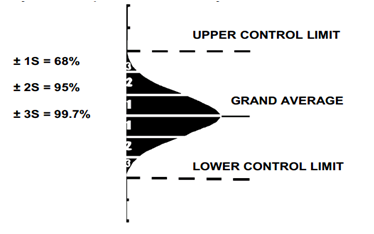
An unstable process refers to a process where your data falls outside of upper and lower control limits. The control plan should specify what is to be done when a process goes out of control, who will be responsible for taking action, and the expected deliverables and outputs of such an unstable process.
Conversely, an “in-control” process refers to a process in which the data points are falling well inside your upper and lower specification limits, and which is not exhibiting significant trends or any kind of shifts that could point to problems.
In stable processes, you will see a normal variation, which would fall well within your expected upper and lower control limits. When dealing with the capability of a process, you should understand the lower and upper specification limits, as well as the process spread for the data inside those lower and upper specification limits.
A stable process will be defined around the Statistical Process Control by the voice of the process, while in the capable process, you’ll be bringing in the voice of the customer to establish the lower and upper specification limits within which you want to plot and understand the voice of the process. In an ideal situation, the data would very rarely hit the lower or upper specification limits, and you wouldn’t have many issues with this particular view of the data.
It is important to note that control limits as used in a stable process are given by the process itself and are calculated using the time ordered process data. In a capable process, you have the specification limits. These limits are supplied by the customer, the business, or regulatory requirements that come from outside the process.
Selection of Variable – The risk of charting many parameters is that the operator will spend so much time and effort completing the charts, that the actual process becomes secondary. When a change does occur, it will most likely be overlooked. In the ideal case, one process parameter is the most critical, and is indicative of the process as a whole. Some specifications identify this as a critical to quality (CTQ) characteristic. CTQ may also be identified as a key characteristic.
Key process input variables (KPIVs) may be analyzed to determine the degree of their effect on a process. For some processes, an input variable such as temperature may be so significant that control charting is mandated. Key process output variables (KPOVs) are candidates both for determining process capability and process monitoring using control charting.
Design of experiments (DOE) and analysis of variance (ANOVA) methods may also be used to identify variable(s) that are most significant to process control.
Because of the Improve Phase of the DMAIC process, the project team has implemented improvements to the variables or inputs (Xs) in the process causing variation in the output (Y). Once these improvements are in place, it is important to monitor the process. Select statistically and practically significant variables for monitoring that are critical to quality (CTQ) when establishing control charts. It is possible to monitor multiple variables using separate control charts.
When you’re using statistical process control (SPC), you’ll find that control charts offer many benefits. In fact, you might be tempted to think that if a control chart can help control a process, charting every characteristic or process variable will allow you to entirely control the process. But it is possible to over-chart. And when you chart too many parameters, there’s a risk that you’ll spend so much time and effort completing the charts, the actual processes you’re monitoring will become secondary. When a change actually does happen, you might overlook it. When you use more than a few charts, the benefits can actually decrease while costs increase. So, it’s vital that you choose the appropriate variables for control charting, and monitor only these.
You should keep in mind a few considerations when selecting variables for SPC
- choose variables that are most difficult to hold or maintain – An example of this is variables that can be directly associated with high defect rates. Another example is variables that are known to exhibit a lot of variation.
- choose variables tied to customer, organizational, or regulatory imperatives – Examples are customer complaints, customer requests, and organizational or regulatory standards.
- choose variables that represent a critical dimension of the product or process – For example, you should consider aspects of a product or process that affect human safety, the environment, or the primary use of the product. Key process variables that impact the product are ideal candidates. These include key process input variables – or KPIVs – and key process output variables, or KPOVs. You should analyze KPIVs to figure out how they affect a process. KPOVs can help you determine process capability and use control charts to monitor the process.
- choose salient or known variables – For example, you might select variables with special cause variation – the root cause of which is known. Or, you could choose variables that can be measured or items that can be counted by the person doing the charting.
Common causes – Common causes are sources of process variation that are inherent in a process over time. A process that has only common causes operating is said to be in statistical control. A common cause is sometimes referred to as a “chance cause” or “random cause”. Examples includes variation in raw material, variation in ambient temperature and humidity, variation in electrical or pneumatic sources, variation within equipment (worn bearings) or variation in the input data
Special causes – Special causes or assignable causes are sources of process variation (other than inherent process variation) periodically disrupting the process. A process that has special causes operating is said to lack statistical control. Examples include tool wear, large changes in raw materials or broken equipment.
Type I SPC Error – It occurs when we treat a behavior as a special cause when no change has occurred in the process. It is also referred to as “over control”.
Type II SPC Error – Occurs when we do not treat a behavior as a special cause when in fact it is a special cause. It is also referred to as under control.
Defect– An undesirable result on a product; also known as “a nonconformity”.
Defective -An entire unit failing to meet specifications; also known as “a nonconformance”.
Rational sub-grouping
Rational sub-grouping is a subset defined by a specific factor. As a sample with variations caused by conditions producing random effects, the rational subgroup identifies and separates variations by special causes. Rational subgroups are our attempt to be sure that we are asking the right questions about the data. Selecting the appropriate control chart to use depends on the subgroups.
A control chart provides a statistical test to determine if the variation from sample to sample is consistent with the average variation within the sample. Generally, subgroups are selected in a way that makes each subgroup as homogeneous as possible. This provides the maximum opportunity for estimating expected variation from one subgroup to another. In production control charting, it is very important to maintain the order of production. Data from a charted process, which shows out of control conditions, may be mixed to create new – R charts which demonstrate remarkable control. By mixing, chance causes are substituted for the original assignable causes as a basis for the differences among subgroups.
There are two types of variation:
- To capture variability within a subgroup, you take samples from one particular source – for instance, four samples taken from the output of a single machine.
- To capture variability between the subgroups, you take samples from a number of sources.
When you’re dealing with variable data and decide to create an Xbar and R chart, you calculate the average – or Xbar – and range – or R – for each subgroup. Then, you plot these on control charts to determine if the variation from subgroup to subgroup is consistent with the average variation within the subgroups.
Usually, you need to select subgroups in a way that ensures they’re as homogeneous as possible. A relatively lower within-subgroup variation allows for maximum chances to observe subgroup to subgroup variations. You need to minimize within-subgroup variations because in the Xbar chart, you use the average of subgroup averages to determine control limits for the entire process.
If you’re interested in variation according to time, location, operator, or other variables, you should choose subgroups with the intention of minimizing variation within each subgroup, while maximizing the chance that subgroups will be different from each other due to variation in underlying conditions.
- In rational subgroups, the observations comprising the subgroup must be independent. This can be challenging for processes that are particularly prone to dependent sampling.
- The observations within a subgroup are from a single, stable process. Consider what would happen if they weren’t; when subgroups are made up of multiple process streams, the within-subgroup variation would be significant compared to the between-subgroup variation.
- The subgroups are formed from observations taken in a time-ordered sequence. You can’t form subgroups from random data – a subgroup has to be a “snapshot” of the process over a small window of time, the optimum size of which is determined on an individual process basis.
Sub-grouping Schemes – Where order of production is used as a basis for sub-grouping, two fundamentally different approaches are possible. The subgroup consists of product all produced as nearly as possible at one time. The subgroup consists of product intended to be representative of all the production over a given period of time.
The second method is sometimes preferred where one of the purposes of the control chart is to influence decisions on acceptance of product. In most cases, more useful information will be obtained from, five subgroups of 5th and from one subgroup of 25. In large subgroups, such as 25, there is likely to be too much opportunity for a process change within the sub-group.
The steps for sub-grouping are
- Select the measurement
- Identify the best data to track.
- Focus on the vital few, not the trivial many.
- Select the best data for a few charts.
- Produce elements of the subgroup in closely similar identical ways.
- Identify number of subgroups
- Establishing rational subgroups is important for dividing observations.
- Compute statistics for each subgroup separately before plotting on the control chart.
- Desire a minimal chance for variations within each subgroup
Sources of Variability – The long term variation in a product will, for convenience, be termed the product (or process) spread. One of the objectives of control charting is to markedly reduce the lot-to-lot variability. The distribution of products flowing from different streams may produce variability’s greater than those of individual streams. It may be necessary to analyze each stream-to-stream entity separately. Another main objective of control charting is to reduce time-to-time variation.
Physical inspection measurements taken at different points on a given unit are referred to as within-piece variability. Another source of variability is the piece-to piece variation. Often, the inherent error of measurement is significant. This error consists of both human and equipment components. The remaining variability is referred to as the inherent process capability.
For example the project team desires to monitor a process that manufactures PET (plastic) bottles for the beverage industry. The bottles are injection-molded on a multi-cavity carousel. The particular carousel contains 4 cavities and the team initially decides to take 3 bottles from each cavity each hour and measure a critical characteristic.
- Option 1 – Every hour, take 3 samples (subgroups) of 4 bottles (n= 4) at random. Plot the process (on one chart).
- Option 2 – Every hour, take 3 samples (subgroups) of 4 bottles (n= 4) or one bottle from each cavity. Plot chart for process on 1 chart.
- Option 3 – Every hour, take 4 samples (subgroups) and 3 bottles (n= 3) with each sample from a different cavity. Plot each cavity on separate charts.
Selection and application of control charts
Control charts are the most powerful tools to analyze variation in most processes – either manufacturing or administrative. Control charts were originated by Walter Shewhart in 1931 with a publication called Economic Control of Quality of Manufactured Product.
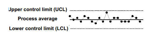
Originated by Walter Shewhart, control charts are a type of graph for studying how a process changes over time. By comparing data points to a central line average, with an upper control limit (UCL) and lower control limit (LCL), users can note variation, track common causes, and seek special causes. Alternative names are “statistical process control charts” and “Shewhart charts”. Run charts display data measures over time without the central line average and the limits.
Control charts using variables data are line graphs that display a dynamic picture of process behavior. Control charts for attributes data require 25 or more subgroups to calculate the control limits. A process which is under statistical control is characterized by plot points that do not exceed the upper or lower control limits. When a process is in control, it is predictable.
Control Chart have various benefits as the addition of calculated control limits facilitates the ability to detect special or assignable causes of variation, the current process is displayed and compared to the improved process by identifying shifts in either average or variation and since every process varies within predictable limits, identifying assignable causes and addressing them will save money.
Control charts are used to control ongoing processes by finding and correcting problems as they occur, to predict the expected range of outcomes from a process, determine if a process is in statistical control, differentiate variation from non-routine events or common causes and determine whether the quality improvement should aim to prevent specific problems or make fundamental process changes.
Types of control charts – Different types of control charts exist depending on the measurement used and two basic categories are
- Variable charts – It is constructed from variable data (data that consists of measurements like weight, length, etc.). Variable data contains more information than data that simply qualifies or counts something. Consequently, variable charts are some of the most powerful tools in quality improvement. In it the samples are taken in 2-10 subgroups at predetermined intervals with the statistic (mean, range, or standard deviation) calculated and recorded on the chart. Various types of variable charts are
- – R Charts (when data is readily available)
- Run Charts (limited single-point data)
- M- MR Charts (moving average/moving range)
- X – MR Charts (I – MR, individual moving range)
- – S Charts (when sigma is readily available)
- Median Charts
- Short Run Charts
- Attribute charts – It Uses attribute data(data that counts items, such as the number of rejects or the number of errors). Control charts based on attribute data are generally less powerful and sometimes more difficult to interpret than variable charts. Samples are taken from lots of material where the number of defective units in the sample are counted (for p and np-charts) or the number of individual defects are counted for a defined unit (c and u-charts). Various types of attribute charts are
- p Charts (for defectives – sample size varies)
- np Charts (for defectives – sample size fixed)
- c Charts (for defects – sample size fixed)
- u Charts (for defects – sample size varies)
The structure of both types of control charts is similar, but the statistical construction of the control limits is quite different due to the differences in the distributions in each.
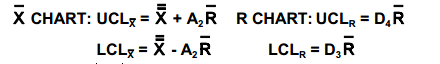
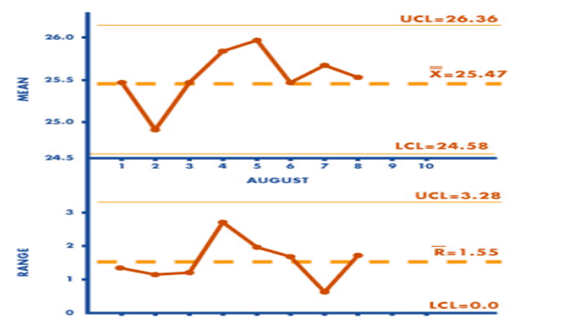
– R Chart – The X and R (average and range chart) is most widely used by many companies as they implement statistical process control. These charts are very useful because they are sensitive enough to detect early signals of process drift or target shift. It’s main advantages are easy to construct and interpret, information from data is needed to perform process capability studies, when a process can be sufficiently monitored by collecting variable data in small subgroups and can be sensitive to process changes and provide early warning; providing opportunity to act before situation worsens. But it has the disadvantage of only being used when data is available to collect in subgroups.
- Plot the data and interpret the chart for special or assignable causes.
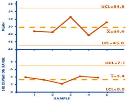
X-Bar and Sigma Charts – X-bar () and sigma (S) charts are often used for increased sensitivity to variation (especially when larger sample sizes are used).The sample standard deviation (S) formula is
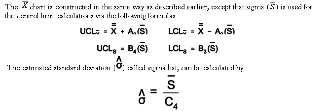
The A3, B3, B4 and C4 factors are based on sample size and are obtained from tables. The and s (average and standard deviation) chart is complex and not used extensively. It has the advantage that, when the subgroup sizes are fairly large (greater than 10), it is often beneficial to consider the average and standard deviation chart, since using the range as the measure of dispersion may not yield a good estimate of process variability and it may also be used when more sensitivity in detecting a process shift is desired, as in the case where the product being manufactured is quite expensive and any change in the process could either cause quality problems or add unnecessary costs. It has the disadvantage that it may issue false signals at a much higher rate than other types of control charts and is complex to construct and use.
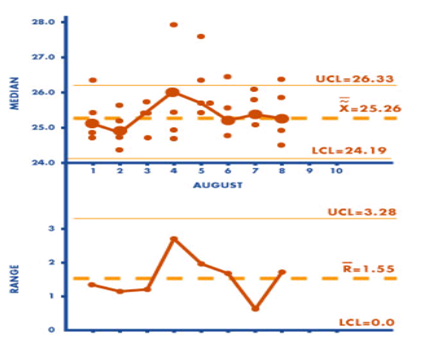
Median (X-tilde and R) Chart – The median control chart or X~ and R chart is calculated using the same formulas as the and R chart. The median control chart is different from the average and range chart in that it is easier to use and requires fewer calculations because the median is plotted rather than the average of the sample. Typically, the ease of using arithmetic is the advantage of using a median chart. It is easy to use, shows the process variation, the median and the spread but has the disadvantage of being less efficient, as exhibiting more variation than the and R chart and difficult to detect trends and other anomalies in the range.
Moving Range – It is because of the type of data available and the situation, various control charts may be applicable. Given the unknowns of future projects and situations, the project team may prefer to use the individual and moving range (X-MR, I-MR) control chart. The project team often use this chart with limited data, such as when production rates are slow, testing costs are very high, or there is a high level of uncertainty relative to future projects. It has also found use where data are plentiful, such as in the case of automatic testing of every unit where no basis exists for establishing subgroups.
M-MR (moving average-moving range) charts are a variation of the -R chart where data is less readily available. There are several construction techniques, the one most sensitive to change is n = 3.Control limits are calculated using the -R formulas and factors.
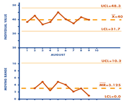
X-MR Chart – The individual and moving range chart (X-MR, I-MR) is applicable when the sample size used for process monitoring is n= 1. X-MR charts are used in various applications like the early stages of a process when one is not quite sure of the structure of the process data, when analyzing every unit, slow production rates with long intervals between observations, when differences in measurements are too small to create an objective difference, when measurements differ only because of laboratory or analysis error or when taking multiple measurements on the same unit (as thickness measurements on different places of a sheet).
Control charts plotting individual readings and a moving range may be used for short runs and in the case of destructive testing. X-MR charts are also known as I -MR, individual moving range charts. The formulas are as

The control limits for the range chart are calculated exactly as for the -R chart. The X-MR chart is the only control chart which may have specification limits shown. M
-MR charts with n = 3 is recommended by the authors when information is limited.
An X-MR (individuals and moving range) chart is useful as, it is made with individual measures (when the subgroup size is one). The X-MR chart is applicable to many different situations, since there are many scenarios when the most obvious subgroup size is one (monthly data, etc.).
It has the advantage of being useful even in a situation with small amounts of data, easy to construct and useful in the early stages of a new process when not much is known about the structure of the data but it has the disadvantage as it cannot discern between common cause and special cause variation.
Attribute Charts – Attributes are discrete, counted data, such as defects or no defects. Only one chart is plotted for attributes.
| Chart | Records | Subgroup size |
| p | Fraction Defective | Varies |
| np | Number of Defectives | Constant |
| c | Number of Defects | Constant |
| u | Number of defects per unit | Varies |
Normally the subgroup size is greater than 50 (for p charts). The average number of defects/defectives is equal to or greater than 4 or 5. The most sensitive attribute chart is the p chart. The most sensitive and expensive chart is the -R.
p-Charts – The p-chart is one of the most-used types of attribute charts. It shows the proportion of defective items in successive samples of equal or varying size. Consider the proportion as the number of defectives divided by the number in the sample. To develop the control limits for a p-chart, consider the case where we are inspecting a variable sample size and recording the number of nonconforming items in each sample.
The p-chart is used when dealing with ratios, proportions, or percentages of conforming or nonconforming parts in a given sample. A good example for a p-chart is the inspection of products on a production line. They are either conforming or nonconforming. The probability distribution used in this context is the binomial distribution with p for the nonconforming proportion and q (which is equal to 1 − p) for the proportion of conforming items. Because the products are only inspected once, the experiments are independent from one another. The first step when creating a p-chart is to calculate the proportion of nonconformity for each sample as p =m/b where, m represents the number of nonconforming items, b is the number of items in the sample, and p is the proportion of nonconformity. The mean proportion is computed as
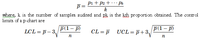
The benefit of the p-chart is that the variations of the process change with the sizes of the samples or the defects found on each sample.
np-Charts – The np-chart, number of defective units, is related to the p-chart. The np-chart is a control chart of the counts of nonconforming items (defectives) in successive samples of constant size. The np-chart can be used in place of the p-chart to plot the counts of non-conforming items (defectives) when there is a constant sample size. In effect, using np-charts involves converting from proportions to a plot of the actual counts.
The np-chart is one of the easiest to build. While the p-chart tracks the proportion of nonconformities per sample, the np-chart plots the number of nonconforming items per sample. The audit process of the samples follows a binomial distribution—in other words, the expected outcome is “good” or “bad,” and therefore the mean number of successes is np. The control limits for an np-chart are

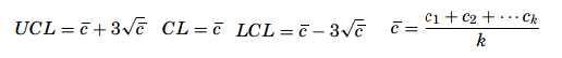
C-Chart – The c-chart is based on Poisson distribution and work with the count of individual defects rather than numbers of defective units. It’s formula assume counting the number of defects in the same area of opportunity. The c in the formulas is the number of defects found in the defined inspection unit, and that is plotted on the chart.
The c-chart monitors the process variations due to the fluctuations of defects per item or group of items. The c-chart is useful for the process engineer to know not just how many items are not conforming but how many defects there are per item. Knowing how many defects there are on a given part produced on a line might in some cases be as important as knowing how many parts are defective. Here, non-conformance must be distinguished from defective items because there can be several nonconformities on a single defective item.
The probability for a nonconformity to be found on an item in this case follows a Poisson distribution. If the sample size does not change and the defects on the items are fairly easy to count, the c-chart becomes an effective tool to monitor the quality of the production process. If c is the average nonconformity on a sample, the UCL and the LCL limits will be given as
U-Chart – It is also based on Poisson distribution and work with the count of individual defects rather than numbers of defective units. With a u-chart, the number of inspection units may vary. The u-chart requires an additional calculation with each sample to determine the average number of defects per inspection unit. The n in the formulas is the number of inspection units in the sample.
The sample sizes can vary when a u-chart is being used to monitor the quality of the production process, and the u-chart does not require any limit to the number of potential defects. Further, for a p-chart or an np-chart the number of nonconformities cannot exceed the number of items on a sample, but for a u-chart it is conceivable because what is being addressed is not the number of defective items but the number of defects on the sample. The first step in creating a u-chart is to calculate the number of defects per unit for each sample as u = c/ n. where u represents the average defect per sample, c is the total number of defects, and n is the sample size. Once all the averages are determined, a distribution of the means is created and then the mean of the distribution is to be computed as
Analysis of control charts
Interpreting control charts is a learned behavior based upon increased process knowledge. No shortcuts exist to becoming competent at the skill of interpreting control charts and it is most certainly not a skill learned without practice. The distinction between common and special causes is critical in statistical process control. For Shewhart and Deming, this distinction is the distinction between a process surrounded by “noise” and one sending a “signal.”
Improving the process is the central goal of using control charts. Control charts provide a “voice of the process” that enables a Black Belt to identify special causes of variation and remove them, thus allowing for a stable and more consistent process. A control chart becomes a useful tool after initial development. After establishing and basing the control limits on a stable, in-control process, charts put in the work area allow operational personnel to monitor the process by collecting data and plotting points on a regular basis. Personnel can act upon the signals from the chart when conditions indicate the process is moving or has gone out of control.
Basic rules for control chart interpretation are
- Specials are any points above the UCL or below the LCL.
- A run violation is seven or more consecutive points on one side of the centerline.
- A 1-in-20 violation is more than one point in twenty consecutive points close to control limits.
- A trend violation is any upward or downward movement of 5 or more consecutive points or drifts of 7 or more points.
You can apply several important rules to test for trends
- Rule 1 – A control chart with points outside the UCL or LCL fails the test and indicates the presence of special cause variation. This trend is commonly known as freaks.
- Rule 2 – A run of nine or more data points in a row on the same side of the center line fails the test. When this happens, it’s known as a “shift” in the process mean where the process moves up or down and stays there for a period. A violation of this rule indicates the presence of special cause variation. This trend is commonly known as “process shift up or down.”
- Rule 3 – A run of six or more data points in a row in steadily increasing or decreasing order fails the test. This trend is commonly known as “process drift up or down.”
- A control chart with fourteen or more data points in a row alternating up and down fails the test. This trend is commonly known as “systematic variation.”
- A control chart that has patterns with fifteen or more data points in a row within one sigma of the center line clustered around the center line, fails the test. This trend is commonly known as “stratification.”
- A control chart demonstrating any other visible recurring patterns or cycles fails the test. Cycles often show up because of the nature of the process, and can include hour of the day, day of the week, or month of the year. They’re often caused when you modify the process inputs or methods following a regular schedule. This trend is commonly known as “recurring cycles.”
If one or more of the trends mentioned earlier are present in a process, you’ll have to analyze possible causes. It’s not enough to identify trends on a control chart. Once you’ve created the chart, you have to respond to the trends that exist. Each of the patterns can indicate specific problems, and you have to take the proper corrective action. The corrective actions that you apply when you discover trends will be very specific to the business or production context that you’re in. Different situations will require different actions.
- Freaks – Freaks are points that are outside the limits. These can occur for several reasons – for example, over control or the use of a variety of materials of different quality can all contribute to this trend. Corrective actions include preventing operators from over adjusting the process, ensuring the variability in machines and operators is reduced to the minimum, and checking into any variation in materials.
- Process shift up or down – When a shift occurs, the average and range shifts up or down over nine or more data points. You might not find any points on the chart that are outside the control lines, but the average and range charts demonstrate shifts in the process average and range. This trend can have many causes, including new machinery or operators, and changes in materials or methods. Corrective actions include ensuring your material supply is consistent, making sure operators use the same methods and instructions over a reasonable period of time, and checking the calibration of the device used for measurements.
- Process drift up or down – Process drift is characterized by the range increasing about three times. Even though the points on the range chart go up and down, there’s still an apparent overall trend. You might find that there aren’t any points that are out of control, and the average chart demonstrates large shifts but remains centered. Corrective actions include maintaining a machine that’s wearing down, finding out why the operator is having problems, training the operator, or repairing a broken tool.
- Systematic variation – The change in range can either be up or down on the control chart. Systematic variation can be hard to detect when you’re performing control chart analysis – there might not be any out-of-control points on the chart. Possible causes for this trend include over control, differences in the methods used for testing, and using materials that are mixed or are of different qualities. Corrective actions include ensuring the control limits are set at the correct levels, checking the testing procedures, determining if inspections should be performed differently or occur more frequently, or standardizing the materials used.
- Stratification – You might find that there aren’t any points out of control. This trend can have many causes, including the control limits being incorrectly calculated, an employee who’s not conducting regular checks, and the process improving since the last time the limits were calculated. Corrective actions include ensuring the checking procedure is being followed and making sure employees are taking measurements properly and following procedures for rational subgrouping.
- Recurring cycles – Recurring cycles can be caused by physical factors, such as humidity or temperature, operator fatigue, periodic rotation of operators, and seasonal effects of incoming material. Corrective actions include adjusting the environmental factors, if possible, regularly maintaining equipment, changing operators when signs of fatigue are evident, and regularly inspecting the input material to ensure its homogeneity.
Process Stability – Before taking appropriate action, a SSBB must identify the state the process. A process can occupy one of 4 states as
- Ideal state – A predictable process fully meeting the requirements.
- Threshold state – A predictable process that is not always meeting the requirements.
- Brink of chaos – An unpredictable process currently meeting the requirements.
- State of chaos – An unpredictable process that is currently not meeting the requirements.
Out-of-control – If a process is “out-of-control,” then special causes of variation are present in either the average chart or range chart, or both. These special causes must be found and eliminated in order to achieve an in-control process. A process out-of-control is detected on a control chart either by having any points outside the control limits or by unnatural patterns of variability.
Usually the following conditions are based on Western Electric Rules for out of control, though the lists of conditions may vary depending on the resource used.
- 1 point more than 3σ from the center line (either side)
- 9 points in a row on the same side of the center line
- 6 points in a row, all increasing or decreasing
- 14 points in a row, alternating up and down
- 2 out of 3 points more than 2σ from the center line (same side)
- 4 out of 5 points more than 1σ from the center line (same side)
- 15 points in a row within 1σ from the center line (either side)
- 8 points in a row more than 1σ from the center line (either side)
The Pre-control Technique – Pre-control was developed by a group of consultants (including Dorin Shainin) in an attempt to replace the control chart. Pre-control is most successful with processes which are inherently stable and not subject to rapid process drifts once they are set up. It can be shown that 86% of the parts will be inside the P-C lines with 7% in each of the outer sections, if the process is normally distributed and Cpk= 1.
The chance that two parts in a row will fall outside either P-C line is 1/7 times 1/7, or 1/49.This means that only once in every 49 pieces can we expect to get two pieces in a row outside the P-C lines just due to chance.
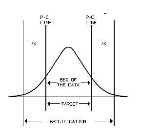
Pre-control is a simple algorithm based on tolerances which is used for controlling a process. Pre-control is a method of detecting and preventing failures and assumes the process is producing a measurable product, with varying characteristics according to some distribution. Pre-control zones include halfway between the target and each specification limit. Each zone between the lines has colors resembling a traffic signal with green (acceptable), yellow (alert), and red (unacceptable).
The Pre-control utilizes process capability limits instead of specification limits to set the green, yellow, and red zones and is therefore considered more robust than the traditional use of pre-control charts. The limits of each zone are calculated based on the distribution of the characteristic measured, not on the tolerances. Units that fall in the yellow or red zones trigger an alarm before defects are produced. Pre-control rules are as follows
- Rule 1 – If two parts are in the green zone, take no action – continue to run.
- Rule 2 – If the first part is in the green or yellow zones, then check the second part. If second part is in the green zone, then continue to run. If first part is in the yellow zone and the second part is also in the yellow zone on the same side, adjust the process. If first part is in the yellow zone and the second part is also in the yellow zone on the opposite side, stop and investigate the process.
- Rule 3 – If any part is in the red zone, then stop. Investigate, adjust, or reset the process. Re-qualify the process and begin again with Rule 1.
It has the advantage of easy to implement and interpret, being used in initial setup operations to determine if the product is centered between the tolerances, easy to detect shifts in process centering or increases in process spread and it serves as a set up plan for short production runs. But, it has the disadvantages of lacking information about how to reduce variability or how to return the process into control, too limited to use for process with a capability ratio greater than 1.0 and small sample size limits the ability of the chart to detect moderate to large shifts.
Runs Test for Randomness – A run is a sequence of data that exhibit the same characteristic. Time sequence analysis can apply to both variable and attribute data. As an example, results of surveys of individuals who prefer Diet Pepsi or Diet Coca Cola
Test I PPPPPPPPPCCCCCCCCC
Test II PCPCPCPCPCPCPCPCPC
In both examples, eighteen samples were taken. Test I, there were only 2 runs. In Test II, there were 18 runs. Both examples suggest non-random behavior. To perform a runs test
- Determine the value of n1 and n2(either the total of two attributes or the readings above and below the center line on a run or control chart).
- Determine the number of runs (R).
- Consult a critical value table or calculate a test statistic.
Consult the Critical Value Table for the expected numbers of runs. The expected number of runs can be approximated by adding the smallest and largest values together and dividing by two.
Short-Run SPC – Short-run or low-volume production is common in manufacturing systems and includes manufacturing processes that produce built-to-order products or quick turnaround production. The short-run control chart can also be used in other industries such as general services and healthcare when data are collected infrequently. These processes often are so short that not enough data can be collected to construct standard control charts.
Statistical process control techniques have been developed to accommodate short-run production for both variables data and attributes data. Examples of control charts for both situations are presented. If possible, collect approximately 20 samples before constructing the control charts for short production runs are constructed. In the examples presented in this subtopic, ten samples will be used for illustration purposes.
A short-run SPC chart is used in two situations.
- When the organization produces a low volume of outputs
- When the process itself only lasts a short time, providing a small amount of data that’s insufficient to ensure a statistically reliable determination of process control
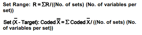
Short run charting may be desirable when the production lot size is extremely small (10-20) pieces or when the sample size, under typical operating conditions, is small. Two limited data charts may be used X – MR Charts M- MR Charts.
The emphasis has been on short runs and multiple variables per chart. Consider a part which has four key dimensions. Each dimension has a different target but expected similar variances. The for each variable are coded by subtracting the target value. Calculating Centerlines is done as
Exponentially Weighted Moving Average (EWMA) – The exponentially weighted moving average (EWMA) is a statistic for monitoring a process by averaging the data in a way that gives less and less weight to data as they are further removed in time. By the choice of a weighting factor, 8, the EWMA control procedure can be made sensitive to a small or gradual drift in the process. The statistic that is calculated is

where, EWMA0is the mean of historical data (target), Yt is the observation at time t, n is the number of observations to be monitored including EWMA0, 0 < l <= 1 is a constant that determines the depth of memory of the EWMA . It is a variable control chart where each new result is averaged with the previous average value using an experimentally determined weighting factor, λ (lambda).
The parameter, l determines the rate at which “older” data enters into the calculation of the EWMA statistic. A large value of l gives more weight to recent data and a small value of8 gives more weight to older data. The value of 8 is usually set between 0.2 and 0.3 although this choice is somewhat arbitrary. The estimated variance of the EWMA statistic is approximately
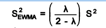
when t is not small, and where s is the standard deviation calculated from the historical data. The center line for the control chart is the target value or EWMA0.The control limits are
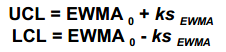
Where the factor k is either set equal to 3 or chosen using the Lucas and Saccucci tables. The data are assumed to be independent and these tables also assume a normal population.
It usually only averages plotted and range omitted and the action signal, a single point out of limits. It is also known as the Geometric Moving Average (GMA) chart and used extensively in time-series modeling and in forecasting. It allows the user to detect smaller shifts in the process than with traditional control charts and is ideal to use with individual observations.
CUSUM Charts – It is called as the cumulative sum control chart (CUSUM) and is used with variable data and calculates the cumulative sum of the deviations from target to detect shifts in the level of the measurement. It may be suitable when necessary to detect small process shifts faster than with a comparable Shewhart control chart.
The chart is effective with samples of size n= 1 where rational subgroups are frequently of size one. Examples of utilization are in the chemical and process industries and in discrete parts manufacturing. The CUSUM chart can be graphical (V-mask) or tabular (algorithmic) and unlike standard charts, all previous measurements for CUSUM charts are included in the calculation for the latest plot. But, establishing and maintaining the CUSUM chart is complicated.
V-mask – A V-mask resembles a sideways V. The chart is used to determine whether each plotted point falls within the boundaries of the V-mark. Points falling outside are considered to signal a shift in the process mean. Each time a point is plotted, the V-mask is shifted to the right. The geometry associated with the construction of the V-mask is based on a combination of specified and computed values. The graph below shows how the formulas relate.
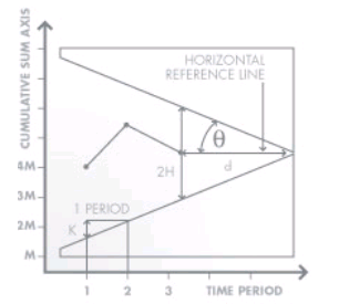
The behavior of the V-Mask is determined by the distance k (which is the slope of the lower arm) and the rise distance h. The team could also specify d and the vertex angle (or, as is more common in the literature, q = 1/2 the vertex angle). For an alpha and beta design approach, we must specify
- a, the probability of concluding that a shift in the process has occurred, when in fact it did not.
- b, the probability of not detecting that a shift in the process mean has, in fact, occurred.
- d(delta), the detection level for a shift in the process mean, expressed as a multiple of the standard deviation of the data points.
These charts have been shown to be more efficient in detecting small shifts in the mean of a process than Shewhart charts. They are better to detect 2 sigma or less shifts in the mean. To create a CuSum chart, collect m sample groups, each of size n, and compute the mean of each sample. Determine Sm or S’m from the following equations
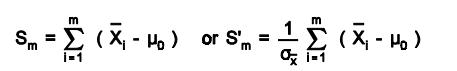
where, m0 is the estimate of the in-control mean andsx is the known (or estimated) standard deviation of the sample means. The CuSum control chart is formed by plotting Sm or S’m as a function of m. If the process remains in control, centered at m0, the CuSum plot will show variation in a random pattern centered about zero.
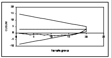
A visual procedure proposed by Barnard, known as the V-Mask, may be used to determine whether a process is out of control. A V-Mask is an overlay V shape that is superimposed on the graph of the cumulative sums. As long as all the previous points lie between the sides of the V, the process is in control.
For example a process has an estimated mean of 5.000 with h set at 2 and k at 0.5.As h and k are set to smaller values, the V-Mask becomes sensitive to smaller changes in the process average. Consider the following 16 data points, each of which is average of 4 samples (m=16, n=4). The CuSum control chart with 16 data groups and shows the process to be in control.
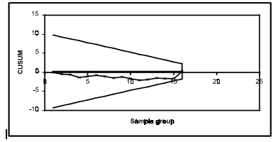
If data collection is continued until there are 20 data points (m=20, n=4), the CuSum control chart shows the process shifted upward, as indicated by data points 16, 17 and 18 below the lower arm of the V-Mask.