Transitions
CSS transitions, which are part of the CSS3 set of specifications, provide a way to control animation speed when changing CSS properties. Instead of having property changes take effect immediately, you can cause the changes in a property to take place over a period of time. For example, if you change the color of an element from white to black, usually the change is instantaneous. With CSS transitions enabled, changes occur at time intervals that follow an acceleration curve, all of which can be customized.
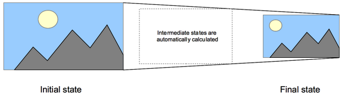
Animations that involve transitioning between two states are often called implicit transitions as the states in between the start and final states are implicitly defined by the browser.
CSS transitions let you decide which properties to animate (by listing them explicitly), when the animation will start (by setting a delay), how long the transition will last (by setting a duration), and how the transition will run (by defining a timing function, e.g. linearly or quick at the beginning, slow at the end).
CSS transition properties can be used without any prefix provider, but since the specification has only recently achieved stability, the vendor prefixes can still be necessary for browsers based on WebKit. They are also necessary for compatibility with older browser versions (e.g.: Firefox 15 and earlier, Opera 12 and earlier). A compatibility table is available at the bottom of this page with more information.
Animatable CSS properties – The Web author can define which property has to be animated and in which way. This allows the creation of complex transitions. As it doesn’t make sense to animate some properties, the list of animatable properties is limited to a finite set. The set of properties that can be animated is subject to change. Developers should proceed with caution.
Also the auto value is often a very complex case. The specification asks not to animate from and to such a value. Some user agents, like those based on Gecko, implement this requirement and others, like those based on WebKit, are less strict. Using animations with auto may lead to unpredictable results, depending on the browser and its version, and should be avoided.
Care should also be taken when using a transition immediately after adding the element to the DOM using .appendChild() or removing its display: none; property. This is seen as if the initial state had never occurred and the element was always in its final state. The easy way to overcome this limitation is to apply a window.setTimeout() of a handful of milliseconds before changing the CSS property you intend to transition to.
Multiple animated properties example
HTML Content
<body>
<p>The box below combines transitions for: width, height, background-color, transform. Hover over the box to see these properties animated.</p>
<div class=”box”></div>
</body>
CSS Content
.box {
border-style: solid;
border-width: 1px;
display: block;
width: 100px;
height: 100px;
background-color: #0000FF;
-webkit-transition:width 2s, height 2s, background-color 2s, -webkit-transform 2s;
transition:width 2s, height 2s, background-color 2s, transform 2s;
}
.box:hover {
background-color: #FFCCCC;
width:200px;
height:200px;
-webkit-transform:rotate(180deg);
transform:rotate(180deg);
}
CSS Properties
CSS Transitions are controlled using the shorthand transition property. This is the best way to configure transitions, as it makes it easier to avoid that the lengths of the parameter list are out of sync, which can be very frustrating to have to spend lots of time debugging the CSS.
You can control the individual components of the transition with the following sub-properties:
- transition-property – Specifies the name or names of the CSS properties to which transitions should be applied. Only properties listed here are animated during transitions; changes to all other properties occur instantaneously as usual.
- transition-duration – Specifies the duration over which transitions should occur. You can specify a single duration that applies to all properties during the transition, or multiple values to allow each property to transition over a different period of time.
- transition-timing-function – Specifies a function to define how intermediate values for properties are computed. Timing functions determine how intermediate values of the transition are calculated. Most timing functions can be specified by providing the graph of the corresponding function, as defined by four points defining a cubic bezier.
- transition-delay – Defines how long to wait between the time a property is changed and the transition actually begins.
The shorthand CSS syntax is written as follows:
div {
transition: <property> <duration> <timing-function> <delay>;
}
Detecting the completion of a transition
There is a single event that is fired when transitions complete. In all standard-compliant browser, the event is transitionend, in WebKit it is webkitTransitionEnd. See the compatibility table at the bottom for more. The transitionend event offers two properties:
- propertyName – A string indicating the name of the CSS property whose transition completed.
- elapsedTime – A float indicating the number of seconds the transition had been running at the time the event fired. This value isn’t affected by the value of transition-delay.
As usual, you can use the element.addEventListener() method to monitor for this event:
el.addEventListener(“transitionend”, updateTransition, true);
The transitionend event doesn’t fire if the transition is aborted because the animating property’s value is changed before the transition is completed.
Different lengths of property value lists
If any property’s list of values is shorter than the others, its values are repeated to make them match. For example:
div {
transition-property: opacity, left, top, height;
transition-duration: 3s, 5s;
}
This is treated as if it were:
div {
transition-property: opacity, left, top, height;
transition-duration: 3s, 5s, 3s, 5s;
}
Similarly, if any property’s value list is longer than that for transition-property, it’s truncated, so if you have the following CSS:
div {
transition-property: opacity, left;
transition-duration: 3s, 5s, 2s, 1s;
}
This gets interpreted as:
div {
transition-property: opacity, left;
transition-duration: 3s, 5s;
}
A simple example
This example performs a four-second font size transition with a two-second delay between the time the user mouses over the element and the beginning of the animation effect:
#delay1 {
position: relative;
transition-property: font-size;
transition-duration: 4s;
transition-delay: 2s;
font-size: 14px;
}
#delay1:hover {
transition-property: font-size;
transition-duration: 4s;
transition-delay: 2s;
font-size: 36px;
}
Using transitions when highlighting menus
A common use of CSS is to highlight items in a menu as the user hovers the mouse cursor over them. It’s easy to use transitions to make the effect even more attractive.
Before we look at code snippets, you might want to take a look at the live demo (assuming your browser supports transitions). You can also take a look directly at the CSS it uses.
First we set up the menu using HTML:
<div class=”sidebar”>
<p><a class=”menuButton” href=”home”>Home</a></p>
<p><a class=”menuButton” href=”about”>About</a></p>
<p><a class=”menuButton” href=”contact”>Contact Us</a></p>
<p><a class=”menuButton” href=”links”>Links</a></p>
</div>
Then we build the CSS to implement the look and feel of our menu. The relevant portions are shown here:
.menuButton {
position: relative;
transition-property: background-color, color;
transition-duration: 1s;
transition-timing-function: ease-out;
text-align: left;
background-color: grey;
left: 5px;
top: 5px;
height: 26px;
color: white;
border-color: black;
font-family: sans-serif;
font-size: 20px;
text-decoration: none;
box-shadow: 2px 2px 1px black;
padding: 2px 4px;
border: solid 1px black;
}
.menuButton:hover {
position: relative;
transition-property: background-color, color;
transition-duration: 1s;
transition-timing-function: ease-out;
background-color:white;
color:black;
box-shadow: 2px 2px 1px black;
}
This CSS establishes the look of the menu, with the background and text colors both changing when the element is in its :hover state.
Instead of describing the effect at length, you can take a look at the live sample if your browser has transitions support.
Using transitions to make JavaScript functionality smooth
Transitions are a great tool to make things look much smoother without having to do anything to your JavaScript functionality. Take the following example.
<p>Click anywhere to move the ball</p>
<div id=”foo”></div>
Using JavaScript you can make the effect of moving the ball to a certain position happen:
var f = document.getElementById(‘foo’);
document.addEventListener(‘click’, function(ev){
f.style.left = (ev.clientX-25)+’px’;
f.style.top = (ev.clientY-25)+’px’;
},false);
With CSS you can make it smooth without any extra effort. Simply add a transition to the element and any change will happen smoothly:
p {
padding-left: 60px;
}
#foo {
border-radius: 50px;
width: 50px;
height: 50px;
background: #c00;
position: absolute;
top: 0;
left: 0;
transition: all 1s;
}
Animation
CSS animations make it possible to animate transitions from one CSS style configuration to another. Animations consist of two components, a style describing the CSS animation and a set of keyframes that indicate the start and end states of the animation’s style, as well as possible intermediate waypoints along the way. There are three key advantages to CSS animations over traditional script-driven animation techniques
- They’re easy to use for simple animations; you can create them without even having to know JavaScript.
- The animations run well, even under moderate system load. Simple animations can often perform poorly in JavaScript (unless they’re well made). The rendering engine can use frame-skipping and other techniques to keep the performance as smooth as possible.
- Letting the browser control the animation sequence lets the browser optimize performance and efficiency by, for example, reducing the update frequency of animations running in tabs that aren’t currently visible.
Configuring the animation – To create a CSS animation sequence, you style the element you want to animate with the animation property or its sub-properties. This lets you configure the timing and duration of the animation, as well as other details of how the animation sequence should progress. This does not configure the actual appearance of the animation, which is done using the @keyframes at-rule. The sub-properties of the animation property are
- animation-delay – Configures the delay between the time the element is loaded and the beginning of the animation sequence.
- animation-direction – Configures whether or not the animation should alternate direction on each run through the sequence or reset to the start point and repeat itself.
- animation-duration – Configures the length of time that an animation should take to complete one cycle.
- animation-iteration-count – Configures the number of times the animation should repeat; you can specify infinite to repeat the animation indefinitely.
- animation-name – Specifies the name of the @keyframes at-rule describing the animation’s keyframes.
- animation-play-state – Lets you pause and resume the animation sequence.
- animation-timing-function – Configures the timing of the animation; that is, how the animation transitions through keyframes, by establishing acceleration curves.
- animation-fill-mode – Configures what values are applied by the animation before and after it is executing.
Defining the animation sequence using keyframes – Once you’ve configured the animation’s timing, you need to define the appearance of the animation. This is done by establishing two or more keyframes using the @keyframes at-rule. Each keyframe describes how the animated element should render at a given time during the animation sequence.
Since the timing of the animation is defined in the CSS style that configures the animation, keyframes use a percentage to indicate the time during the animation sequence at which they take place. 0% indicates the first moment of the animation sequence, while 100% indicates the final state of the animation. Because these two times are so important, they have special aliases: from and to. Both are optional. If from/0% or to/100% is not specified, the browser starts or finishes the animation using the computed values of all attributes.
You can optionally include additional keyframes that describe intermediate steps along the way from the starting point to the ending point of the animation.
Examples – The examples here don’t use any prefix on the animation CSS properties. WebKit-based browsers and older version of the other browsers may need prefixes; the live examples you can click to see in your browser also include the -webkit prefixed versions.
Making text slide across the browser window – This simple example styles the <h1> element so that the text slides in from off the right edge of the browser window.
h1 {
animation-duration: 3s;
animation-name: slidein;
}
@keyframes slidein {
from {
margin-left: 100%;
width: 300%;
}
to {
margin-left: 0%;
width: 100%;
}
}
The style for the <h1> element here specifies that the animation should take 3 seconds to execute from start to finish, using the animation-duration property, and that the name of the @keyframes at-rule defining the keyframes for the animation sequence is named “slidein”.
If we wanted any custom styling on the <h1> element to appear in browsers that don’t support CSS animations, we would include it here as well; however, in this case we don’t want any custom styling other than the animation effect.
The keyframes are defined using the @keyframes at-rule. In this case, we have just two keyframes. The first occurs at 0% (using the alias from). Here, we configure the left margin of the element to be at 100% (that is, at the far right edge of the containing element), and the width of the element to be 300% (or three times the width of the containing element). This causes the first frame of the animation to have the header drawn off the right edge of the browser window.
The second (and final) keyframe occurs at 100% (using the alias to). The left margin is set to 0% and the width of the element is set to 100%. This causes the header to finish its animation flush against the left edge of the content area.
Adding another keyframe – Let’s add another keyframe to the previous example’s animation. Let’s say we want the header’s font size to increase as it moves from right to left for a while, then to decrease back to its original size. That’s as simple as adding this keyframe:
75% {
font-size: 300%;
margin-left: 25%;
width: 150%;
}
This tells the browser that 75% of the way through the animation sequence, the header should have its left margin at 25% and the width should be 150%.
Making it repeat – To make the animation repeat itself, simply use the animation-iteration-count property to indicate how many times to repeat the animation. In this case, let’s use infinite to have the animation repeat indefinitely:
h1 {
animation-duration: 3s;
animation-name: slidein;
animation-iteration-count: infinite;
}
Making it move back and forth – That made it repeat, but it’s very odd having it jump back to the start each time it begins animating. What we really want is for it to move back and forth across the screen. That’s easily accomplished by setting animation-direction to alternate:
h1 {
animation-duration: 3s;
animation-name: slidein;
animation-iteration-count: infinite;
animation-direction: alternate;
}
Using animation events – You can get additional control over animations — as well as useful information about them — by making use of animation events. These events, represented by the AnimationEvent object, can be used to detect when animations start, finish, and begin a new iteration. Each event includes the time at which it occurred as well as the name of the animation that triggered the event.
We’ll modify the sliding text example to output some information about each animation event when it occurs, so we can get a look at how they work.
Adding the CSS – We start with creating the CSS for the animation. This animation will last for 3 seconds, be called “slidein”, repeat 3 times, and alternate direction each time. In the @keyframes, the width and margin-left are manipulated to make the element slide across the screen.
.slidein {
-moz-animation-duration: 3s;
-webkit-animation-duration: 3s;
animation-duration: 3s;
-moz-animation-name: slidein;
-webkit-animation-name: slidein;
animation-name: slidein;
-moz-animation-iteration-count: 3;
-webkit-animation-iteration-count: 3;
animation-iteration-count: 3;
-moz-animation-direction: alternate;
-webkit-animation-direction: alternate;
animation-direction: alternate;
}
@-moz-keyframes slidein {
from {
margin-left:100%;
width:300%
}
to {
margin-left:0%;
width:100%;
}
}
@-webkit-keyframes slidein {
from {
margin-left:100%;
width:300%
}
to {
margin-left:0%;
width:100%;
}
}
@keyframes slidein {
from {
margin-left:100%;
width:300%
}
to {
margin-left:0%;
width:100%;
}
}
Adding the animation event listeners – We’ll use JavaScript code to listen for all three possible animation events. This code configures our event listeners; we call it when the document is first loaded in order to set things up.
var e = document.getElementById(“watchme”);
e.addEventListener(“animationstart”, listener, false);
e.addEventListener(“animationend”, listener, false);
e.addEventListener(“animationiteration”, listener, false);
e.className = “slidein”;
This is pretty standard code; you can get details on how it works in the documentation for element.addEventListener(). The last thing this code does is set the class on the element we’ll be animating to “slidein”; we do this to start the animation.
Why? Because the animationstart event fires as soon as the animation starts, and in our case, that happens before our code runs. So we’ll start the animation ourselves by setting the class of the element to the style that gets animated after the fact.
Receiving the events – The events get delivered to the listener() function, which is shown below.
function listener(e) {
var l = document.createElement(“li”);
switch(e.type) {
case “animationstart”:
l.innerHTML = “Started: elapsed time is ” + e.elapsedTime;
break;
case “animationend”:
l.innerHTML = “Ended: elapsed time is ” + e.elapsedTime;
break;
case “animationiteration”:
l.innerHTML = “New loop started at time ” + e.elapsedTime;
break;
}
document.getElementById(“output”).appendChild(l);
}
This code, too, is very simple. It simply looks at the event.type to determine which kind of animation event occurred, then adds an appropriate note the <ul> (unordered list) we’re using to log these events. The output, when all is said and done, looks something like this:
- Started: elapsed time is 0
- New loop started at time 3.01200008392334
- New loop started at time 6.00600004196167
- Ended: elapsed time is 9.234000205993652
The times are very close to, but not exactly, those expected given the timing established when the animation was configured. Note also that after the final iteration of the animation, the animationiteration event isn’t sent; instead, the animationend event is sent.
The HTML
Just for the sake of completeness, here’s the HTML that displays the page content, including the list into which the script inserts information about the received events:
<body>
<h1 id=”watchme”>Watch me move</h1>
<p>This example shows how to use CSS animations to make <code>H1</code> elements
move across the page.</p>
<p>In addition, we output some text each time an animation event fires, so you can see them in action.</p>
<ul id=”output”>
</ul>
</body>
