Px or Pixel
It is useful for display on screen. It is measured relative to the computer screen’s settings of the resolution as 1px on a resolution of 800 x 600 is larger than 1px on resolution of 1024 x 768. It is used as
font: 12px sans-serif;
em or Font Size Relative
It is widely used. It being relative to the font size facilitates designs to scale up and down as per the user’s font size preferences. Browsers have means for scaling the font size up or down hence, changing the size of an em and values based on em units. It is used as
font-size: 2em;
% or Percentage
They depend on another element’s measurement, like font size or width or height of containing element. It is relative to either the property and/or value used in percentage measurement for or other CSS applied to the web page.
Ex or Height of the Lowercase Letter “x”
It is relative to the height of the lowercase letter “x”. It can be inconsistent across different fonts, so it is neither used for display design nor for print style sheets for which em or pt are used.
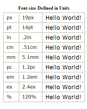
Most of CSS is influenced by length and units. Usually for display on a screen pixel is used as computers display images in pixels. Units of lengths in CSS are explained in the figure
