Angular’s animation system lets you build animations that run with the same kind of native performance found in pure CSS animations. You can also tightly integrate your animation logic with the rest of your application code, for ease of control.
Angular animations are built on top of the standard Web Animations API and run natively on browsers that support it.
Animatable properties and units
Since Angular’s animation support builds on top of Web Animations, you can animate any property that the browser considers animatable. This includes positions, sizes, transforms, colors, borders, and many others. The W3C maintains a list of animatable properties on its CSS Transitions page.
For positional properties that have a numeric value, you can define a unit by providing the value as a string with the appropriate suffix:
- ’50px’
- ‘3em’
- ‘100%’
If you don’t provide a unit when specifying dimension, Angular assumes the default of px:
- 50 is the same as saying ’50px’
States and transitions
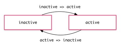
Angular animations are defined as logical states and transitions between states. An animation state is a string value that you define in your application code. In the example above, the states ‘active’ and ‘inactive’ are based on the logical state of hero objects. The source of the state can be a simple object attribute, as it was in this case, or it can be a value computed in a method. The important thing is that you can read it into the component’s template.
You can define styles for each animation state:
src/app/hero-list-basic.component.ts
state(‘inactive’, style({
backgroundColor: ‘#eee’,
transform: ‘scale(1)’
})),
state(‘active’, style({
backgroundColor: ‘#cfd8dc’,
transform: ‘scale(1.1)’
})),
These state definitions specify the end styles of each state. They are applied to the element once it has transitioned to that state, and stay as long as it remains in that state. In effect, you’re defining what styles the element has in different states.
After you define states, you can define transitions between the states. Each transition controls the timing of switching between one set of styles and the next:
src/app/hero-list-basic.component.ts
transition(‘inactive => active’, animate(‘100ms ease-in’)),
transition(‘active => inactive’, animate(‘100ms ease-out’))
If several transitions have the same timing configuration, you can combine them into the same transition definition:
src/app/hero-list-combined-transitions.component.ts
transition(‘inactive => active, active => inactive’,
animate(‘100ms ease-out’))
When both directions of a transition have the same timing, as in the previous example, you can use the shorthand syntax <=>:
src/app/hero-list-twoway.component.ts
transition(‘inactive <=> active’, animate(‘100ms ease-out’))
You can also apply a style during an animation but not keep it around after the animation finishes. You can define such styles inline, in the transition. In this example, the element receives one set of styles immediately and is then animated to the next. When the transition finishes, none of these styles are kept because they’re not defined in a state.
src/app/hero-list-inline-styles.component.ts
transition(‘inactive => active’, [
style({
backgroundColor: ‘#cfd8dc’,
transform: ‘scale(1.3)’
}),
animate(’80ms ease-in’, style({
backgroundColor: ‘#eee’,
transform: ‘scale(1)’
}))
]),
