Data visualization involves the creation and study of the visual representation of data, or information that has been abstracted in some schematic form, including attributes or variables for the units of information.
A primary goal of data visualization is to communicate information clearly and efficiently to users via the statistical graphics, plots, information graphics, tables, and charts selected. Effective visualization helps users in analyzing and reasoning about data and evidence. It makes complex data more accessible, understandable and usable.
The images may include interactive capabilities, enabling users to manipulate them or drill into the data for querying and analysis. Indicators designed to alert users when data has been updated or predefined conditions occur can also be included.
Well-crafted data visualization helps uncover trends, realize insights, explore sources, and tell stories. Author Stephen Few, defines two types of data, which are used in combination to support a meaningful analysis or visualization:
- Categorical: Text labels describing the nature of the data, such as “Name” or “Age”. This term also covers qualitative (non-numerical) data.
- Quantitative: Numerical measures, such as “25” to represent the age in years.
Two primary types of information displays are tables and graphs.
- A table contains quantitative data organized into rows and columns with categorical labels. It is primarily used to look up specific values. In the example above, the table might have categorical column labels representing the name (a qualitative variable) and age (a quantitative variable), with each row of data representing one person (the sampled experimental unit or category subdivision).
- A graph is primarily used to show relationships among data and portrays values encoded as visual objects (e.g., lines, bars, or points). Numerical values are displayed within an area delineated by one or more axes. These axes provide scales (quantitative and categorical) used to label and assign values to the visual objects. Many graphs are also referred to as charts.
The rate at which data is generated has increased, driven by an increasingly information-based economy. Data created by internet activity and an expanding number of sensors in the environment, such as satellites and traffic cameras, are referred to as “Big Data”. Processing, analyzing and communicating this data present a variety of ethical and analytical challenges for data visualization.
Data visualization is both an art and a science. There are a few basic concepts that can help you generate the best visuals for displaying your data:
- Understand the data you are trying to visualize, including its size and cardinality (the uniqueness of data values in a column).
- Determine what you are trying to visualize and what kind of information you want to communicate.
- Know your audience and understand how it processes visual information.
- Use a visual that conveys the information in the best and simplest form for your audience.
Visualizations should
- show the data
- induce the viewer to think about the substance rather than about methodology, graphic design, the technology of graphic production or something else
- avoid distorting what the data has to say
- present many numbers in a small space
- make large data sets coherent
- encourage the eye to compare different pieces of data
- reveal the data at several levels of detail, from a broad overview to the fine structure
- serve a reasonably clear purpose: description, exploration, tabulation or decoration
- be closely integrated with the statistical and verbal descriptions of a data set.
Table
A table consists of an ordered arrangement of rows and columns. This is a simplified description of the most basic kind of table. Certain considerations follow from this simplified description:
- the term row has several common synonyms (e.g., record, k-tuple, n-tuple, vector);
- the term column has several common synonyms (e.g., field, parameter, property, attribute);
- a column is usually identified by a name;
- a column name can consist of a word, phrase or a numerical index;
- the intersection of a row and a column is a cell.
The elements of a table may be grouped, segmented, or arranged in many different ways, and even nested recursively. Additionally, a table may include metadata, annotations, a header, a footer or other ancillary features.
Simple Table – The following illustrates a simple table with three columns and seven rows. The first row is not counted, because it is only used to display the column names. This is traditionally called a “header row”.
| First name | Last name | Age |
| Tinu | Elejogun | 14 |
| Blaszczyk | Kostrzewski | 25 |
| Lily | McGarrett | 16 |
| Olatunkboh | Chijiaku | 22 |
| Adrienne | Anthoula | 22 |
| Axelia | Athanasios | 22 |
| Jon-Kabat | Zinn | 22 |
Multi-dimensional table – The concept of dimension is also a part of basic terminology. Any “simple” table can be represented as a “multi-dimensional” table by normalizing the data values into ordered hierarchies. A common example of such a table is a multiplication table.
| × | 1 | 2 | 3 |
| 1 | 1 | 2 | 3 |
| 2 | 2 | 4 | 6 |
| 3 | 3 | 6 | 9 |
In large tables, vertical lines or light shading can be useful to help the reader differentiate the columns and rows. Most people find design with the fewest grid lines, easiest to read.
Cross-Tabluation
It is about taking two variables and tabulating the results of one variable against the other variable. For example, suppose you wanted to see if there is a relationship between the gender of the survey responder and if sex education in high school is important.
Using the survey data, you can count the number of males and females who said that sex education is important, and the number of males and females who said that sex education is not important. Suppose that there are 300 females and 300 males who completed the survey. Here is what our cross tabulation looks like:
A cross-tabulation gives you a basic picture of how two variables inter-relate. It helps you search for patterns of interaction. Obviously, if certain cells contain disproportionately large (or small) numbers of cases, then this suggests that there might be a pattern of interaction.
Charts
Charting also helps in data analysis and can understand the trends also. Charts used to represents worksheet data can be stored on chart sheets. These chart sheets can be printed, viewed or edited separately. It is also possible to embed them in the current sheet. Excel allows us to create charts in two or three dimensions based on data.
Histograms – It shows frequencies in data as adjacent rectangles, erected over intervals with an area proportional to the frequency of the observations in the interval. They are frequency column graphs that display a static picture of process behavior and require a minimum of 50-100 data points. It is characterized by the number of data points that fall within a given bar or interval or frequency. It enables the user to visualize how the data points spread, skew and detect the presence of outliers. A stable process which is predictable, usually shows a histogram with bell-shaped curves which is not shown with unstable process even though shapes like exponential, lognormal, gamma, beta, Poisson, binomial, geometric, etc. are a stable process.
The construction of a histogram starts with the division of a frequency distribution into equal classes, and then each class is represented by a vertical bar. They are used to plot the density of data especially of continuous data like weight or height.
Run Charts – It displays how a process performs over time as data points are plotted in chronological order and connected as a line graph. It is useful in detection of variation or problem trend or pattern as it is evident in run charts when shift occurs that’s why, it is also called as trend charts. It can displays sequential data for spotting patterns and abnormalities. It is used for monitoring and communicating process performance. It is usually used for displaying performance data over time or for showing tabulations.
Even though trends observable on the run chart might not signify deviation as it might be under normal limits but, usually it indicates a trend or shift or a cycle. When a run chart exhibits seven or eight points successively up or down, then a trend is clearly present in the data.
Developing Run Chart
- Sequence the input data against time and order the data from lowest to highest.
- Calculate the median and the range.
- Make the Y-axis scale 1.5 to 2 times the range and of X-axis 2 to 3 times against Y-axis.
- Depict the median by a dotted line.
- Plot the points and connect them to form a line graph.
Scatter Diagram – It is displays multiple XY coordinate data points represent the relationship between two different variables on X and Y-axis. It is also called as correlation chart. It depicts the relationship strength between an independent variable on the vertical axis and a dependent variable on the horizontal axis. It enables strategizing on how to control the effect of the relationship on the process. It is also called scatter plots, X-Y graphs or correlation charts.
Developing Scatter Diagram
- Collect data for both variables.
- Draw a graph with the independent variable on the horizontal axis (x) and the dependent variable on the vertical axis (y).
- For each pair of data, plot a dot (or symbol) where the x-axis value intersects the y-axis value.
There are various types of charts, which are discussed as under –
An area chart emphasizes the magnitude of change over time. By displaying the sum of the plotted values, an area chart also shows the relationship of parts to a whole.
In this example, an area chart emphasizes increased sales in Washington and illustrates the contribution of each state to total sales.
3-D column Chart
In this 3-D chart, you can compare four quarters of sales performance in Europe with the performance of two other divisions.
A line chart shows trends in data at equal intervals. As shown in the figure below
A pie chart shows the proportional size of items that make up a data series to the sum of the items. It always shows only one data series and is useful when you want to emphasize a significant element. As shown in the figure below
A Pie Chart
To make small slices easier to see, you can group them together as one item in a pie chart and then break down that item in a smaller pie or bar chart next to the main chart.
A surface chart is useful when you want to find optimum combinations between two sets of data. As in a topographic map, colours and patterns indicate areas that are in the same range of values.
In a radar chart, each category has its own value axis radiating from the center point. Lines connect all the values in the same series.
A radar chart compares the aggregate values of a number of data series. In this chart, the data series that covers the most area, Brand A, represents the brand with the highest vitamin content.
A bubble chart is a type of xy (scatter) chart. The size of the data marker indicates the value of a third variable. To arrange your data, place the x values in one row or column, and enter corresponding y values and bubble sizes in the adjacent rows or columns.
A Bubble Chart
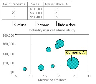
The chart in this example shows that Company A has the most products and the greatest market share, but not the highest sales.
Learn and become a Certified Inventory and Warehouse Analytics Professional
