Database Management
What is a database?
A database is a system of storing data. But in MS-EXCEL terminology vis-à-vis a database, the columns in the list are the fields in the database. The column labels in the list are the field names in the database. Each row in the list is a record in the database.
What is Database Management?
It refers to managing of data in a database i.e. adding, removing, updating, sorting data in a database.
Sort the database
Using one sort column
Following steps have to be taken
- Click a cell in the column you would like to sort by.
- Click Sort Ascending on the standard toolbar.
Using two, three or more sort column
Following steps have to be taken
- Click a cell in the list you want to sort.
- On the Data menu, click Sort.
- In the Sort by and Then by boxes, click the columns you want to sort.
- If you need to sort by more than three columns, sort by the least important columns first. For example, if your list contains employee information and you need to organize it by Department, Title, Last Name, and First Name, sort the list twice. First, click First Name in the Sort by box and sort the list. Second, click Department in the Sort by box, click Title in the first Then by box, and click Last Name in the second Then by box, and sort the list.
- Select any other sort options you want, and then click OK.
Repeat steps if needed, using the next most important columns.
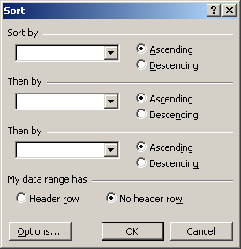
Sort dialog box
Basics of list
A series of worksheet rows that contain related data, such as an invoice database or a set of client names and phone numbers. A list can be used as a database, in which rows are records and columns are fields. The first row of the list has labels for the columns.
Finding records
Using the criteria button
Your worksheet should have at least three blank rows above the list that can be used as a criteria range. The list must have column labels. Then the following steps are to be taken
- Select the column labels from the list for the columns that contain the values you want to filter, and click Copy.
- Select the first blank row of the criteria range, and click Paste.
- In the rows below the criteria labels, type the criteria you want to match. Make sure there is at least one blank row between the criteria values and the list.
- Click a cell in the list.
- On the Data menu, point to Filter, and then click Advanced Filter.
- To filter the list by hiding rows that don’t match your criteria, click Filter the list, in-place. To filter the list by copying rows that match your criteria to another area of the worksheet, click Copy to another location, click in the Copy to box, and then click the upper-left corner of the area where you want to paste the rows.
- In the Criteria range box, enter the reference for the criteria range, including the criteria labels. To move the Advanced Filter dialog box out of the way temporarily while you select the criteria range, click Collapse Dialog.
We can name a range Criteria, and the reference for the range will appear automatically in the Criteria range box. You can also define the name Database for the range of data to be filtered and define the name Extract for the area where you want to paste the rows, and these ranges will appear automatically in the List range and Copy to boxes, respectively. When you copy filtered rows to another location, you can specify which columns to include in the copy. Before filtering, copy the column labels for the columns you want to the first row of the area where you plan to paste the filtered rows. When you filter, enter a reference to the copied column labels in the Copy to box. The copied rows will then include only the columns for which you copied the labels.
For alphabetic information
To find rows in a list that contain an exact value, type the text, number, date, or logical value in the cell below the criteria label. For example, if you type 98133 below a Postal Code label in the criteria range, Microsoft Excel displays only rows that contain the postal code value “98133.”
When you use text as criteria with an advanced filter, Microsoft Excel finds all items that begin with that text. For example, if you type the text Dav as a criterion, Microsoft Excel finds “Davolio,” “David,” and “Davis.” To match only the specified text, type the following formula, where text is the text you want to find.
=”=text”
Using Wildcards
To find text values that share some characters but not others, use a wildcard character. A wildcard character represents one or more unspecified characters.
| Use | To find |
| ? (question mark) | Any single character in the same position as the question mark For example, sm?th finds “smith” and “smyth” |
| * (asterisk) | Any number of characters in the same position as the asterisk For example, *east finds “Northeast” and “Southeast” |
| ~ (tilde) followed by ?, *, or ~ | A question mark, asterisk, or tilde. For example, fy91~? finds “fy91?” |
For Numeric Information
To display only rows that fall within certain limits, type a comparison operator, followed by a value, in the cell below the criteria label. For example, to find rows whose unit values are greater than or equal to 1,000, type >=1000 under the Units criteria label in the criteria range.
Adding a record
Following steps are to be taken –
- Click a cell in the list you want to add the record to.
- On the Data menu, click Form.
- Click New.
- Type the information for the new record. To move to the next field, press TAB. To move to the previous field, press SHIFT+TAB.
- When you finish typing data, press ENTER to add the record. When you finish adding records, click Close to add the new record and close the data form.
Deleting a record
When you delete a record by using a data form, you cannot undo the deletion. The record is permanently deleted. Then following steps are to be taken
- Click a cell in the list.
- On the Data menu, click Form.
- Find the record you want to delete.
- Click Delete.
Filter and multiple filter
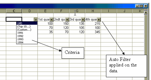
Filtering is a quick and easy way to find and work with a subset of data in a list. A filtered list displays only the rows that meet the criteria you specify for a column. Microsoft Excel provides two commands for filtering lists
When you use the AutoFilter command, AutoFilter arrows appear to the right of the column labels in the filtered list. Clicking an AutoFilter arrow displays a list of all unique, visible items in the column, including blanks (all spaces) and nonblanks. By selecting an item from a list for a specific column, you can instantly hide all rows that don’t contain the selected value. You use custom AutoFilter to display rows that contain either one value or another. You can also use custom AutoFilter to display rows that meet more than one condition for a column, such as rows that contain values within a specific range (such as values between 2,000 and 3,000).
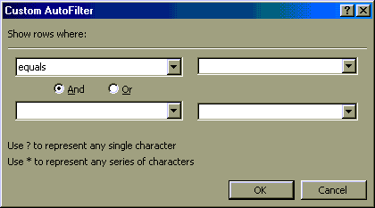
Finding specific values in rows in a list by using one or two comparison criteria for the same column, point to Filter on the Data menu, click AutoFilter, click the arrow in the column that contains the data you want to compare, and then click Custom. Then,
- To match one criterion, click the comparison operator you want to use in the first box under Show rows where, and then enter the value you want to match in the box immediately to the right of the comparison operator.
- To display rows that meet two conditions, enter the comparison operator and value you want, and then click the And button. In the second comparison operator and value boxes, enter the operator and value you want.
- To display rows that meet either one condition or another condition, enter the comparison operator and value you want, and then click the Or button. In the second comparison operator and value boxes, enter the operator and value you want
This is illustrated in the given figure
Automatic filter options
| To | Click |
| Display all rows | All |
| Display all rows that fall within the upper or lower limits you specify, either by item or percentage | Top 10 |
| Apply two criteria values within the current column, or use comparison operators other than AND (the default operator) | Custom |
| Display only rows that contain a blank cell in the column | Blanks |
| Display only rows that contain a value in the column | NonBlanks |
Summarizing data
Microsoft Excel provides several ways to summarize values on your worksheet. You can create formulas that summarize data in columns, use tools that generate reports that summarize data in lists, and create PivotTable and PivotChart reports that summarize the data and allow you to interactively change the view of the data. There are various methods to summarize the data. Each of them has been discussed below
Methods to be applied on a worksheet –
- Show a total for a range – When you want to select a range of cells and quickly see a total of their values (without entering the sum on your worksheet), look at the status bar. There, the Auto Calculate feature displays the sum of a selected range. If the selected range contains hidden cells or cells that are hidden by filtering, the hidden values are not included in the sum.
- Insert totals – By using the AutoSum button, you can insert a formula that calculates the total value for a range. Learn about inserting totals.
- Create a simple formula that’s based on a condition – You can create formulas that calculate a total value based on a condition, such as the total of all sales when the invoice amount is more than $500.
Overview of subtotals in lists
Subtotalling on a list can be done and hence a summary can be generated.
- Create subtotals that summarize data – You can automatically calculate subtotals of values in a list. For example, if your list contains sales amounts for salespeople in different regions, you can calculate subtotal values for each region and for each salesperson. Learn about creating lists on worksheets.
- Use database functions to summarize columns – Is the data in your worksheet similar to a database, with columns of related information? Excel provides several database functions that summarize only those values that meet complex criteria, such as “provide a count of the records where sales are greater than 1,000 but less than 2,500.”
Creating interactive summary reports
In it summarizing is done by generation of reports.
- Summarize data with PivotTable reports – A PivotTable report is an interactive table that you can use to quickly summarize the data in a large list of data. You can quickly change the layout and format of a PivotTable report by dragging items where you want them.
- Graphically summarize data with PivotChart reports – A PivotChart report combines the visual appeal of a chart with the interactive summary and layout advantages of a PivotTable report.
A PivotTable report is an interactive table that you can use to quickly summarize large amounts of data. You can rotate its rows and columns to see different summaries of the source data, filter the data by displaying different pages, or display the details for areas of interest.
Creating the pivot table
Use a PivotTable report when you want to compare related totals, especially when you have a long list of figures to summarize and you want to compare several facts about each figure. Use PivotTable reports when you want Microsoft Excel to do the sorting, subtotalling, and totalling for you. In the example above, you can easily see how the third-quarter golf sales in cell F5 stack up against sales for another sport or quarter, or grand total sales. Because a PivotTable report is interactive, you or other users can change the view of the data to see more details or calculate different summaries. Following steps are to be taken for creating a pivot table –
- Open the workbook where you want to create the PivotTable report. If you are basing the report on a Microsoft Excel list or database, click a cell in the list or database.
- On the Data menu, click PivotTable and PivotChart Report.
- In step 1 of the PivotTable and PivotChart Wizard, follow the instructions, and click PivotTable under What kind of report do you want to create?
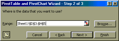
- Follow the instructions in step 2 of the wizard.
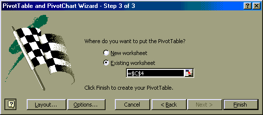
- In step 3 of the wizard, determine whether you need to click Layout.
Do one of the following
- If you clicked Layout in step 3, after you lay out the report in the wizard, click OK in the PivotTable and PivotChart Wizard – Layout dialog box, and then click Finish to create the report.
- If you did not click Layout in step 3, click Finish, and then lay out the report on the worksheet.
As illustrated in the figures
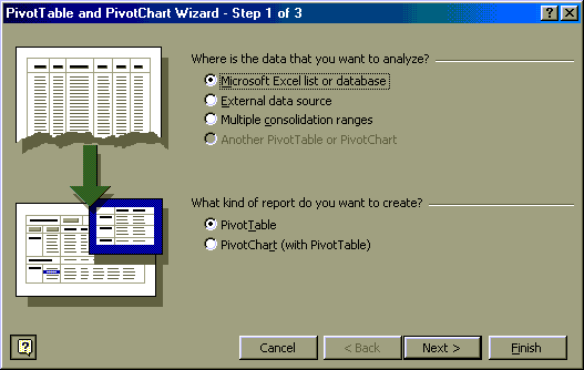
Step 1 of Wizard
Step 2 of Wizard
Step 3 of Wizard
Working with graphs and charts
Introduction to Chart
Charting also helps in data analysis and can understand the trends also. Charts used to represents worksheet data can be stored on chart sheets. These chart sheets can be printed, viewed or edited separately. It is also possible to embed them in the current sheet. Excel allows us to create charts in two or three dimensions based on data. Charts toolbar helps we take complete control over every element of chart. Excel’s chart Wizard can make decisions for us.
- Worksheet Data
- Chart created on the worksheet data
- Chart data series
- Axis values
- Category Names
- Data Marker
- Data Marker in the chart with the same pattern
Charts are visually appealing and make it easy for users to see comparisons, patterns, and trends in data. For instance, rather than having to analyse several columns of worksheet numbers, you can see at a glance whether sales are falling or rising over quarterly periods, or how the actual sales compare to the projected sales.
We can create a chart on its own sheet or as an embedded object on a worksheet. We can also publish a chart on a Web page. To create a chart, you must first enter the data for the chart on the worksheet. Then select that data and use the Chart Wizard to step through the process of choosing the chart type and the various chart options. We can also create a chart in one step without using the Chart Wizard. When created this way, the chart uses a default chart type and formatting that can be changed later.
Axis values
Microsoft Excel creates the axis values from the worksheet data. Note that the axis values in the example above range from 0 to 140000, which encompasses the range of values on the worksheet. Unless you specify differently, Excel uses the format of the upper-left cell in the value range as the number format for the axis.
Category names
Excel uses column or row headings in the worksheet data for category axis names. In the example above, the worksheet row headings 1st Quarter, 2nd Quarter, and so on appear as category axis names. You can change whether Excel uses column or row headings for category axis names or create different names.
Chart data series names
Excel also uses column or row headings in the worksheet data for series names. Series names appear in the chart legend. In the example above, the row headings Projected and Actual appear as series names. You can change whether Excel uses column or row headings for series names or create different names.
Data markers
Data markers with the same pattern represent one data series. Each data marker represents one number from the worksheet. In the example above, the rightmost data marker represents the Actual 4th Quarter value of 120000.
Tick Marks and grid lines
Tick marks are short lines that intersect with an axis to separate parts of a series scale or category. These are lines scaled according to the values on the axis and they help to read the value of individual data points.
Data Labels
They are displayed to show the value of the data point.
Data Markers
They are used to distinguish one data series from another.
Making embedded or chart sheet charts using chart wizards
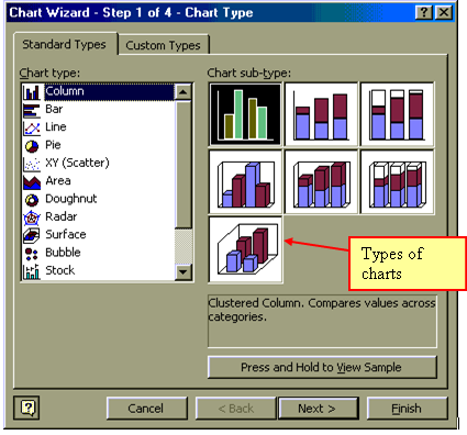
Click the chart wizards to work and drag the icon attached to it at a location in the worksheet where the chart has to be placed. After deciding the location on the worksheet, dialog box of chart wizard step 1 of 4 appears on the screen. In this step, we have to select the worksheet area whose data is to be charted. This will be indicated by absolute references. Manual entry can also be made by clicking on the NEXT button to move to next step.
In the dialog box, steps 1 of 4 we have to select the chart type among the alternatives, Click NEXT to go for the next step.
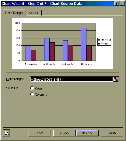
Step 2 of 4 will guide us to select the data range or series column or row wise.
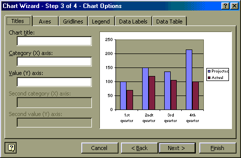
In step 3 of 4, we will have to give the names of the x-axis, y-axis, chart name, legends etc.
And in the last step 4 of 4 we will have to select the location for the chart
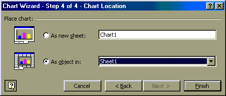
Click finish complete chart is displayed on the desired location.
We can create a chart on its own chart sheet or as an embedded chart on a worksheet. Either way, the chart is linked to the source data on the worksheet, which means the chart, is updated when you update the worksheet data.
- An embedded chart is considered a graphic object and is saved as part of the worksheet on which it is created. Use embedded charts when you want to display or print one or more charts with your worksheet data.
- A chart sheet is a separate sheet within your workbook that has its own sheet name. Use a chart sheet when you want to view or edit large or complex charts separately from the worksheet data or when you want to preserve screen space as you work on the worksheet.
Move and resize chart
In most charts, you can use the mouse to resize and move the chart area, (The entire chart and all its elements.) The plot area, (In a 2-D chart, the area that’s bounded by the axes and includes all data series. In a 3-D chart, the area that’s bounded by the axes and includes the data series, category names, tick-mark labels, and axis titles.) and the legend (a box that identifies the patterns or colours that are assigned to the data series or categories in a chart.). Microsoft Excel automatically sizes titles to accommodate their text. You can move titles with the mouse but you cannot resize them. Following steps are to be taken to move or resize charts
- Click the chart item you want to move or resize.
- To move an item, point to the item, and then drag it to another location.
Updating charts
The values in a chart are linked to the worksheet from which the chart is created. The chart is updated when you change the data on the worksheet. Then, following steps have to be taken
- Open the worksheet that contains the data plotted in the chart.
- In the cell that contains the value you want to change, type a new value.
- Press ENTER.
Changing the chart types
Following steps have to be taken
- Click the chart.
- On the Chart menu, click Chart Type.
- On the Standard Types or Custom Types tab, click the chart type you want.
To apply the cone, cylinder, or pyramid chart type to a 3-D bar or column data series, click Cylinder, Cone, or Pyramid in the Chart type box on the Standard Types tab, and then select the Apply to selection check box.
Adding titles, gridlines and formatting legends
Adding the chart title
Following steps have to be taken
- Click the chart to which you want to add a title.
- On the Chart menu, click Chart Options, and then click the Titles tab.
- To add a chart title, click in the Chart title box, and then type the text you want.
Adding the gridlines
Pie and doughnut charts do not have gridlines. Following steps have to be taken
- Click the chart to which you want to add gridlines.
- On the Chart menu, click Chart Options, and then click the Gridlines tab.
- Select the check boxes for the gridlines you want to display.
When you click one of the Placement options, the legend moves, and the plot area automatically adjusts to accommodate it. If you move and size the legend by using the mouse, the plot area does not automatically adjust. When you use the Placement options, the legend loses any custom sizing you may have already applied by using the mouse.
