Correspondence analysis (CA) is a multivariate statistical technique proposed by Hirschfeld and later developed by Jean-Paul Benzécri. It is conceptually similar to principal component analysis, but applies to categorical rather than continuous data. In a similar manner to principal component analysis, it provides a means of displaying or summarising a set of data in two-dimensional graphical form.
All data should be nonnegative and on the same scale for CA to be applicable, and the method treats rows and columns equivalently. It is traditionally applied to contingency tables — CA decomposes the chi-squared statistic associated with this table into orthogonal factors. Because CA is a descriptive technique, it can be applied to tables whether or not the χ² statistic is appropriate.
It is a statistical technique that provides a graphical representation of cross tabulations (which are also known as cross tabs, or contingency tables). Cross tabulations arise whenever it is possible to place events into two or more different sets of categories, such as product and location for purchases in market research or symptom and treatment in medical testing.
Example
Consider the following list of seventeenth- and eighteenth-century writers.

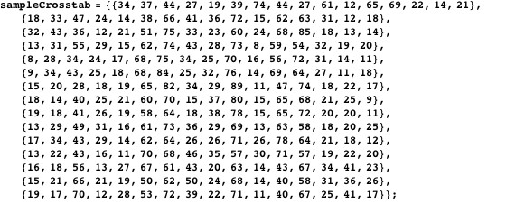
Imagine that we are given two fragments of text written by one or two of these writers, and charged with identifying the true author(s). To make things interesting, imagine also that the only information we are given about an unidentified fragment of text is the frequency with which certain letters appear in it. Accordingly, I have taken three distinct samples of about 1000 characters each from the writings of each these authors, and added up the number of times each of the following characters appears in each of the samples (restricting ourselves to less than the complete alphabet prevents the tables in the rest of the discussion from becoming unwieldy; the characters chosen happen to occur with middling frequency in all the texts as a whole).

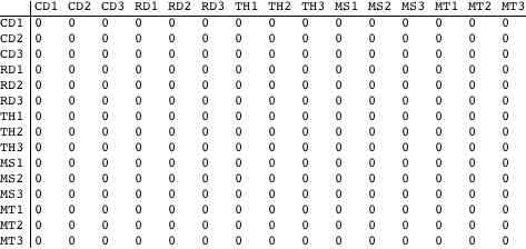
This is the cross tabulation.
![]() Calculations
Calculations
Is it possible to say with reasonable certainty that the distribution of letters differs significantly from sample to sample (i.e., from row to row in the cross tab)? The usual means of answering such questions is Pearson’s test for independence; it tests whether a cross tab deviates significantly from one in which rows and columns are independent. In our case, independence would imply that the letters occur with the same frequency in all of the text samples.
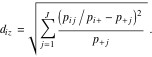
Assume that the cross tab under examination is described formally by the ![]() matrix
matrix ![]() . We derive the correspondence matrix p from F by dividing its entries by their grand total.
. We derive the correspondence matrix p from F by dividing its entries by their grand total. ![]() (1)
(1)
Next, define row and column totals:
 (2)
(2)
The ![]() statistic,
statistic, ![]() , is calculated:
, is calculated:
![]() (3)
(3)
Here ![]() is an estimate of an entry’s value assuming independence:
is an estimate of an entry’s value assuming independence:
![]() (4)
(4)
If rows and columns really are independent (i.e., “under the null hypothesis”), ![]() should follow a
should follow a ![]() distribution with
distribution with ![]() degrees of freedom.
degrees of freedom.
Thus there is (almost) no probability under the null hypothesis of observing a statistic as large as the one actually observed, and indeed only a 1% probability of seeing a value about half as large. According to the ![]() test, therefore, there is a statistically significant difference in the distribution of letters across the samples.
test, therefore, there is a statistically significant difference in the distribution of letters across the samples.
Unfortunately, the ![]() test by itself does not provide a solution to the problem of distinguishing the works of the different authors. Though it establishes that the distribution of letters differs significantly from one sample to another, it does not tell us whether the samples of one author differ from those of other authors more than they differ from each other, nor does it allow us to characterize the authors in terms of the distribution of letters in their works. Answers to these questions are provided by correspondence analysis.
test by itself does not provide a solution to the problem of distinguishing the works of the different authors. Though it establishes that the distribution of letters differs significantly from one sample to another, it does not tell us whether the samples of one author differ from those of other authors more than they differ from each other, nor does it allow us to characterize the authors in terms of the distribution of letters in their works. Answers to these questions are provided by correspondence analysis.
![]() Distances
Distances
For the purposes of correspondence analysis, the differences between the distributions of letters in the text samples—which you will recall are given in the rows of the cross tab—are measured by so-called ![]() distances, which are weighted Euclidean distances between normalized rows (calculated by dividing row entries by their respective row total), with weights inversely proportional to the square roots of the column totals. In symbols, the
distances, which are weighted Euclidean distances between normalized rows (calculated by dividing row entries by their respective row total), with weights inversely proportional to the square roots of the column totals. In symbols, the ![]() distance between row
distance between row ![]() and row
and row ![]() is given by the expression:
is given by the expression:
 (5)
(5)
This computes the ![]() distances between the text samples using the correspondence matrix and displays them in a reasonably compact table (after scaling up by 100 and rounding).
distances between the text samples using the correspondence matrix and displays them in a reasonably compact table (after scaling up by 100 and rounding).
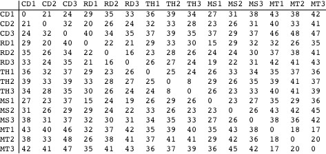
Certain characteristics of the samples can be detected in the table above. For example, it appears that the Mark Twain (MT) texts form a relatively isolated group, in that the distances from the MT samples to each other are considerably smaller than from the MT samples to those of other authors. By itself, however, the table does little to make apparent the overall pattern of the distances—something done in the next section. Before that, however, here is a little more on the nature of ![]() distances.
distances.
As their name suggests, ![]() distances are closely related to the
distances are closely related to the ![]() statistic of the previous section. To show how they are related, consider the “average” row—termed the centroid or barycenter in correspondence analysis—whose entries are simply the column totals
statistic of the previous section. To show how they are related, consider the “average” row—termed the centroid or barycenter in correspondence analysis—whose entries are simply the column totals
![]() (6)
(6)
From equation (5), since the row total for the centroid is 1 (by the definition of P), the ![]() distance of row i to the centroid is
distance of row i to the centroid is
 (7)
(7)
Now ![]() with as defined in (4)
with as defined in (4)
![]() (8)
(8)
Drawing an analogy with the physical concept of angular inertia, correspondence analysis defines the inertia of a row as the product of the row total (which is referred to as the row’s mass) and the square of its distance to the centroid, ![]() Comparing the expression for
Comparing the expression for ![]() in (5) with definition of the
in (5) with definition of the ![]() statistic in (3), it follows that the total inertia of all the rows in a contingency matrix is equal to the
statistic in (3), it follows that the total inertia of all the rows in a contingency matrix is equal to the ![]() statistic divided by
statistic divided by ![]() a quantity known as Pearson’s mean-square contingency, denoted ø2 :
a quantity known as Pearson’s mean-square contingency, denoted ø2 :
![]() (9)
(9)
The total inertia of a table is used to assess the quality of its graphical representation in correspondence analysis.
Calculating Row Scores
Correspondence analysis provides a means of representing a table of ![]() distances in a graphical form, with rows represented by points, so that the distances between points approximate the
distances in a graphical form, with rows represented by points, so that the distances between points approximate the ![]() distances between the rows they represent. To compute such a representation, we begin with a matrix of standardized residuals, which are the square roots of the terms comprising the
distances between the rows they represent. To compute such a representation, we begin with a matrix of standardized residuals, which are the square roots of the terms comprising the ![]() statistic in (3)
statistic in (3)
![]() (10)
(10)
Next, we compute the singular value decomposition of Ω which is to say that we find orthogonal matrices ![]() , together with a diagonal matrix ∧, such that (with the transpose of matrix Μ denoted
, together with a diagonal matrix ∧, such that (with the transpose of matrix Μ denoted ![]() , and writing Ι for the identity matrix)
, and writing Ι for the identity matrix)
![]() (11)
(11)
The scores of the rows—whose interpretation we discuss later—are given by the expression
![]() (12)
(12)
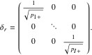
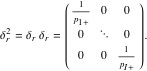
Here ![]() is the diagonal matrix comprising the reciprocals of the square roots of the row totals.
is the diagonal matrix comprising the reciprocals of the square roots of the row totals.
 (13)
(13)

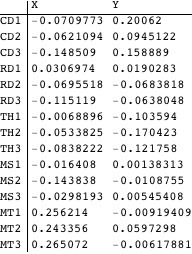
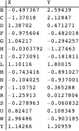
The scores of the rows in our sample cross tab are computed. The row scores may be thought of as the coordinates of points in a high-dimensional space (14-dimensional, as it turns out in this case).
Plotting Rows
Although the row scores faithfully reproduce the ![]() distances between rows in the original table, as coordinates their dimensionality is far too high for them to be presented graphically. Thanks to the properties of the singular value decomposition, however, taking just the first two components of each row’s score usually produces a reasonable approximation to the
distances between rows in the original table, as coordinates their dimensionality is far too high for them to be presented graphically. Thanks to the properties of the singular value decomposition, however, taking just the first two components of each row’s score usually produces a reasonable approximation to the ![]() distances, and yields coordinates that can be placed on a two-dimensional plot. (Below we have labeled the components “X” and “Y” to highlight their role as 2D coordinates.)
distances, and yields coordinates that can be placed on a two-dimensional plot. (Below we have labeled the components “X” and “Y” to highlight their role as 2D coordinates.)
The following displays each row’s (abbreviated) label at the position given by its coordinates and returns a key to the abbreviations.
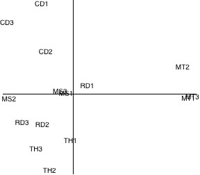

Figure 1. Row plot for text samples.
The plot gives a much clearer picture of the way in which the letters are distributed across the text samples. For example, it is quite evident that—as we concluded from the original cross tab—the Mark Twain samples differ significantly as a group from those of the other writers. The text samples of Darwin and Hobbes also appear to be sui generis, though the Descartes and Shelly samples appear less distinct. The plot suggests that it may be possible, therefore, to distinguish between the works of at least some of the authors using correspondence analysis of their letter distributions.
Diagnostics
Since it uses only the first two components of the row scores, the plot above only approximates the true configuration of the rows in the cross tab. Before using it to make firm inferences, we might try to gauge the quality of the representation it provides. One indicator is derived from the inertia of the rows defined in (9). Recall that ![]() , the total inertia of the rows, is calculated from the row totals and the distances of the rows to the centroid
, the total inertia of the rows, is calculated from the row totals and the distances of the rows to the centroid

It may be shown that for any contingency matrix, the procedure of the previous section always places the centroid at the origin of the plot. Therefore, since Euclidean distances on the plot are supposed to approximate ![]() distances, replacing each
distances, replacing each ![]() distance
distance ![]() in the right-hand side of (14) by the distance of the corresponding row point to origin should yield an approximation to
in the right-hand side of (14) by the distance of the corresponding row point to origin should yield an approximation to ![]() . The following derives this quantity and computes its ratio to the true value of
. The following derives this quantity and computes its ratio to the true value of ![]() .
.
Thus our two-dimensional plot captures about 56% of the total inertia of the table rows. While this seems hardly an impressive fraction, Murtagh points out that ratios like this are not uncommon in correspondence analysis, and do not necessarily point to a bad representation. Nonetheless, we might want to exercise a modicum of caution before drawing categorical conclusions from our analysis.
As an aside, it turns out that the total inertia of the contingency matrix Ρ—which was calculated “longhand” in (9)—is equal to the sum of the squares of the diagonal elements of the matrix in (11). The latter comprise the singular values of the matrix Ω. Furthermore, the inertia retained in the two-dimensional plot is simply the sum of the squares of the first two singular values in ∧.
Plotting Columns
We have seen how correspondence analysis can be used to derive a visual representation of the relationships between the rows of a contingency matrix. We can also use correspondence analysis to illustrate the relationship between the rows and the columns of a correspondence matrix—between the texts and letters in our example. Since our primary concern is with the text samples, the rows of the cross tab, it might seem a digression to look at the cross tab columns (the characters appearing in the texts), but we will see in the next section that the geometry of the columns is central to the identification of the mystery texts.
As with the rows, we begin by deriving scores for the columns from the singular value decomposition in (11). With reference to (11), the matrix C, whose rows are the column scores, is calculated as follows:

Where
 (16)
(16)
As before, the two-dimensional column coordinates are simply the first two components of the scores.
We can display both columns and rows on the same plot with a slight elaboration of the method used to plot the rows alone. The column coordinates are scaled so that the column points occupy roughly the same region of the plot as the row points.
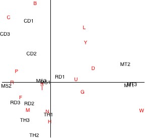
Figure 2. Row and column plot for text samples.
Interpreting the relationships between rows and columns from a plot such as this is not as straightforward as it was for the previous plot with the rows only. For example, it is not true in general that the closer a column appears to a row, the greater the prevalence of the corresponding letter in the corresponding text sample. To show how such relationships are actually represented, consider the text sample “MT2″ (a row) and characters “P” and “Y” (columns).
Possibly the simplest way to determine the relationship between a text sample and a character is to draw lines from their corresponding points in the plot to the origin. If the angle between the two lines is acute, then the character occurs more often in the sample than it does on average in the texts as a whole. Conversely, if the angle is obtuse, the character occurs less often than overall. The following draws the appropriate lines for our chosen text sample and characters; it appears the character “Y” occurs more often than average in “MT2″, while “P” occurs less often.
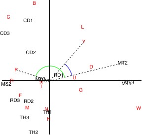
Figure 3. Simple analysis of row/column plot.
Unfortunately, the method described above only tells us if a character appears more or less often than average in a text sample, not whether one character appears more often than another in a sample. In particular, an angle that is more acute does not signify a character that is more prevalent in a text.
A rather more complicated method that does illustrate the relative frequencies of characters in a text sample entails first drawing a line on the plot through the origin and the point corresponding to the text sample in question. Perpendiculars to this line are dropped from each character’s position on the plot. The following draws such a construction for the selected text sample “MT2″.
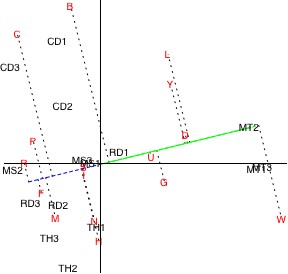
Figure 4. Comprehensive analysis of row/column plot.
The relative frequencies of the characters in the text sample can be read off by traversing the line through the text sample (colored blue and green on the plot above), looking at the positions at which the perpendiculars from the characters intersect it. A character with an intersection on the green line segment (i.e., on the same side of the origin as the text sample) occurs more often in the sample than the average in the texts overall, whereas one on the blue line segment (on the other side of the origin) occurs less frequently than the average. In addition, the further from the origin on the green line segment such an intersection occurs, the greater the frequency of the character in the sample. Conversely, the further out on the blue segment an intersection falls, the less frequent the character in the sample.
So from the plot above, it appears that the character “W” occurs most often in the sample text, and that characters “L”, “D”, “Y”, “G”, “U”, “B”, “S”, “I”, “N”, “H”, “C”, “M”, “P”, “F”, and “R” occur successively less often; characters “W” through “B” in the ranking appear more often than average, while “S” through “R” appear less often than average.
Supplementary Points: Identifying the Mystery Texts
Finally, we return to the problem we faced at the outset: identifying the author or authors of the unidentified text fragments. We have seen how the application of simple correspondence analysis to the text samples allows us to view them graphically in terms of their letter distributions. In Section 5 we saw that it was generally possible to distinguish the authors of the text samples based upon the locations of the corresponding row points—with a few exceptions, samples of work by the same writer tended to occupy the same area of the plot. One might logically surmise that if we were to plot the mystery texts on the same correspondence plot as the samples, we would be able to determine their authorship by looking at the authors of the nearest samples. To begin, we need to calculate an additional cross tab containing the distribution of the selected characters in the mystery texts.

We could proceed by simply appending these frequencies as new rows to the original text samples cross tab given in Section 1 and recalculating the scores and coordinates for all the rows (that is, both the original samples and the mystery texts) in the resulting table. In principle, however, it is possible that the unidentified texts overlap one or more of the text samples, and if this were the case, appending the new rows to the cross tab would distort the analysis by “double-counting” some of the samples.
A more satisfactory approach derives from the fact that the row scores computed in Section 4 are actually weighted sums of the column scores calculated in Section 6. In matrix terms, recalling that Ρ is the correspondence matrix and C is the matrix of column scores, it can be shown that
![]() (17)
(17)
Where
 (18)
(18)
If we replace the original correspondence matrix in (17) with a new correspondence matrix formed from the cross tab of the unidentified texts, we derive a set of row scores for the unidentified texts according to the transformation determined by the text samples only (since they alone produced the row scores ), eliminating the risk of double-counting. Treated in this way, the unidentified texts comprise supplementary points in the terminology of correspondence analysis.
The following calculates row scores for the mystery texts as supplementary points (straightforward algebra vindicates the direct use of the new cross tab without the need to derive a new correspondence matrix).
Lastly, as with the rows and columns, we take the first two elements of the scores above to produce the coordinates of the supplementary points. In the following, they are displayed on the same plot as the original rows.
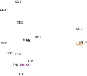

Figure 5. Plot of the mystery texts as supplementary points.
All points on this plot represent texts, or rows, and distances between points can be interpreted directly as degrees of similarity, just as with the row plot in Section 5. On this basis, judging by their closeness to the authors’ other works, it appears that mystery texts 1 and 2 belong to Mark Twain and Thomas Hobbes respectively. While the manifest isolation of the Mark Twain texts on the plot leaves little doubt as to the provenance of the first unidentified text, the author of the second is a little less clearly defined—particularly given the middling diagnostic ratio calculated in Section 5. Nonetheless, I am sure you will agree that considering the rather scant literary information on which the analysis was based (amounting to no more than a table of letter frequencies), the results are encouraging.
