Control charts are the most powerful tools to analyze variation in most processes – either manufacturing or administrative. Control charts were originated by Walter Shewhart in 1931 with a publication called Economic Control of Quality of Manufactured Product.
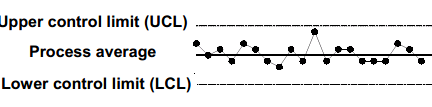
Originated by Walter Shewhart, control charts are a type of graph for studying how a process changes over time. By comparing data points to a central line average, with an upper control limit (UCL) and lower control limit (LCL), user can note variation, track common causes, and seek special causes. Alternative names are “statistical process control charts” and “Shewhart charts”. Run charts display data measures over time without the central line average and the limits.
Control charts using variables data are line graphs that display a dynamic picture of process behavior. Control charts for attributes data require 25 or more subgroups to calculate the control limits. A process which is under statistical control is characterized by plot points that do not exceed the upper or lower control limits. When a process is in control, it is predictable.
Control Chart have various benefits as the addition of calculated control limits facilitates the ability to detect special or assignable causes of variation, the current process is displayed and compared to the improved process by identifying shifts in either average or variation and since every process varies within predictable limits, identifying assignable causes and addressing them will save money.
Control charts are used to control ongoing processes by finding and correcting problems as they occur, to predict the expected range of outcomes from a process, determine if a process is in statistical control, differentiate variation from non-routine events or common causes and determine whether the quality improvement should aim to prevent specific problems or make fundamental process changes.
Types of control charts – Different types of control charts exist depending on the measurement used and two basic categories are
- Variable charts – It is constructed from variable data (data that consists of measurements like weight, length, etc.). Variable data contains more information than data that simply qualifies or counts something. Consequently, variable charts are some of the most powerful tools in quality improvement. In it the samples are taken in 2-10 subgroups at predetermined intervals with the statistic (mean, range, or standard deviation) calculated and recorded on the chart. Various types of variable charts are
- – R Charts (when data is readily available)
- Run Charts (limited single-point data)
- M- MR Charts (moving average/moving range)
- X – MR Charts (I – MR, individual moving range)
- – S Charts (when sigma is readily available)
- Median Charts
- Short Run Charts
- Attribute charts – It Uses attribute data(data that counts items, such as the number of rejects or the number of errors). Control charts based on attribute data are generally less powerful and sometimes more difficult to interpret than variable charts. Samples are taken from lots of material where the number of defective units in the sample are counted (for p and np-charts) or the number of individual defects are counted for a defined unit (c and u-charts). Various types of attribute charts are
- p Charts (for defectives – sample size varies)
- np Charts (for defectives – sample size fixed)
- c Charts (for defects – sample size fixed)
- u Charts (for defects – sample size varies)
The structure of both types of control charts is similar, but the statistical construction of the control limits is quite different due to the differences in the distributions in each.
