Burndown Chart
In this section, we will learn about the burndown chart. Therefore, let’s start the discussion.
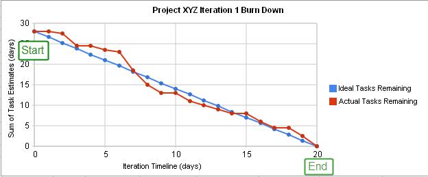
It is a graphical representation of outstanding work versus time, where the outstanding work is on the vertical axis, with time on the horizontal. The chart is useful to predict the completion of work.
Expected Benefits And Common Pitfalls: Burndown Chart
Let’s start with benefits first.
- First things first, the practice results in the visibility of recent project status. Moreover, but it motivates the team to confront any difficulties more decisively.
- Secondly, burndown charts are simple to create on the basis of velocity alone which adds more effectiveness in the practice.
Time to pay heed to some common pitfalls.
- Burndown charts only depict the number of story points done, and they do not indicate any changes in the scope of work in the backlog. Consequently, it is difficult to tell whether changes can be attributed to backlog items completed, or simply and increase (or much less likely) a decrease in story points.
- After that, it doesn’t provide an indication of the product backlog items which have been completed. As a result, burndown can only provide an indication of trends.
Get certified and unlock more opportunities. Practice and Validate your skills to become a Certified Agile Testing Professional Now
