
Control charts can be used for various things, including determining process stability, monitoring processes, finding the root causes of special variations or assignable causes that go outside the expected control limits, predicting a range of process outcomes, and analyzing process variation patterns.
In a control chart, the calculated levels of plus or minus three sigma are used to get at some critical pieces of information, and you would set the upper and lower control limits at these levels. A center line is then set. It’s desirable that the process operate within these defined parameters.
Warning limits should also be set at plus or minus two sigma. If the warning limits are exceeded, it is an indication that you could be headed towards an outer specification condition. This could mean that you are actually producing scrap or defects at plus or minus three sigma or outside of those upper and lower control limits.
Control charts can either be univariate when they monitor a single CTQ characteristic of a product or service or be multivariate when they monitor more than one CTQ. The univariate control charts are further classified according to whether they monitor attribute data or variable data.
A typical control chart plots sample statistics and is made up of minimum four lines of, a vertical line to measure the levels of the sample’s means, the two outmost horizontal lines for the UCL and the LCL; and the center line, which represents the mean of the process. If all of the points plot between the UCL and the LCL in a random manner, the process is considered to be, in control which means that the variations are random but are not outside the control limits thus, the process trends can be predicted because the variations are strictly due to common causes.
One of the key assumptions when it comes to control charts is that the data is expected to follow a normal distribution pattern. The upper control limit and the lower control limit should be set at plus three sigma and minus three sigma, respectively, on either side of the center line, and you need to remember that you would expect 99.7% of all the data points to fall within those two limits.
Anything falling outside of those limits should be considered a special cause variation, and therefore subject to action as outlined in your control plan.
The control charts helps in prevent the process from going out of control by detecting the assignable causes of variation in time and it dissuade from making unnecessary adjustments when they are not needed. It also determines the natural range (control limits) of a process so as to compare the range to its specified limits. Control charts inform about the process capabilities and stability as well. It is a tool for constant process monitoring thus, facilitate the planning of production resources allocation. Control limits on a control chart are readjusted every time a significant shift in the process occurs. As per the Western Electric (WECO) rules, a process is said to be out-of-control if one the following occur
- A single point falls outside the 3σ limit
- Two out of three successive points fall beyond the 2σ limits
- Four out of five successive points fall beyond 1σ from the mean
- Eight successive points fall on one side of the center line
Variations you’re likely to find on a control chart for a process are divided into common cause variation, which is expected variation or is expected over time and it does not typically fall outside the control limits. Other variation being special cause, or assignable, variations, which are event-driven, it accounts for a process going out of control and is represented on a control chart by plotted points that have crossed over the upper or lower specification limits.
There are different types of control charts. For instance, in charts that show common cause variations, the data would not exceed the upper and lower control limits, and it shows fairly random patterns. This is due to common causes that can be expected, for example, machine wear-and-tear, variation in the material inputs to the process, or operator fatigue.
The steps for creating a control chart, are
- plot the process or the product variable data that you are interested in; this data could be temperature, diameter, speed, or any other element that you want to gain an understanding of
- connect the plotted points and begin to determine a time ordered series of the data
- draw a center line at the mean of the data, through the middle
- add upper and lower control limits (UCL and LCL), which represent the normal amount of variation you’d expect to see for a consistent process; these limits are typically plus three sigma or minus three sigma from the center line, respectively
Control Chart for Attribute Data
It’s characteristics resemble binary data — they can only take one of two given forms like conforming or not conforming, good or bad, etc Attribute data must be transformed into discrete data to be meaningful. The types of charts used for attribute data are
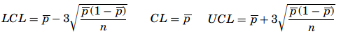
The p–chart – The p-chart is used when dealing with ratios, proportions, or percentages of conforming or nonconforming parts in a given sample. A good example for a p-chart is the inspection of products on a production line. They are either conforming or nonconforming. The probability distribution used in this context is the binomial distribution with p for the nonconforming proportion and q (which is equal to 1 − p) for the proportion of conforming items. Because the products are only inspected once, the experiments are independent from one another. The first step when creating a p-chart is to calculate the proportion of nonconformity for each sample as p =m/b where, m represents the number of nonconforming items, b is the number of items in the sample, and p is the proportion of nonconformity. The mean proportion is computed as

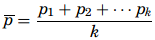
where, k is the number of samples audited and pk is the kth proportion obtained. The control limits of a p-chart are

The benefit of the p-chart is that the variations of the process change with the sizes of the samples or the defects found on each sample.
- The np-chart – The np-chart is one of the easiest to build. While the p-chart tracks the proportion of nonconformities per sample, the np-chart plots the number of nonconforming items per sample. The audit process of the samples follows a binomial distribution—in other words, the expected outcome is “good” or “bad,” and therefore the mean number of successes is np. The control limits for an np-chart are


- The c-chart – The c-chart monitors the process variations due to the fluctuations of defects per item or group of items. The c-chart is useful for the process engineer to know not just how many items are not conforming but how many defects there are per item. Knowing how many defects there are on a given part produced on a line might in some cases be as important as knowing how many parts are defective. Here, non-conformance must be distinguished from defective items because there can be several nonconformities on a single defective item.
The probability for a nonconformity to be found on an item in this case follows a Poisson distribution. If the sample size does not change and the defects on the items are fairly easy to count, the c-chart becomes an effective tool to monitor the quality of the production process. If c is the average nonconformity on a sample, the UCL and the LCL limits will be given as


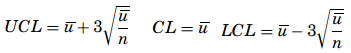
- The u-chart – One of the premises for a c-chart is that the sample sizes had to be the same. The sample sizes can vary when a u-chart is being used to monitor the quality of the production process, and the u-chart does not require any limit to the number of potential defects. Further, for a p-chart or an np-chart the number of nonconformities cannot exceed the number of items on a sample, but for a u-chart it is conceivable because what is being addressed is not the number of defective items but the number of defects on the sample. The first step in creating a u-chart is to calculate the number of defects per unit for each sample as u = c/ n. where u represents the average defect per sample, c is the total number of defects, and n is the sample size. Once all the averages are determined, a distribution of the means is created and then the mean of the distribution is to be computed as

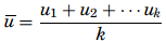
where k is the number of samples. The control limits are determined based on u and the mean of the samples, n as

Control charts for Variable Data
Control charts monitor not only the means of the samples for CTQ characteristics but also the variability of those characteristics. When the characteristics are measured as variable data (length, weight, diameter, and so on), the X -charts, S-charts, and R-charts are used. These control charts are used more often and they are more efficient in providing feedback about the process performance. The principle underlying the building of the control charts for variables is the same as that of the attribute control charts. The whole idea is to determine the mean, the standard deviation, and the distance between the mean and the control limits based on the standard deviation.
Control charts for variable data are used when quality characteristics can be measured and expressed as numerical data – information like length, volume, temperature, or time. A key characteristic of variable data is that it can be expressed in decimal values, for instance 1.375 cm or 120.78 degree Celsius.

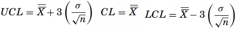
- Standard error-based X-chart – It is based on the Central Limit Theorem, the standard deviation used for the control limits is nothing but the standard deviation of the process divided by the square root of the sample’s size as,

- Mean range- based X-chart – With sample sizes n ≤ 10, the variations are also small, so the range can be used against the standard deviation when constructing a control chart. R is called the relative range computed as R = d2/σ and the mean range is R = (R1 + R2+··Rk)/k where Rk is the range of the kth sample. Therefore, the estimator of σ is σ =R/d2. The formulas for the control limits are


- R-chart – In it, the center line will be R and the estimator of sigma is given as σ R = d3σ. The control limits are

