
CSS3 introduces a few new modules that make multi-column layouts easier to create. The Multi-column Layout module deals with flowing the text of a single block into multiple columns, similar to newspaper layout. The Flexible Box Layout module deals with making blocks align horizontally or vertically with each other and making them more flexible to the available space than floats or positioning can be. There are also more experimental layout modules called Template Layout and Grid Positioning.
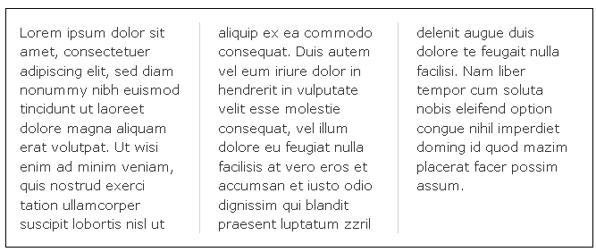
The CSS3 multi-column layout allows easy definition of multiple columns of text – just like in newspapers:

Browser Support
The numbers in the table specify the first browser version that fully supports the property.
Numbers followed by -webkit- or -moz- specify the first version that worked with a prefix.
| Property | IE | Chrome | Mozilla | Safari | Opera |
| column-count | 10.0 | 4.0 -webkit- | 2.0 -moz- | 3.1 -webkit- | 15.0 -webkit- 11.1 |
| column-gap | 10.0 | 4.0 -webkit- | 2.0 -moz- | 3.1 -webkit- | 15.0 -webkit- 11.1 |
| column-rule | 10.0 | 4.0 -webkit- | 2.0 -moz- | 3.1 -webkit- | 15.0 -webkit- 11.1 |
| column-rule-color | 10.0 | 4.0 -webkit- | 2.0 -moz- | 3.1 -webkit- | 15.0 -webkit 11.1 |
| column-rule-style | 10.0 | 4.0 -webkit- | 2.0 -moz- | 3.1 -webkit- | 15.0 -webkit 11.1 |
| column-rule-width | 10.0 | 4.0 -webkit- | 2.0 -moz- | 3.1 -webkit- | 15.0 -webkit 11.1 |
| column-width | 10.0 | 4.0 -webkit- | 2.0 -moz- | 3.1 -webkit- | 15.0 -webkit 11.1 |
CSS3 Create Multiple Columns
The column-count property specifies the number of columns an element should be divided into. The following example will divide the text in the <div> element into 3 columns, as
div { -webkit-column-count: 3; /* Chrome, Safari, Opera */ -moz-column-count: 3; /* Firefox */ column-count: 3; }
CSS3 Specify the Gap Between Columns
The column-gap property specifies the gap between the columns. The following example specifies a 40 pixels gap between the columns, as
div { -webkit-column-gap: 40px; /* Chrome, Safari, Opera */ -moz-column-gap: 40px; /* Firefox */ column-gap: 40px; }
CSS3 Column Rules
The column-rule-style property specifies the style of the rule between columns, as
div { -webkit-column-rule-style: solid; /* Chrome, Safari, Opera */ -moz-column-rule-style: solid; /* Firefox */ column-rule-style: solid; }
The column-rule-width property specifies the width of the rule between columns, as
div { -webkit-column-rule-width: 1px; /* Chrome, Safari, Opera */ -moz-column-rule-width: 1px; /* Firefox */ column-rule-width: 1px; }
The column-rule-color property specifies the color of the rule between columns, as
div { -webkit-column-rule-color: lightblue; /* Chrome, Safari, Opera */ -moz-column-rule-color: lightblue; /* Firefox */ column-rule-color: lightblue; }
The column-rule property is a shorthand property for setting all the column-rule-* properties above. The following example sets the width, style, and color of the rule between columns, as
div { -webkit-column-rule: 1px solid lightblue; /* Chrome, Safari, Opera */ -moz-column-rule: 1px solid lightblue; /* Firefox */ column-rule: 1px solid lightblue; }
Specify The Column Width
The column-width property specifies a suggested, optimal width for the columns. The following example specifies that the suggested, optimal width for the columns should be 100px, as
h2 { -webkit-column-width: 100px; /* Chrome, Safari, Opera */ column-width: 100px; }
CSS3 Multi-columns Properties
The following table lists all the multi-columns properties:
| Property | Description |
| column-count | Specifies the number of columns an element should be divided into |
| column-fill | Specifies how to fill columns |
| column-gap | Specifies the gap between the columns |
| column-rule | A shorthand property for setting all the column-rule-* properties |
| column-rule-color | Specifies the color of the rule between columns |
| column-rule-style | Specifies the style of the rule between columns |
| column-rule-width | Specifies the width of the rule between columns |
| column-span | Specifies how many columns an element should span across |
| column-width | Specifies a suggested, optimal width for the columns |
| columns | A shorthand property for setting column-width and column-count |