
Create, Modify, and Position Diagrams and Charts Based on Worksheet Data
diagrams and charts
Both diagrams and charts are pictorial representations of information. Both are used to communicate visually, and both try to simplify the information they’re conveying. But there are some differences.
A diagram is designed to:
- Demonstrate or explain how something works.
- Clarify the relationship between the parts of a whole.
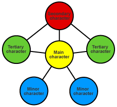
Using a diagram is a good way to illustrate conceptual material and to enliven documents. For example, you can illustrate how the characters in a novel relate to each other.
A chart is designed to:
- Present information in tabular or graphic format.
- Plot specific information.
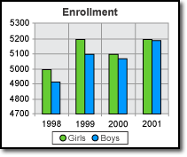
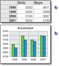
Using a chart is a great way to make complicated material—such as comparisons, patterns, and trends in data—easy to view and understand. For instance, rather than analyze several columns of worksheet numbers, you can use a chart to compare at a glance how the enrollment statistics of girls and boys are changing over a period of years.
Creating a chart
You can create a chart on its own worksheet or as an embedded object on another worksheet. You can also publish a chart on a Web page. To create a chart, you must first enter the data for the chart on the Excel worksheet. Then select that data and either use the Chart Wizard (on the Insert menu, click Insert) to choose the chart type and the various chart options, or use the Chart toolbar to create a basic chart that you can format later.
Apply for MS Excel Certification Now!!
https://www.vskills.in/certification/excel-online-certification-course