
Create and Modify Custom Data Formats
By applying conditional formatting to your data, you can quickly identify variances in a range of values with a quick glance.
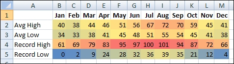
This graphic shows temperature data with conditional formatting that uses a color scale to differentiate high, medium, and low values. The following procedure uses that data.
Select the data that you want to conditionally format

Apply the conditional formatting
On the Home tab, in the Styles group, click the arrow next to Conditional Formatting, and then click Color Scales.
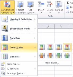
Hover over the color scale icons to see a preview of the data with conditional formatting applied.
In a three-color scale, the top color represents higher values, the middle color represents medium values, and the bottom color represents lower values. This example uses the Red-Yellow-Blue color scale.
Experiment with the conditional formatting
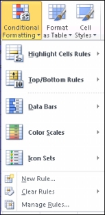
On the Home tab, in the Styles group, click the arrow next to Conditional Formatting, and then experiment with the available styles.
Apply for MS Excel Certification Now!!
https://www.vskills.in/certification/excel-online-certification-course